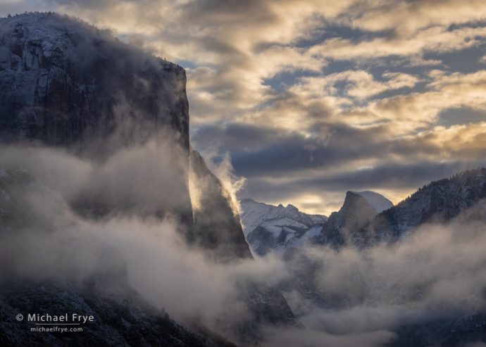
Sunrise from Tunnel View after a spring snowstorm, Yosemite (2015). In my Landscapes in Lightroom: Advanced Techniques course I show how to subtly enhance the inherent qualities of light in photographs like this.
Also, if you purchase any of my Lightroom courses you’ll be able to attend the live Lightroom processing webinar I’ll be giving on January 8th, and submit images for possible inclusion in this webinar.
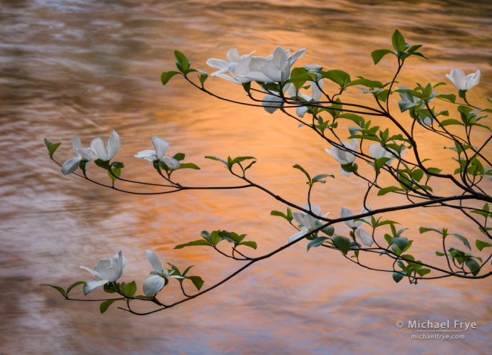
Dogwood blossoms and sunset reflections, Yosemite. I used the Color Range and two Brush components in Lightroom’s Masking Panel to select and lighten just the dogwood blossoms in this photograph.
On Saturday, January 8th (10:30 a.m. Pacific Time) I’ll be hosting a live webinar where I’ll pick two or three images from members of our Education Center and show how I would process them in Lightroom – with special emphasis on using the new Masking Panel.
The new Masking Panel is one of the biggest changes to Lightroom since 2012. It’s incredibly powerful and flexible, with better tools for viewing and organizing all your local adjustments, two new AI-powered selection tools (Select Subject and Select Sky), and best of all, the ability to combine selections in almost unlimited ways to create exactly the selection you want.
I’m really excited about all these new capabilities, but there’s a lot to learn, and it takes some getting used to. So I’ve just finished a new three-part video tutorial all about Lightroom’s Masking Panel.
I’ve included Part 1 here for free to help get you up to speed with the Masking Panel. This video will help you navigate the new layout and learn how to use its great new tools for viewing, organizing, and renaming your masks.
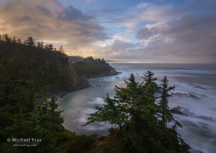
Sunrise along the Oregon Coast. I used some of the powerful selection tools in Lightroom’s new Masking panel to re-process this image, balancing the bright highlights and dark shadows, and bringing out subtle colors and definition in the foreground.
Today Adobe officially released a major update to Lightroom, Lightroom Classic (v11.0), and Camera Raw (v14.0), featuring a completely revamped method of making local adjustments called Masking. This new implementation improves the layout and functionality of the local adjustments, adds some powerful new selection tools, and allows you to combine tools in almost unlimited ways to create exactly the selection you want.
With the new Masking panel, all of your local adjustments can be viewed together, rather than spread out between three panels (Graduated Filter, Radial Filter, and Adjustment Brush). You can also rename each mask, turn each mask off and on, and view the masks with different overlays.
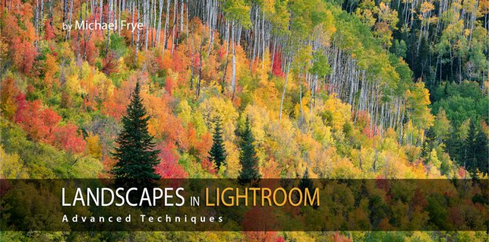
I know many of you have purchased and used my original Lightroom course, Landscapes in Lightroom: The Essential Step-by-Step Guide. (I used to refer to this as an ebook, but it’s evolved into much more than that.) This new, advanced course takes you further, showing you how to add sophisticated touches to your images that you might have thought were only possible in Photoshop. Things like…
I’ve been using Lightroom since Adobe released the beta version in 2006. Over the years I’ve learned many shortcuts, and in this video I share some of my favorite tips – things I use all the time to streamline my workflow:
We will never sell or share your email address with anyone. Read our complete Privacy Policy.
Subscribe to My Blog:
Success! Now check your email to confirm your subscription.