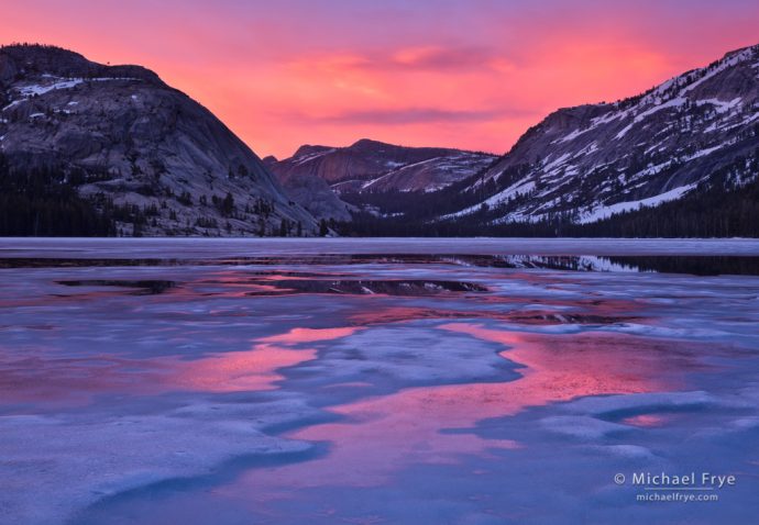
Sunset at Tenaya Lake, Yosemite. I had to work quickly to find a foreground design to go with this colorful sunset.
I’ve always been attracted to color. Color can be eye-catching, but more importantly to me, it’s a powerful tool for conveying a mood.
My attention is easily caught by colorful subjects like flowers, fall leaves, sunrise or sunset clouds, reflections, and so on. The colors don’t have to be bold; a subtle color palette can be just as compelling.
But while interesting colors always catch my eye, I know that color is not enough by itself. You can’t just point your camera toward something colorful and expect to make a great photograph. A frame filled with a random mishmash of autumn leaves won’t be compelling – it’ll just be a colorful mess. You need to find a design to go with that color. So I’m always looking for focal points and patterns that could help give structure to the color.
I made the image at the top of this post back in June of 2011. It was an overcast afternoon, and Tenaya Lake was still partially frozen, so I spent some time photographing not-very-colorful abstract patterns of ice along the shore.
It looked like a gray day would just fade into darkness, but right before sunset I noticed a pink glow in the clouds to the east. I knew the glow could quickly fade, but it also might grow and become more intense. If it did become more intense, what could I do with that color? A random arrangement of ice in the foreground just wouldn’t make an interesting photograph, no matter how colorful the sky. I needed to find some kind of design, pattern, or focal point in that ice — preferably a design that would tie the foreground and background together, or lead the eye from foreground to background.
As the pink glow grew more intense, I hurried along the lakeshore, looking for a location that would fit those criteria. I found one spot that seemed to work, with a vaguely circular swath of smoother ice reflecting the pink sky. In the middle of that circle was a patch of snow which could provide a foreground focal point. And some diagonal lines in the ice echoed the diagonals in the distant granite domes, creating a visual connection between foreground and background.
With more time I might have been able to find a better foreground, but I knew the sunset color wouldn’t last, so this would have to do. I switched from a telephoto lens to a wide-angle zoom to incorporate the sky into the picture, composed, and quickly bracketed several frames before the color faded. The resulting photograph is colorful, but it’s not just a random arrangement of color – it has some design too.
In the next example I had more time to think about the composition. It was overcast again, but that soft light was perfect for the pink redbuds surrounded by green leaves:
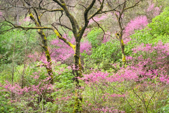
Redbud and oaks, Merced River Canyon, California. The three oaks provided focal points and a repeating pattern to add some design to the surrounding color.
What originally attracted me to this spot was the pattern of rounded, pink and green shapes. But that pattern was rather weak, so I needed something else. I tried incorporating some of the oak trees into the frame, but at first none of those compositions seemed to quite work. Then I found this view, where the three oaks created their own repeating pattern, and provided focal points amid the surrounding chaos. In other words, the trees added design to the color.
You’ll find a couple more examples below, but I think you get the point: whenever you find a colorful subject, look for a way to incorporate that color into a cohesive design.
— Michael Frye
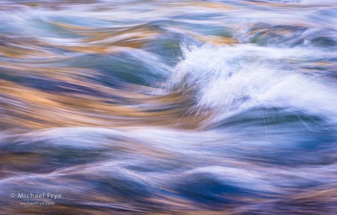
Waves in the Merced River near Happy Isles, Yosemite. The color in the water was beautiful, with sunlit cliffs reflecting in the water and creating golden reflections. But again, the challenge was to find a design to go with that color. I ended up just using the patterns in the waves themselves. Filling the frame with blurred water usually doesn’t work, as there’s nothing for the eye to latch onto. But sometimes you can find patterns in the water that are strong enough to hold the image together. Here, in addition to the overall wavy pattern, the white, breaking waves right of center add a subtle focal point.
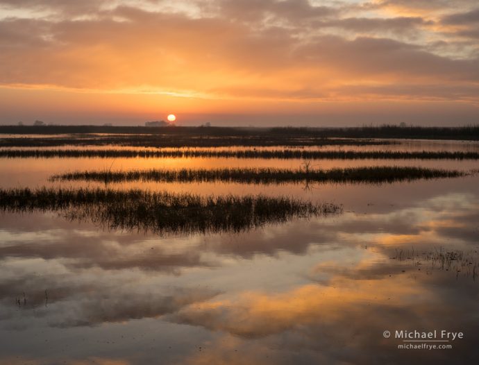
Sunrise in a San Joaquin Valley marsh, California. The sun provided a clear focal point here, but I needed something more, so I looked for some kind of pattern or design among the reeds. Eventually I found this spot, with the reeds creating layered bands across the frame, echoing the horizontal bands in the clouds.
Related Posts: When Does a Photograph Need a Focal Point?; Intimate Landscapes with Wide-Angle Lenses; The Painted Hills
Michael Frye is a professional photographer specializing in landscapes and nature. He is the author or principal photographer of The Photographer’s Guide to Yosemite, Yosemite Meditations, Yosemite Meditations for Women, Yosemite Meditations for Adventurers, and Digital Landscape Photography: In the Footsteps of Ansel Adams and the Great Masters. He has also written three eBooks: Light & Land: Landscapes in the Digital Darkroom, Exposure for Outdoor Photography, and Landscapes in Lightroom: The Essential Step-by-Step Guide. Michael has written numerous magazine articles on the art and technique of photography, and his images have been published in over thirty countries around the world. Michael has lived either in or near Yosemite National Park since 1983, currently residing just outside the park in Mariposa, California.


Thank you for this article. Very subtle and insightful.
Glad you found this helpful Rick.
I have to agree with Rick. Very helpful and thought provoking.
Thanks Doug!
I am new to this forum. I would like to thank you for the very interesting topic and clear explanation
Thanks Michele!
The waves in the Merced is still one of my favorite images you have made, it’s hanging on my wall.
Glad you like that image Matthew, thanks!
I’ve been trying to put this into words for weeks. Thank you Michael.
Glad that helped Sean!
Thanks, Michael, as Rick well said, very insightful. I think we are all drawn to colors, but as you said, all the elements of a composition must be cohesive, indeed a contrasting focal point may be needed as in the three oaks in the photo above.
Thank you Bob!
I found this to be an inspiring article. Great photography and clear explanations of how you are composing. I will be reading more of your writings. I’m headed to the California coast to shoot flowers on the cliffs. Will be keeping your tips in mind. Thank you for a very informative piece.
Thanks very much Bob! Have fun on your trip.