In the Moment:
Michael Frye's Landscape Photography Blog
by Michael Frye | Sep 1, 2010 | Yosemite Photo Conditions

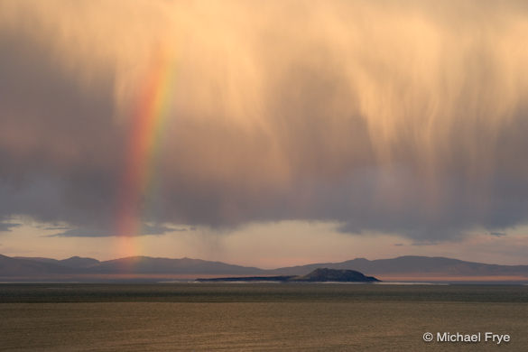
Rainbow over Mono Lake, September 7, 2006
It’s September 1st, a milestone for photographers in the northern hemisphere. Technically it’s still summer, and in most of the United States the weather remains warm. In Yosemite the waterfalls are barely flowing, and fall color is still at least a month away.
But the the light is changing. Every day is a little shorter than the previous one. Gradually the sun is taking a lower path through the sky. Sunrises and sunsets last longer. For the next eight months the sun won’t be directly overhead anymore during the middle of the day, beaming down harsh, unflattering light on our favorite subjects. Best of all, we won’t have to get up so early for sunrise!
So although summer isn’t officially over yet, it’s days are numbered. Here’s to more interesting light in the months to come.
by Michael Frye | Aug 26, 2010 | Critiques

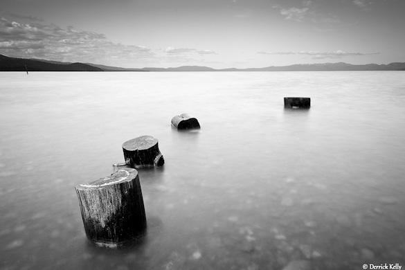
“Kiva” by Derrick Kelly
This week’s photograph was made by Derrick Kelly at Kiva Beach in South Lake Tahoe, California. By having his image chosen for this critique Derrick will receive a free 16×20 matted print from Aspen Creek Photo. If you’d like your images considered for future critiques you can upload them to theFlickr group I created for this purpose.
If you’ve been reading these critiques you know that I’m a fan of clean, simple compositions. This photograph epitomizes that. The four stumps stand out clearly against the smooth water, creating a serene, zen-like composition.
The image seems nicely balanced, and I like the way the stumps form a subtle curve through the foreground. The only thing about the composition I can nitpick is the visual merger between the two stumps closest to the camera; it would be great to see clean separation and balanced spacing between all the stumps.
Gaining that separation would have required either raising the camera, moving forward, or stepping to the right and pointing the camera more to the left. I don’t know if any of those options was feasible: the tripod might have been as high as it could go, stepping forward would probably have required wading, and moving to the right and pointing left could have introduced unwanted distractions in the background. But I point this out to make you more aware of such mergers in your own compositions; if you notice problems like this in the field then you have a chance to fix them by changing the camera position.
Derrick seemed to have a clear vision of how he wanted this photograph to look before he pressed the shutter. When I first viewed this image I thought it was captured at dusk, but it was actually made in midday light. Derrick put on a four-stop neutral-density filter, allowing him to use a 15-second exposure. This blurred and smoothed the water, giving the photograph a dusky, long-exposure look.
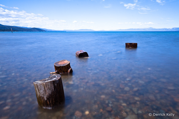
Derrick also knew from the beginning that he would convert this to black and white. He told me, “I like black and white because I feel it allows me to be more expressive in the image, with less ambiguity about my artistic intent, than does color photography.” Just for comparison, here’s the color version. To me the black-and-white image is indeed more expressive, and makes a stronger statement, than the color one. In color we see what stumps in water look like. In black and white we get that feeling of space and simplicity.

Color version
I’ve talked about this in a previous critique, but it’s worth mentioning again how black and white can simplify a photograph. Sometimes color can just be a distraction; here, for example, the rocks underneath the water stand out more in the color image, pulling our eyes away from the stumps.
Derrick said that he processed the single Raw file twice in Lightroom, darkening one version to bring out detail in the sky, lightening the other to provide the feeling he wanted in the foreground. He then converted both to black and white and merged them together in Photoshop.
As with many things in the digital darkroom, there were probably several different techniques that could have created a similar look. But the particular tools don’t matter. What does matter is having a clear idea of what you want to convey in the photograph. If you can do that, then you can make the right decisions along the way to convey that vision, from the choice of composition, exposure, shutter speed, depth of field, and filters, to the steps of post-processing.
In his books The Camera, The Negative, and The Print, Ansel Adams stressed the importance of visualization. He said, “The term visualization refers to the entire emotional-mental process of creating a photograph, and as such, it is one of the most important concepts in photography. It includes the ability to anticipate a finished image before making the exposure, so that the procedures employed will contribute to achieving the desired result.”
I think Derrick did a great job of visualization here. He didn’t want a literal representation of reality. He wanted something more expressive, and took the necessary steps to create that, starting with the 15-second exposure to smooth the water, and finishing with some skillful digital-darkroom work.
What do you think of this photograph? Do you like the black-and-white version better? Does the visual merger of the two stumps bother you? As always, I look forward to hearing your comments.
Thanks Derrick for sharing your image! You can see more his work on Flickr.
If you like these critiques, share them with a friend! Email this article, or click on one of the buttons below to post it on Facebook or Twitter.
As part of being chosen for this week’s critique Derrick will receive a free 16×20 matted print courtesy of the folks at Aspen Creek Photo. If you’d like your images considered for future critiques, just upload them to the Flickr group I created for this purpose. If you’re not a Flickr member yet, joining is free and easy. You’ll have to read and accept the rules for the group before adding images, and please, no more than five photos per person per week. I’ll be posting the next critique in two weeks. Thanks for participating!
by Michael Frye | Aug 20, 2010 | Photography Tips

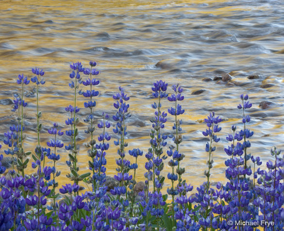
Lupine and reflections along the Tuolumne River
On Tuesday Claudia and I headed up to Tioga Pass. We planned to photograph flowers below Mt. Dana, but when we arrived at the pass the wind was gusting—not good for flower photography. After some indecision we drove toward White Wolf, but then Claudia remembered seeing some nice patches of lupine along the Tuolumne River near Lembert Dome two weeks ago, so we decided to stop and see if they were still blooming.
They were—in fact they were in great shape, and the wind was relatively calm. We found a spot with a thick patch of lupine in the foreground and Lembert Dome in the distance, and stayed until sunset taking photos. (more…)
by Michael Frye | Aug 17, 2010 | Announcements
The response to my new online store has been gratifying—thanks everyone! We’ll be adding more products, services, and special offers in the weeks and months to come, so stay tuned.
by Michael Frye | Aug 13, 2010 | Announcements

Redbud Reflection — get 20% off this print until midnight Sunday
A reminder that there are only two days left in the opening sale for my online store! Get 20 percent off everything until midnight Sunday. Just type “photojunkie” into the Discount Code box in the shopping cart.
Visit the Books & Posters section purchase a signed copy The Photographer’s Guide to Yosemite or my latest book, Digital Landscape Photography: In the Footsteps of Ansel Adams and the Great Masters.
Or browse through the Portfolios to find just the right print to put on your wall or give as a gift. All the images in the Yosemite and Eastern Sierra portfolios are available as “Mini-Mikes.” These are approximately 7×9 inch prints, initialed only, on 11×14 mats. At only 35 dollars, they’re a bargain compared to my larger, limited edition prints that start at $325. Click on the image thumbnails to see more information about each print and find the “Add to Cart” buttons.
by Michael Frye | Aug 12, 2010 | Critiques

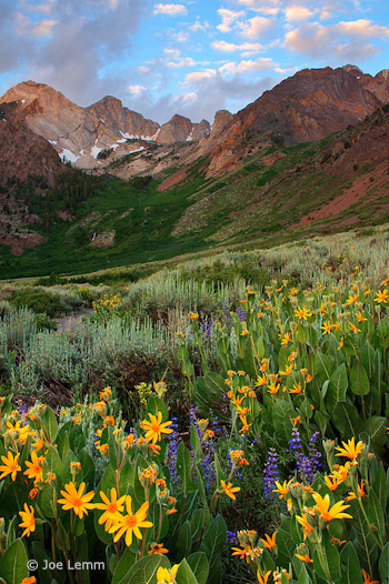
“McGee Creek” by Joe Lemm
This week’s photograph was made by Joe Lemm near McGee Creek, on the eastern side of my home mountain range, the Sierra Nevada. By having his image chosen for this critique Joe will receive a free 16×20 matted print from Aspen Creek Photo. If you’d like your images considered for future critiques you can upload them to theFlickr group I created for this purpose.
This is a beautiful mountain scene, with a nice juxtaposition between flowers and distant peaks. The colors are harmonious and pleasing; the yellow mule’s ears in the foreground brighten the mood and give this scene an idyllic feeling. Joe was lucky to find clouds in the sky at sunrise—uncommon in the Sierra in summer. But everyone needs a little luck now and then. Technique and vision are important, but there’s no substitute for being in the right place at the right time!
When you find yourself facing a beautiful scene, you have to make the most of the opportunity. The most important consideration is the composition: what, exactly, do you frame?
In the past two critiques (“Red Sky at Night” and “Glen Coe“) I’ve discussed photographs with prominent foregrounds. In both cases I thought the images might have been stronger without them; I felt the backgrounds were more interesting, and the foregrounds distracting.
Here, though, I think the foreground clearly adds to the image; in fact I think the flowers are the most eye-catching thing in the frame. There’s a good visual connection between the bottom and top of the image: the yellows, purples, and greens in the foreground complement the golds, blues, and greens in the background. The arrangement of those flowers also meshes nicely with the peaks: there’s a subtle V shape to the yellow mule’s ears that echoes the broad V of the ridgeline and smaller Vs in the notches between the peaks.
The only minor complaint I have about the composition is that I’d like to see a little more breathing room around the prominent yellow blossoms along the bottom and left edges, and would prefer that the large flower along the left edge wasn’t missing the tips of its petals. Of course zooming out and including more space at the bottom and sides might have introduced other distractions. In a situation like this it’s virtually impossible to avoid cutting some flowers in half, and there could have been patches of dirt or rocks or other unwanted elements that needed to be cropped out of the frame.
So I’m going to give Joe the benefit of the doubt here and assume that there were good reasons for not including more space around the bottom edges. Overall I think he did a good job of finding a foreground that adds something to the photograph, and positioning the camera to emphasize that V shape of the flowers.
But as always, I’d like to hear what you think. Does this foreground work? What do you think of the composition overall?
Technically this is well executed. Joe used a small aperture, f/18, to get sufficient depth of field, and everything looks sharp, even at a larger size. Wind can often be a problem when capturing images like this—you need a small aperture to get depth of field, but that forces you to use a slower shutter speed. Perhaps Joe got lucky (again!) and found a calm morning.
Joe said he used a three-stop graduated neutral-density filter to balance the bright sky with the darker foreground. Mountain scenes like this often require a graduated filter or exposure blending to balance sunlit peaks or sky with shaded areas below. Here the transition looks pretty natural; I don’t see any obvious line that would make the filter’s presence obvious.

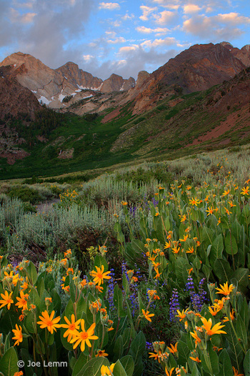
Non-HDR Version
Joe told me that he processed the Raw file three ways—normal, one stop under, and one stop over—then merged those three images with Photomatix HDR software. The result appears natural, again, with none of that HDR grunge look. The only hint that this might be HDR is that some of the colors, particularly the yellow-orange flowers, might be slightly over-saturated, and when viewed larger you can see a thin blue halo along the tops of the peaks—although that might be chromatic aberration in the lens (which could be fixed in Lightroom or Adobe Camera Raw), or oversharpening, or both.
Joe said that he also processed the image without HDR, and actually liked that version better, so I asked him to send it to me, and here it is (left). Personally I prefer the HDR version; the shadows are more open, and it feels more luminous. Just for fun I tried to adjust this non-HDR version to look more like the HDR version. I used a little Fill Light in Lightroom to open up the shadows, added Clarity to boost midtone contrast, then increased Vibrance to approximate the saturation in the HDR version.
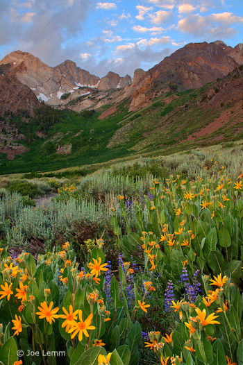
The result, shown below, is actually pretty close to the HDR photograph, and in some ways I like it better. But it shows that there are many ways to process an image. There are no right or wrong answers—just different interpretations.

Non-HDR version with added Fill Light, Clarity, and Vibrance
Overall this a well-seen, well-executed photograph in which the foreground and background complement each other nicely.
Thanks Joe for sharing your image! You can see more his work on Flickr.
If you like these critiques, share them with a friend! Email this article, or click on one of the buttons below to post it on Facebook or Twitter.
As part of being chosen for this week’s critique Joe will receive a free 16×20 matted print courtesy of the folks at Aspen Creek Photo. If you’d like your images considered for future critiques, just upload them to the Flickr group I created for this purpose. If you’re not a Flickr member yet, joining is free and easy. You’ll have to read and accept the rules for the group before adding images, and please, no more than five photos per person per week. I’ll be posting the next critique in two weeks. Thanks for participating!
by Michael Frye | Aug 5, 2010 | Yosemite Photo Conditions

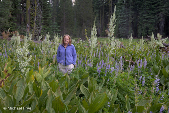
Lupine and cow parsnip near the Glacier Point Road last Sunday
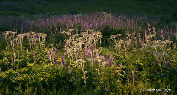
As expected, the wildflowers are nearing their peak in the higher elevations of Yosemite. They’re not really late; this is typical timing after a heavy winter. A fleeting, beautiful period of time has begun.
Summit Meadow, right along the Glacier Point Road, is a damp, boggy place. As the meadow slowly dries out over the summer, the shooting stars that dominated the early-season landscape give way to corn lilies, sneezeweed and lupine. There should be a nice mix of flowers there by this weekend. There are also many other small meadows and clearings near this road with flowers—you just have to look. It might also be worth a short hike to McGurk or Westfall meadows. A couple of years ago Claudia and I arranged a car shuttle and hiked from Taft Point to the McGurk Meadow trailhead, and found lots of great flowers along the way.
Speaking of Claudia, there’s a photo of her below near Crane Flat, standing next to the tallest corn lily I’ve ever seen. Ten feet tall? It’s a good year for corn lilies. In some summers a cold snap kills them before they bloom, but while we had a late spring, the temperatures have been moderate since early June, and corn lily blossoms are abundant right now. Some are already spent at Crane Flat, at only 6000 feet in elevation, but at 7000 feet and higher they should still be going strong for another week or so.
Other flowers, however, are still blooming at Crane Flat. Last Thursday the sneezeweed, coneflowers, and lupine were abundant, and other blossoms like yampah and goldenrod were about to bloom in big numbers.
I haven’t been to Tuolumne Meadows recently, but Claudia has, and says the wildflower display is typical of recent years—scattered blooms, but no thick carpets of flowers. However she found more color in other places, like along the trail to Mono Pass. It’s likely that other spots near Tioga Pass have good displays as well.
Please be careful when photographing wildflowers, and try not to trample them in your efforts to find the perfect composition. We want them to bloom next year too!

Claudia next to the tallest corn lily I’ve ever seen
by Michael Frye | Aug 3, 2010 | Announcements

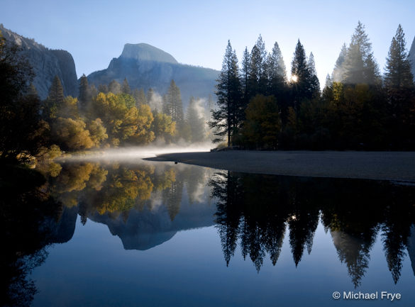
Autumn Sunrise, Half Dome and the Merced River; available as a poster or matted print
I’m very excited to announce my new online store! This is something I’ve wanted to do for a long time—to allow you, my faithful blog readers, Facebook fans, and Twitter followers to buy books, posters, and prints directly from me, and get those books and posters individually signed.
Visit the Books & Posters section of my web site to purchase a signed copy of my latest book, Digital Landscape Photography: In the Footsteps of Ansel Adams and the Great Masters, or get my classicBand of Light, El Capitan poster.
Or browse through the Portfolios section to find just the right print to put on your wall or give as a gift. All the images in the Yosemite and Eastern Sierra portfolios are available as “Mini-Mikes.” These are approximately 7×9 inch prints, initialed only, on 11×14 mats. At only 35 dollars, they’re a bargain compared to my larger, limited edition prints that start at $325. Click on the image thumbnails to see more information about each print and find the “Add to Cart” buttons.
Transactions are handled securely with PayPal or Google Checkout. To start things rolling, and to show my appreciation to for all your support, comments, and participation in this blog, I’m offering 20% off every purchase through August 15th. That’s coming up soon, so don’t miss out! Just type “photojunkie” into the Discount Code box in the shopping cart.
by Michael Frye | Jul 29, 2010 | Critiques

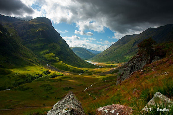
“Glen Coe” by Tim Smalley
This week’s photograph was made by Tim Smalley near Kinlochleven, Scotland. By having his image chosen for this critique Tim will receive a free 16×20 matted print from Aspen Creek Photo. If you’d like your images considered for future critiques you can upload them to the Flickr group I created for this purpose.
The first thing that grabbed me about this photograph is the wonderful light. The dappled sunshine, rich colors, and strong contrast create a powerful mood. It looks like a scene from Lord of the Rings; I could imagine winged Nazgûl swooping down over the valley.
Tim said that “There was a certain emotion that I wanted to express” about Glen Coe. “The weather is often quite mixed . . . and there can be some phenomenal light, even during the day as the sun breaks through parting clouds.” (more…)
by Michael Frye | Jul 27, 2010 | Advanced Techniques, Digital Darkroom, Video Tutorials

Vision is the most important part of photography. Your eye is what makes the difference between a great photograph and a mediocre one.
But when realizing your vision and making it come to life in the final image, getting the right color is vital.
Recently I posted two videos about using curves in Photoshop, Lightroom, and Camera Raw. But there’s a more fundamental step that I haven’t talked about, something you might want to do with Raw files before adding curves, correcting white balance, or doing anything else: choosing a profile.
What is a Camera Profile?
A camera profile is a translator: it’s translates the colors that a camera captures into the colors they should be. In other words, if a certain camera tends to turn reds into orange, the profile will correct for that and convert those reds back to their proper hue. Of course there’s no such thing as “correct” color—it’s all subjective. So profiles can come in different flavors: more saturated, less saturated, more contrasty, etc. Choosing the right flavor for your image is the first step toward making your visualization come to life.
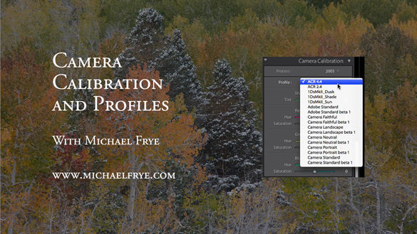
I’ve posted a new video on YouTube that delves into this seemingly esoteric yet actually quite simple subject. In it I show you how to choose different profiles in Lightroom, and explore whether creating a custom profile might be worthwhile. I evaluate some profiles I made with the X-Rite ColorChecker Passport, a $99 package for making custom camera profiles in any lighting situation. Yes, full disclosure, they actually gave this to me for free—I must be hitting the big time!
Also, there’s one more reason for exploring different profile options: reducing noise, banding, and posterization. I show an example where the profile choice made a dramatic difference in noise and banding.

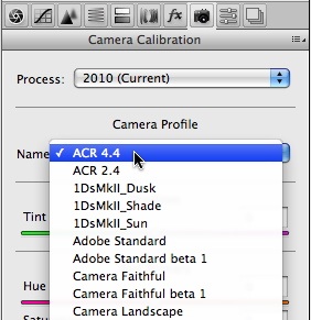
I didn’t have time to demonstrate it in the video, but the same profile choices are also available in Adobe Camera Raw—just look under the Camera Calibration tab, third from the right, as shown here.
So here’s a link to the video:
Camera Calibration and Profiles
As always, it helps to view this at the highest resolution, 480p, and click on the double-sided arrow to make the video larger.
I hope you enjoy it! Comments are always appreciated, and if you like video, please share it with a friend: Email this article, or click on one of the buttons below to post it on Facebook or Twitter.

