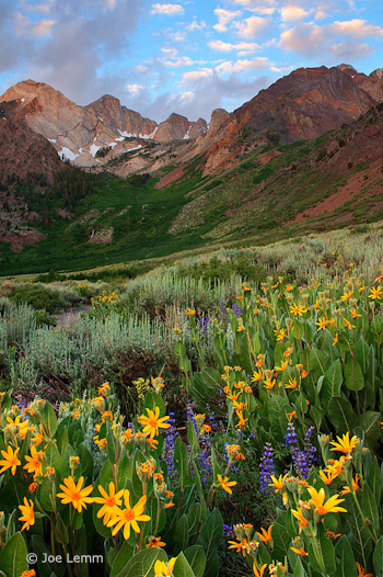
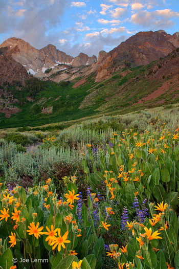
This week’s photograph was made by Joe Lemm near McGee Creek, on the eastern side of my home mountain range, the Sierra Nevada. By having his image chosen for this critique Joe will receive a free 16×20 matted print from Aspen Creek Photo. If you’d like your images considered for future critiques you can upload them to theFlickr group I created for this purpose.
This is a beautiful mountain scene, with a nice juxtaposition between flowers and distant peaks. The colors are harmonious and pleasing; the yellow mule’s ears in the foreground brighten the mood and give this scene an idyllic feeling. Joe was lucky to find clouds in the sky at sunrise—uncommon in the Sierra in summer. But everyone needs a little luck now and then. Technique and vision are important, but there’s no substitute for being in the right place at the right time!
When you find yourself facing a beautiful scene, you have to make the most of the opportunity. The most important consideration is the composition: what, exactly, do you frame?
In the past two critiques (“Red Sky at Night” and “Glen Coe“) I’ve discussed photographs with prominent foregrounds. In both cases I thought the images might have been stronger without them; I felt the backgrounds were more interesting, and the foregrounds distracting.
Here, though, I think the foreground clearly adds to the image; in fact I think the flowers are the most eye-catching thing in the frame. There’s a good visual connection between the bottom and top of the image: the yellows, purples, and greens in the foreground complement the golds, blues, and greens in the background. The arrangement of those flowers also meshes nicely with the peaks: there’s a subtle V shape to the yellow mule’s ears that echoes the broad V of the ridgeline and smaller Vs in the notches between the peaks.
The only minor complaint I have about the composition is that I’d like to see a little more breathing room around the prominent yellow blossoms along the bottom and left edges, and would prefer that the large flower along the left edge wasn’t missing the tips of its petals. Of course zooming out and including more space at the bottom and sides might have introduced other distractions. In a situation like this it’s virtually impossible to avoid cutting some flowers in half, and there could have been patches of dirt or rocks or other unwanted elements that needed to be cropped out of the frame.
So I’m going to give Joe the benefit of the doubt here and assume that there were good reasons for not including more space around the bottom edges. Overall I think he did a good job of finding a foreground that adds something to the photograph, and positioning the camera to emphasize that V shape of the flowers.
But as always, I’d like to hear what you think. Does this foreground work? What do you think of the composition overall?
Technically this is well executed. Joe used a small aperture, f/18, to get sufficient depth of field, and everything looks sharp, even at a larger size. Wind can often be a problem when capturing images like this—you need a small aperture to get depth of field, but that forces you to use a slower shutter speed. Perhaps Joe got lucky (again!) and found a calm morning.
Joe said he used a three-stop graduated neutral-density filter to balance the bright sky with the darker foreground. Mountain scenes like this often require a graduated filter or exposure blending to balance sunlit peaks or sky with shaded areas below. Here the transition looks pretty natural; I don’t see any obvious line that would make the filter’s presence obvious.
Joe told me that he processed the Raw file three ways—normal, one stop under, and one stop over—then merged those three images with Photomatix HDR software. The result appears natural, again, with none of that HDR grunge look. The only hint that this might be HDR is that some of the colors, particularly the yellow-orange flowers, might be slightly over-saturated, and when viewed larger you can see a thin blue halo along the tops of the peaks—although that might be chromatic aberration in the lens (which could be fixed in Lightroom or Adobe Camera Raw), or oversharpening, or both.
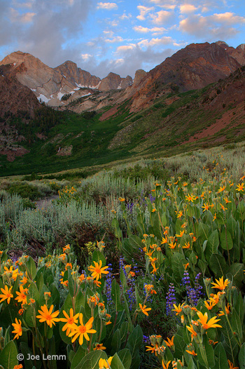
Joe said that he also processed the image without HDR, and actually liked that version better, so I asked him to send it to me, and here it is (left). Personally I prefer the HDR version; the shadows are more open, and it feels more luminous. Just for fun I tried to adjust this non-HDR version to look more like the HDR version. I used a little Fill Light in Lightroom to open up the shadows, added Clarity to boost midtone contrast, then increased Vibrance to approximate the saturation in the HDR version.
The result, shown below, is actually pretty close to the HDR photograph, and in some ways I like it better. But it shows that there are many ways to process an image. There are no right or wrong answers—just different interpretations.
Non-HDR version with added Fill Light, Clarity, and Vibrance
Overall this a well-seen, well-executed photograph in which the foreground and background complement each other nicely.
Thanks Joe for sharing your image! You can see more his work on Flickr.
If you like these critiques, share them with a friend! Email this article, or click on one of the buttons below to post it on Facebook or Twitter.
As part of being chosen for this week’s critique Joe will receive a free 16×20 matted print courtesy of the folks at Aspen Creek Photo. If you’d like your images considered for future critiques, just upload them to the Flickr group I created for this purpose. If you’re not a Flickr member yet, joining is free and easy. You’ll have to read and accept the rules for the group before adding images, and please, no more than five photos per person per week. I’ll be posting the next critique in two weeks. Thanks for participating!

