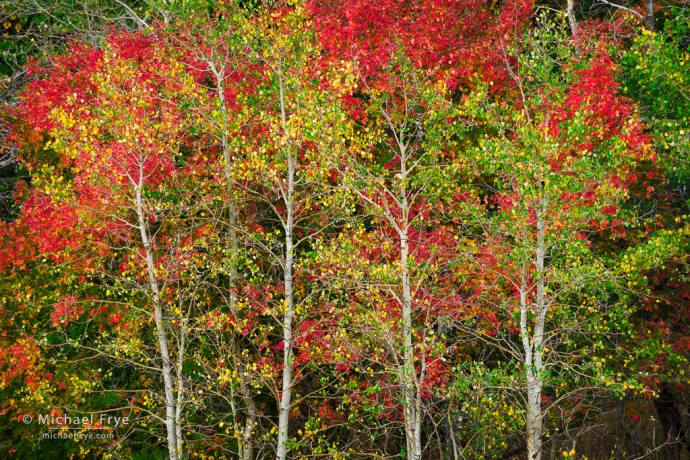
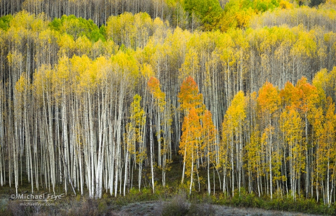
Aspens and bigtooth maples, northern Utah. I used the new Point Color tool to tweak the originally dull-looking greens and yellows in this photo and make them more vibrant.
Last week Adobe launched major updates to Lightroom Classic (13.0), Lightroom Desktop (7.0), and Lightroom Mobile (9.0). The biggest new features are HDR editing, Point Color, and Lens Blur.
All of these new tools deserve their own post, but we just finished a workshop, and we’re still traveling, so for now I’m just going to explain a few of the salient features, and steer you to some more in-depth information.
HDR Editing
First, when I say “HDR editing,” I’m not talking about blending multiple frames together to get detail in the highlights and shadows. Tools for doing that (including Lightroom’s HDR Merge) have been around forever.
This is something much different – and, I think, more exciting. If you have an HDR (high-dynamic-range) display, the new HDR editing feature allows you to view and edit images to take advantage of the increased dynamic range of the display. Instead of compressing the tones to fit within the range that a standard monitor can display, you can show all the tones that your file actually contains. HDR displays can show tones that are brighter than the white background on this page, or brighter than any paper white. With many photos the results are striking; the images have more luminance, brilliance, and depth than with SDR (standard-dynamic-range) images on standard displays.
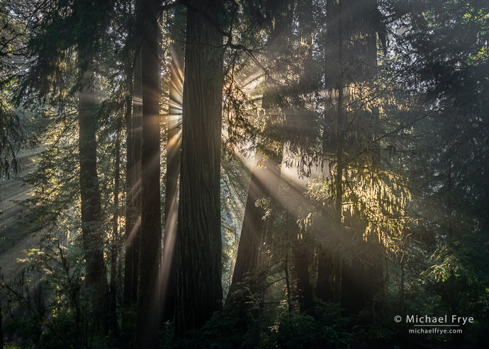
SDR version
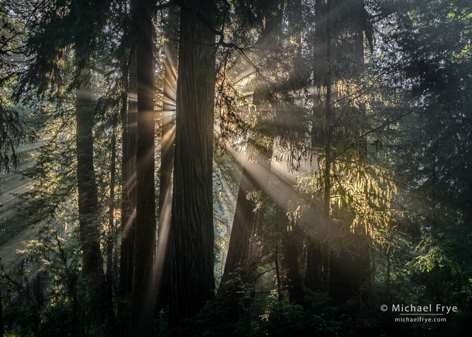
HDR version. If you have an HDR display, and you’re using a recent version of Google Chrome (v. 116 or later), this version should have brighter highlights, and look more luminous than the SDR version. Otherwise it will probably look worse! (The HDR tones get compressed into SDR range, and look rather dull.) Also, if you have the right display and browser, but can’t see much difference between these two versions, you probably have your screen brightness turned up too high. HDR images need a certain amount of “headroom” to display the brighter tones properly, and you lose that headroom if you crank up the monitor brightness.
But this technology is new, and currently it’s rather difficult to share the results so that others can view HDR images as you intend for them to be seen. Eventually that should change, as HDR displays become more common, and all the players (Adobe, Apple, Google, Microsoft, Facebook, etc.) agree on standards for displaying HDR images. We hope.
But while sharing HDR images is still somewhat problematic, the new HDR editing capabilities in Lightroom and Camera Raw are a big step forward in making this technology accessible to photographers. I think HDR displays, along with the right software, have the potential to fundamentally transform how we process, display, and view photographs – and we’re starting to see that happen. The next few years could be really interesting.
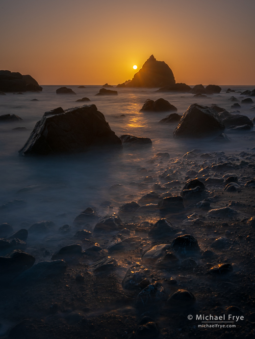
SDR version.
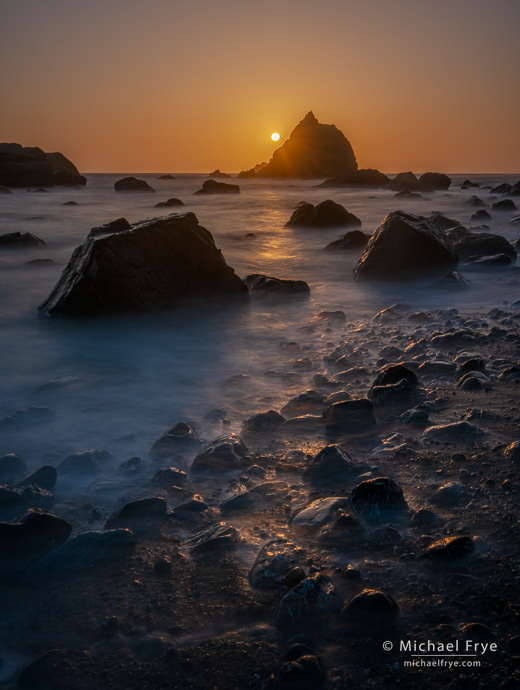
HDR version. Again, if you have an HDR display, and you’re using a recent version of Google Chrome (v. 116 or later), this version should have much brighter highlights, and look more luminous than the SDR version. The sun will actually look brighter than the white background of this page!
To learn how to use this new tool, I recommend reading Eric Chan’s post about HDR editing on the Adobe blog. Eric has been working on this new HDR editing feature in Lightroom and Camera Raw for several years, and his post contains tons of great information, all clearly explained.
Also, Greg Benz has been writing about the capabilities of HDR for awhile now. Though this is an older post, but he’s been updating it, and it contains lots of helpful information about HDR displays and editing.
Point Color
The HSL panel in Lightroom has always frustrated me because I could only adjust a color based on its hue – and a rather broad swath of hues at that. For example, with HSL it’s difficult or impossible to change yellow-greens without changing true yellows, or true greens.
The Color Range tool in the Masking panel went a long way to solving that issue, but the new Point Color tool allows you to make even more precise selections based on three color parameters: hue, saturation, and luminance. From there you can change or refine the hue, saturation, or luminance of just the precise color you’ve selected. You can do this globally or locally, as Point Color is also available with local adjustments in the Masking panel.
You’ll find the global Point Color tool under the new Color Mixer panel, which replaces the HSL panel. The Color Mixer panel has two tabs: Mixer, which contains all the familiar tools from the HSL panel, and Point Color, which has a completely new set of tools that allow you to make those refined color selections. Rather than explain all the details here, I’ll point you to this video by Julieanne Kost, where she does an excellent job of explaining how to use this new tool.
I’ve been using Point Color for a couple of months now, and find it quite helpful. I probably use it more often than HSL or Color Range. But there are situations where Color Range (in the Masking panel) is a better choice. With Point Color, although you can make a precise selection based on color – even more precise than with Color Range – you can only adjust the hue, saturation, or luminance of your selection. With Color Range, you can make a selection based on color, but then within that selection adjust Exposure, Highlights, Shadows, Contrast, the Point Curve, Clarity, Texture, Dehaze, and so on (as well as making color adjustments with Temp, Tint, Saturation, and the Color Picker). So the choice depends on what you want to do with that color-based selection. If you want to adjust the color of that selection, Point Color is a good choice. If you want to do something else, use Color Range.
Point Color is a great tool for tweaking individual colors. Rather than just cranking up the overall saturation or vibrance in a photograph, which can make it look garish and unnatural, try subtly changing the hue and saturation for some of the key colors to make the image look livelier, without overcooking it.
Before using Point Color
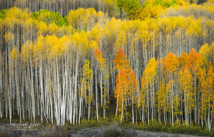
After using Point Color. The difference is admittedly subtle, but I used Point Color to tweak the rather anemic-looking yellows (shown in the top version) by pushing the hue of those yellows slightly more toward orange, and increasing their saturation. I also shifted the oranges a bit toward red-orange, and boosted their saturation a bit as well. Subtle color tweaks like this can make an image look livelier in a more natural-looking way than by just cranking up the saturation.
Lens Blur
This is another new panel in the Develop Module, located between Transform and Effects. It’s labeled “Early Access,” meaning it’s a work in progress.
Lens Blur allows you to select a subject and then blur the background. It uses AI to select a subject and create a depth map, then you can choose how much to blur the background, as well as add bokeh effects. It’s a helpful tool for blurring the background in photos of people, animals, flowers, or other “portrait” subjects. You can use sliders to expand, contract, or shift the depth range, and also modify the selection (what’s getting blurred and what’s not) with a brush. Again, I’ll send you to Julieanne Kost for a good tutorial on how this works.
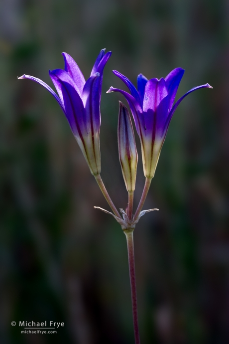
Harvest brodiaea, Mariposa County, California. I captured this at f/16 to get all of the flowers in focus, which left the background more in focus than I would have liked, so I used the new Lens Blur tool to further blur the background.
I’d say Lens Blur has some promise, but needs work. First, I often find that I can’t blur the background as much as I’d like. I wish you could push the blur amount past 100, which is the current limit. Second, AI doesn’t always make a perfect selection. In fact, it rarely does. While it helps to be able to use a brush to modify the selection, it can be tricky to get exactly the selection you want with just the brush. It would be great if you could use all of the tools in the Masking panel to create exactly the selection you want – tools like Object Selection, Color Range, or Luminance Range.
The simple solution for both issues is to make Lens Blur part of the Masking Panel. You could then crank up the Amount slider for the whole mask up to 200% if you wanted more blur. Or duplicate the mask as many times as necessary to get enough blur. And you could modify the AI-created depth map in Lens Blur with any of the selection tools to get a precise selection for your subject, then blur everything else. I’ve got my fingers crossed that Adobe will put Lens Blur in the Masking panel at some point – we’ll see.
This Lightroom update has given us some intriguing new tools. Have you tried them yet? What do you think?
— Michael Frye
Related Posts: Lightroom’s Powerful New Denoise Tool; Lightroom Update Could Be a Game-Changer
Michael Frye is a professional photographer specializing in landscapes and nature. He is the author or principal photographer of The Photographer’s Guide to Yosemite, Yosemite Meditations, Yosemite Meditations for Women, Yosemite Meditations for Adventurers, and Digital Landscape Photography: In the Footsteps of Ansel Adams and the Great Masters. He has also written three eBooks: Light & Land: Landscapes in the Digital Darkroom, Exposure for Outdoor Photography, and Landscapes in Lightroom: The Essential Step-by-Step Guide. Michael has written numerous magazine articles on the art and technique of photography, and his images have been published in over thirty countries around the world. Michael has lived either in or near Yosemite National Park since 1983, currently residing just outside the park in Mariposa, California.


Thanks Michael. I have just begun to play with them and your comments and Kost’s videos will help.
Hope you enjoy the new tools Jack!
Hi Michael…..love what you’re doing here, and seeing your photos, before and after. You mentioned a few sources, but I see no links or any way to find them, from Eric, Greg and Julieanne. How do I find these. Thanks.
Thanks Jack. The links are there; the type might not stand out, but if you hover your mouse over the text you’ll see the mouse turn into a hand.
Thanks, Michael—these are interesting enhancements. I have an Apple Studio Display, which doesn’t offer HDR, but I might consider getting one as the technology advances.
By the way, I’m heading off to Yosemite on Monday to spend a week doing a photography workshop with Jerry Dodrill through the Ansel Adams Gallery. He’s filling in for Kirk Keeler, who is having some health issues. I’m looking forward to working with Jerry, whom I know you’ve done some workshops with. I’m very excited about spending this week taking images in Yosemite.
Since the lodging they’ve set aside at the Yosemite Lodge is beyond my budget, I’ll be spending the week at Upper Pines Campground, sleeping in my Subaru. I’ve done this before, so I hope all works out.
All the best to you and Claudia. The Antarctica workshop sounds very exciting!
You’re welcome Bob. I have a feeling you won’t be the only one looking for an HDR display in the future. 🙂
Glad you’re going to be joining Jerry for the Yosemite workshop. I know he’s excited about it, and it should be a lot of fun. Hope you’re not too cold in your Subaru!
Jerry told me a few days ago that “color is looking decent” shortly after he rolled in to the valley. I bet it’s been a great workshop.