by Michael Frye | May 11, 2016 | Advanced Techniques, Digital Darkroom, Yosemite Photo Conditions
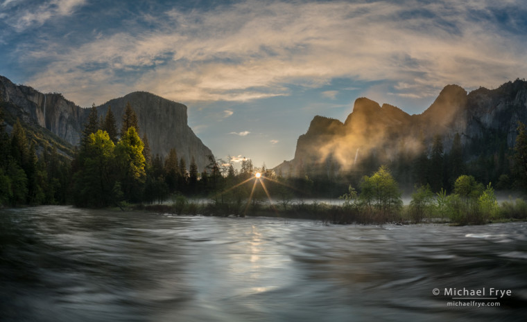
Spring sunrise, Gates of the Valley, Yosemite, Sunday morning
First, to my subscribers, thanks for your understanding about the email glitches yesterday. I really appreciate all the supportive emails so many people sent. Your kind words turned a frustrating day into a great one.
I haven’t posted anything new on the blog for awhile because I was teaching a workshop, and then working on our new website. The new site is still a bit of a work in progress, so if you find any broken links or other issues please let me know. But the new site better integrates the blog with the other content, makes it easier to add and update portfolios, and will work much better with phones and tablets, so I hope it will be a better experience for everyone.
Meanwhile we had a great workshop, with flowing waterfalls, fresh spring greenery, dogwoods, and some interesting weather and clouds. And the cool, showery spring weather has continued, which I love. I’m not ready for the summer heat, and always happy to have clouds and mist to photograph.
(more…)
by Michael Frye | Nov 13, 2015 | Announcements, Digital Darkroom
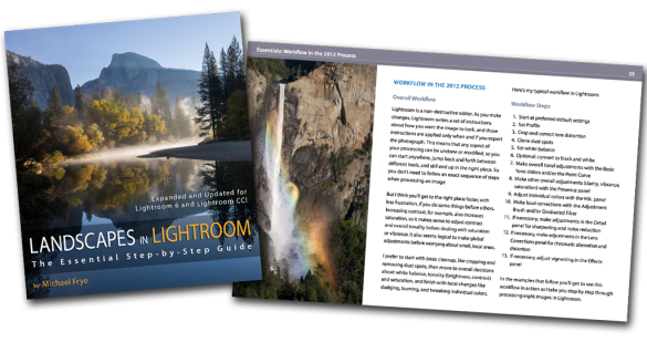
A quick reminder that the price for my Landscapes in Lightroom ebook and video package will go up on Sunday (at midnight Pacific time) from $14.95 to $27.00. This is your last chance to get the new edition at the old price! The new version has been updated for Lightroom 6 and Lightroom CC, and includes eight step-by-step examples, plus ten video tutorials. Click the Add to Cart button below, or visit this page for more information.
Landscapes in Lightroom: The Essential Step-by-Step Guide
PDF ebook plus video tutorials
103 double-page spreads
14.95 until Sunday, November 15th, after which the price goes up to 27.00
FAQ
Purchase from the Eduction Center
(more…)
by Michael Frye | Nov 3, 2015 | Digital Darkroom
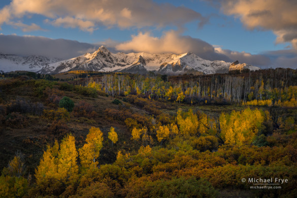
Autumn sunrise over the Sneffels Range from the Dallas Divide, CO, USA
As I wrote in my last post, it can be challenging to process high-contrast scenes with important, colorful subjects in the shade – like aspens. You need to lighten the shadows even more than normal to bring out the color, and it’s hard to do that in a natural-looking way, while keeping contrast and depth.
This photograph is a good example. It’s from the Dallas Divide, one of Colorado’s iconic fall locations. Fresh snow on the peaks added interest, but also created more contrast. The morning sun lit the peaks and clouds, but I knew it would be awhile before that light reached the aspens in the foreground, and by that time the color in the sky would be gone. I bracketed three exposures, each one stop apart, in case I needed to blend them together later. But I didn’t need to blend; the final image was processed in Lightroom with just one frame.
(more…)
by Michael Frye | Oct 7, 2015 | Announcements, Digital Darkroom
Landscapes in Lightroom: The Essential Step-by-Step Guide
PDF ebook with video tutorials
103 double-page spreads
14.95 for a limited time, after which it goes up to 27.00
FAQ


Here it is! The latest update to my ebook, Landscapes in Lightroom: The Essential Step-by-Step Guide, is now available. This new edition is revised and updated for Lightroom 6 and Lightroom CC, and includes two new examples and videos demonstrating how to use the most significant new features – the HDR Merge and the Panorama Merge.
Of course this new version still has all the features that made the first edition so popular. First, you can download the original Raw files used as examples in the ebook, and then follow along with each step yourself – just as if you were attending one of my workshops.
Second, when you purchase the ebook you get exclusive access to ten videos demonstrating different aspects of Lightroom’s Develop Module, like using the Adjustment Brush, Spot Removal Tool, and Point Curve, advanced retouching in Lightroom, the new HDR Merge, and much more. It’s great to read about a tool or technique; it’s even better to watch a demonstration, and then try it yourself on the same image.
And third, there’s the PDF ebook itself. This includes eight examples, where I take you step-by-step through processing each image in Lightroom. You’ll get to see my workflow in action, with a variety of images – high contrast, low contrast, color, black and white, HDR merge, and panorama. You’ll learn many specific techniques and tips, but perhaps more importantly, you’ll gain insight into the decision-making process that so many photographers struggle with. How much contrast is enough? How far can you push the saturation without making the image look garish or fake? What’s the right white balance?
(more…)
by Michael Frye | Jun 26, 2015 | Digital Darkroom
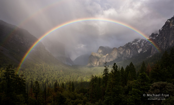
Rainbow over Yosemite Valley from Tunnel View – after applying the Dehaze control
Last week Adobe added an update to Lightroom CC, designated the 2015.1 release. It includes a couple of new features. The main one is a Dehaze slider, designed to reduce the appearance of atmospheric haze. It’s found in the Effects Panel of the Develop Module.
I’m usually skeptical of things like this. Is it really different than adding Contrast or Clarity? Well, yes, actually. Adobe says, “The Dehaze technology is based on a physical model of how light is transmitted, and it tries to estimate light that is lost due to absorption and scattering through the atmosphere.” I’m not sure how they do that exactly, but it seems to work more effectively than just adding Contrast or Clarity.
(more…)


