In the Moment:
Michael Frye's Landscape Photography Blog
by Michael Frye | Sep 8, 2010 | Critiques

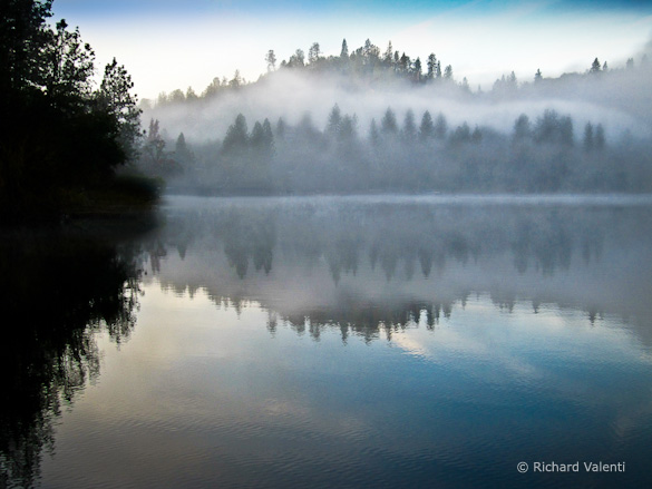
“Misty Morning” by Richard Valenti
This week’s photograph was made by Richard Valenti at Lake Wildwood in Northern California. By having his image chosen for this critique Richard will receive a free 16×20 matted print from Aspen Creek Photo. If you’d like your images considered for future critiques you can upload them to theFlickr group I created for this purpose.
The best landscape photographs have a strong mood, and this image certainly has that. The mist, calm water, and symmetrical reflections create a beautiful, quiet, peaceful feeling. I can almost feel the morning chill.
Richard said that he was drinking his morning cup of coffee at his house along this lake when he noticed the mist. Since the sun was about to crest the ridge he didn’t have time to get his DSLR, so he grabbed his point-and-shoot (Canon PowerShot SX200IS) and ran down to the dock to compose this photograph. As he put it, “no full frame DSLR, no tripod, not shot in RAW; just a point and shoot set to automatic ‘program’ mode! I did ‘see and pre-visualize’ what I wanted the final image to be and carefully composed this image. I was only able to get two shots off before the sun broke through the tree line and totally changed the mood of the scene before me.”
Timing is everything in landscape photography. It’s better to capture a great moment like this with a point-and-shoot than not capture it at all.
Overall the composition is pretty clean and simple. I like the shapes created by the distant ridge and it’s reflection. There are lots of interesting details, like the two layers of trees on the far hill separated by fog, and the ripples in the water. The horizon is above the center, emphasizing the foreground water more than the sky, which I think was a good choice here, as the subtle textures in the water are more interesting than the smooth sky.
One thing I could quibble with is the patch of dark trees along the left edge. Sometimes a dark area adds needed contrast to an otherwise flat scene, but in this case I think it throws the image off balance; without any other dark areas in the frame the left side of the photograph feels heavily weighted compared with everything else. And although usually our attention is drawn to light areas, since this photograph is predominantly light our eyes get pulled toward that dark mass on the left and away from more interesting areas spots. I think this image has enough contrast and mood without that left side, but what could be done about it?
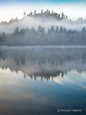
One solution might have been moving the camera position to the right, but since Richard was standing at the end of a dock that probably wasn’t possible. Perhaps he could have pointed the camera more to the right, but I don’t know what was over there—maybe something distracting. As we see it here, just cropping the left side makes this image feel off balance. But cropping both sides and creating a vertical composition does seem to work—it’s simpler, and emphasizes the most interesting things in the frame: the water, central trees, and mist. However, it’s more abstract, with less sense of place. This is a tough call for me; I think I prefer the cropped version, but I’d have to live with it for awhile.
What do you think of the dark area along the left edge? Do you like the vertical crop, or prefer the original version? As always, I look forward to hearing your thoughts.
Despite the camera, the image quality seems pretty good, although there’s a strange color shift in the sky—purple on the left, cyan on the right—and the same colors are reflected in the water. This could probably be corrected in Photoshop with either a Hue/Saturation or Selective Color Adjustment Layer, possibly in conjunction with a layer mask.
Viewed larger some noise is also apparent among the trees along the far shore. Smaller sensors are more prone to noise, and it’s likely that the original JPEG was oversharpened in the camera, further emphasizing the noise. On most cameras the standard sharpening setting is too high, and it’s almost impossible to fix this later, while it’s easy to add more sharpening in software if necessary, so I always recommend setting the sharpening to its lowest setting if your camera allows it (many point-and-shoots don’t), . These in-camera sharpening settings only affect JPEGs, so if you only shoot in Raw don’t worry about it, but if you ever use JPEG mode it might be a good idea to figure out how to adjust the sharpness and turn it down.
While I have some reservations about the dark area along the left side of this photograph, I love the misty mood, and I’m glad Richard captured it, even with a point-and-shoot camera.
Thanks Richard for sharing your image! You can see more his work on Flickr.
If you like these critiques, share them with a friend! Email this article, or click on one of the buttons below to post it on Facebook or Twitter.
As part of being chosen for this week’s critique Richard will receive a free 16×20 matted print courtesy of the folks at Aspen Creek Photo. If you’d like your images considered for future critiques, just upload them to the Flickr group I created for this purpose. If you’re not a Flickr member yet, joining is free and easy. You’ll have to read and accept the rules for the group before adding images, and please, no more than five photos per person per week. I’ll be posting the next critique in two weeks. Thanks for participating!
by Michael Frye | Aug 26, 2010 | Critiques

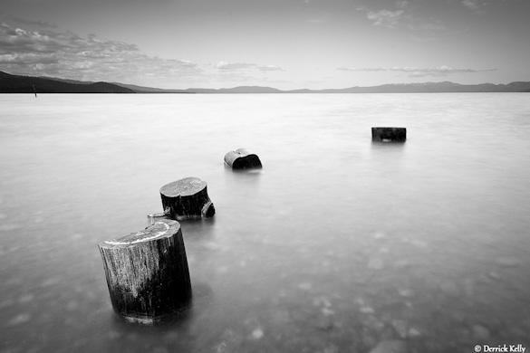
“Kiva” by Derrick Kelly
This week’s photograph was made by Derrick Kelly at Kiva Beach in South Lake Tahoe, California. By having his image chosen for this critique Derrick will receive a free 16×20 matted print from Aspen Creek Photo. If you’d like your images considered for future critiques you can upload them to theFlickr group I created for this purpose.
If you’ve been reading these critiques you know that I’m a fan of clean, simple compositions. This photograph epitomizes that. The four stumps stand out clearly against the smooth water, creating a serene, zen-like composition.
The image seems nicely balanced, and I like the way the stumps form a subtle curve through the foreground. The only thing about the composition I can nitpick is the visual merger between the two stumps closest to the camera; it would be great to see clean separation and balanced spacing between all the stumps.
Gaining that separation would have required either raising the camera, moving forward, or stepping to the right and pointing the camera more to the left. I don’t know if any of those options was feasible: the tripod might have been as high as it could go, stepping forward would probably have required wading, and moving to the right and pointing left could have introduced unwanted distractions in the background. But I point this out to make you more aware of such mergers in your own compositions; if you notice problems like this in the field then you have a chance to fix them by changing the camera position.
Derrick seemed to have a clear vision of how he wanted this photograph to look before he pressed the shutter. When I first viewed this image I thought it was captured at dusk, but it was actually made in midday light. Derrick put on a four-stop neutral-density filter, allowing him to use a 15-second exposure. This blurred and smoothed the water, giving the photograph a dusky, long-exposure look.
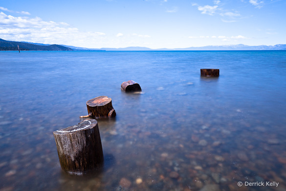
Derrick also knew from the beginning that he would convert this to black and white. He told me, “I like black and white because I feel it allows me to be more expressive in the image, with less ambiguity about my artistic intent, than does color photography.” Just for comparison, here’s the color version. To me the black-and-white image is indeed more expressive, and makes a stronger statement, than the color one. In color we see what stumps in water look like. In black and white we get that feeling of space and simplicity.

Color version
I’ve talked about this in a previous critique, but it’s worth mentioning again how black and white can simplify a photograph. Sometimes color can just be a distraction; here, for example, the rocks underneath the water stand out more in the color image, pulling our eyes away from the stumps.
Derrick said that he processed the single Raw file twice in Lightroom, darkening one version to bring out detail in the sky, lightening the other to provide the feeling he wanted in the foreground. He then converted both to black and white and merged them together in Photoshop.
As with many things in the digital darkroom, there were probably several different techniques that could have created a similar look. But the particular tools don’t matter. What does matter is having a clear idea of what you want to convey in the photograph. If you can do that, then you can make the right decisions along the way to convey that vision, from the choice of composition, exposure, shutter speed, depth of field, and filters, to the steps of post-processing.
In his books The Camera, The Negative, and The Print, Ansel Adams stressed the importance of visualization. He said, “The term visualization refers to the entire emotional-mental process of creating a photograph, and as such, it is one of the most important concepts in photography. It includes the ability to anticipate a finished image before making the exposure, so that the procedures employed will contribute to achieving the desired result.”
I think Derrick did a great job of visualization here. He didn’t want a literal representation of reality. He wanted something more expressive, and took the necessary steps to create that, starting with the 15-second exposure to smooth the water, and finishing with some skillful digital-darkroom work.
What do you think of this photograph? Do you like the black-and-white version better? Does the visual merger of the two stumps bother you? As always, I look forward to hearing your comments.
Thanks Derrick for sharing your image! You can see more his work on Flickr.
If you like these critiques, share them with a friend! Email this article, or click on one of the buttons below to post it on Facebook or Twitter.
As part of being chosen for this week’s critique Derrick will receive a free 16×20 matted print courtesy of the folks at Aspen Creek Photo. If you’d like your images considered for future critiques, just upload them to the Flickr group I created for this purpose. If you’re not a Flickr member yet, joining is free and easy. You’ll have to read and accept the rules for the group before adding images, and please, no more than five photos per person per week. I’ll be posting the next critique in two weeks. Thanks for participating!
by Michael Frye | Aug 12, 2010 | Critiques

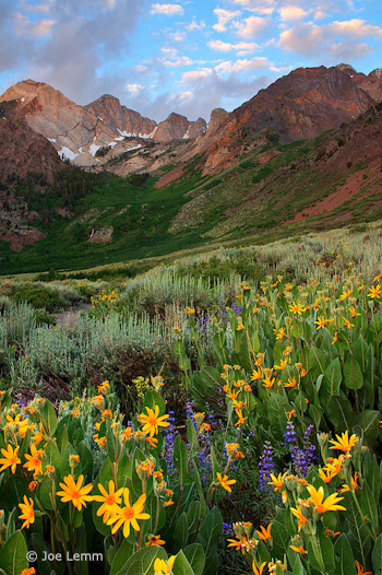
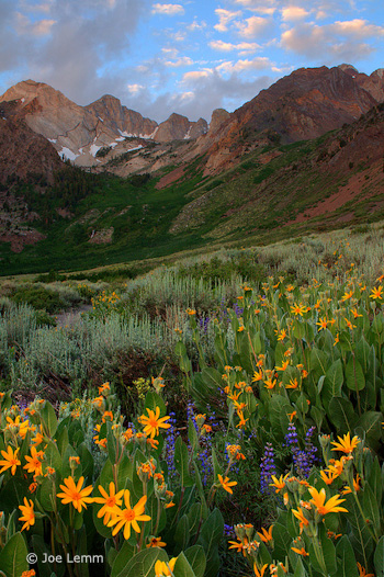
“McGee Creek” by Joe Lemm
This week’s photograph was made by Joe Lemm near McGee Creek, on the eastern side of my home mountain range, the Sierra Nevada. By having his image chosen for this critique Joe will receive a free 16×20 matted print from Aspen Creek Photo. If you’d like your images considered for future critiques you can upload them to theFlickr group I created for this purpose.
This is a beautiful mountain scene, with a nice juxtaposition between flowers and distant peaks. The colors are harmonious and pleasing; the yellow mule’s ears in the foreground brighten the mood and give this scene an idyllic feeling. Joe was lucky to find clouds in the sky at sunrise—uncommon in the Sierra in summer. But everyone needs a little luck now and then. Technique and vision are important, but there’s no substitute for being in the right place at the right time!
When you find yourself facing a beautiful scene, you have to make the most of the opportunity. The most important consideration is the composition: what, exactly, do you frame?
In the past two critiques (“Red Sky at Night” and “Glen Coe“) I’ve discussed photographs with prominent foregrounds. In both cases I thought the images might have been stronger without them; I felt the backgrounds were more interesting, and the foregrounds distracting.
Here, though, I think the foreground clearly adds to the image; in fact I think the flowers are the most eye-catching thing in the frame. There’s a good visual connection between the bottom and top of the image: the yellows, purples, and greens in the foreground complement the golds, blues, and greens in the background. The arrangement of those flowers also meshes nicely with the peaks: there’s a subtle V shape to the yellow mule’s ears that echoes the broad V of the ridgeline and smaller Vs in the notches between the peaks.
The only minor complaint I have about the composition is that I’d like to see a little more breathing room around the prominent yellow blossoms along the bottom and left edges, and would prefer that the large flower along the left edge wasn’t missing the tips of its petals. Of course zooming out and including more space at the bottom and sides might have introduced other distractions. In a situation like this it’s virtually impossible to avoid cutting some flowers in half, and there could have been patches of dirt or rocks or other unwanted elements that needed to be cropped out of the frame.
So I’m going to give Joe the benefit of the doubt here and assume that there were good reasons for not including more space around the bottom edges. Overall I think he did a good job of finding a foreground that adds something to the photograph, and positioning the camera to emphasize that V shape of the flowers.
But as always, I’d like to hear what you think. Does this foreground work? What do you think of the composition overall?
Technically this is well executed. Joe used a small aperture, f/18, to get sufficient depth of field, and everything looks sharp, even at a larger size. Wind can often be a problem when capturing images like this—you need a small aperture to get depth of field, but that forces you to use a slower shutter speed. Perhaps Joe got lucky (again!) and found a calm morning.
Joe said he used a three-stop graduated neutral-density filter to balance the bright sky with the darker foreground. Mountain scenes like this often require a graduated filter or exposure blending to balance sunlit peaks or sky with shaded areas below. Here the transition looks pretty natural; I don’t see any obvious line that would make the filter’s presence obvious.

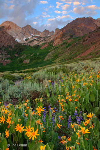
Non-HDR Version
Joe told me that he processed the Raw file three ways—normal, one stop under, and one stop over—then merged those three images with Photomatix HDR software. The result appears natural, again, with none of that HDR grunge look. The only hint that this might be HDR is that some of the colors, particularly the yellow-orange flowers, might be slightly over-saturated, and when viewed larger you can see a thin blue halo along the tops of the peaks—although that might be chromatic aberration in the lens (which could be fixed in Lightroom or Adobe Camera Raw), or oversharpening, or both.
Joe said that he also processed the image without HDR, and actually liked that version better, so I asked him to send it to me, and here it is (left). Personally I prefer the HDR version; the shadows are more open, and it feels more luminous. Just for fun I tried to adjust this non-HDR version to look more like the HDR version. I used a little Fill Light in Lightroom to open up the shadows, added Clarity to boost midtone contrast, then increased Vibrance to approximate the saturation in the HDR version.
The result, shown below, is actually pretty close to the HDR photograph, and in some ways I like it better. But it shows that there are many ways to process an image. There are no right or wrong answers—just different interpretations.

Non-HDR version with added Fill Light, Clarity, and Vibrance
Overall this a well-seen, well-executed photograph in which the foreground and background complement each other nicely.
Thanks Joe for sharing your image! You can see more his work on Flickr.
If you like these critiques, share them with a friend! Email this article, or click on one of the buttons below to post it on Facebook or Twitter.
As part of being chosen for this week’s critique Joe will receive a free 16×20 matted print courtesy of the folks at Aspen Creek Photo. If you’d like your images considered for future critiques, just upload them to the Flickr group I created for this purpose. If you’re not a Flickr member yet, joining is free and easy. You’ll have to read and accept the rules for the group before adding images, and please, no more than five photos per person per week. I’ll be posting the next critique in two weeks. Thanks for participating!
by Michael Frye | Jul 15, 2010 | Critiques

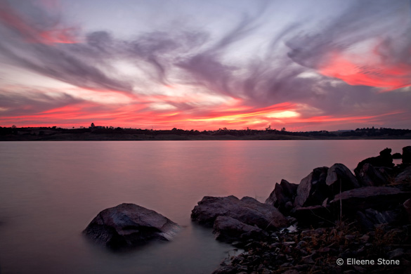
“Red Sky at Night” by Ellie Stone
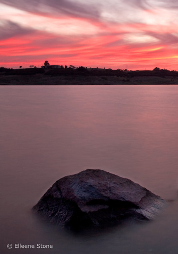
This week’s photograph was made by Ellie Stone at Lake New Hogan in Calaveras County, California. By having her image chosen for this critique Ellie will receive a free 16×20 matted print from Aspen Creek Photo. If you’d like your images considered for future critiques you can upload them to theFlickr group I created for this purpose.
We’ve all seen many sunset photos. For an image like this to grab out attention it either has to portray an exceptional sunset, or somehow integrate a less-than-exceptional sunset into an unusual and striking composition.
This image certainly captured a great sunset—the color is amazing, and the wavy, zig-zagging lines of the clouds create wonderful patterns. The scene has a powerful, end-of-the-day mood. Ellie used a 15-second shutter speed to blur the choppy water—a good decision, I think, as that smoothed out the waves and added an interesting, soft texture that contrasts with the hard-edged foreground rocks.
I’m not sure, however, about the decision to include those rocks in the first place. It’s often difficult to decide whether to include a foreground or not: Does the foreground add interest to the scene, or is it an unnecessary distraction? In this case I think the sunset sky and water are enough to hold our attention. The sky, especially, is exceptional, and to me should be the focus of the composition. The rocks don’t seem as interesting.
There’s another question to ask yourself before including a foreground: Do the lines and shapes of that foreground complement the background, or clash with it? To me the lines and shapes of these foreground rocks don’t integrate particularly well with the background.
I know some books say that you should always include a foreground, middle ground, and background in landscape photographs, but I think that’s one of those arbitrary rules that should be ignored. It’s great to include all three, but only if each is adding something to the photograph. The world is infinitely varied, and no rule can encompass every situation. As Edward Weston said, “Pictures came first. Rules followed. No one ever became an artist by learning rules or keeping them.”
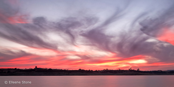
With that in mind, here’s a version where I’ve cropped out the foreground. The camera position forced me to eliminate most of the water along with the rocks, but since the sky is the most interesting thing in the scene, and should fill most of the frame anyway, I think the cropped version works pretty well.

Crop A, eliminating the rocks
 Of course if you can find a foreground that adds interest, and meshes with the background, by all means include it. While I don’t think the somewhat jumbled arrangement of rocks in the original version is appealing, there’s one, isolated rock on the left has a great shape, so I tried another crop which includes just that rock and a piece of sky. That works too: it’s simple, and the diamond shape of the rock echoes some of the diagonal lines of the clouds. But this composition emphasizes the foreground more than the sky, and with such a spectacular sunset I’m not sure that’s the right idea.
As always, I’m interested in hearing your thoughts on the foreground and the various crops presented here. Which version do you like best? Or is there some other framing that you think might be even better?
Technically this is well executed. If you’re going to include a foreground, then both foreground and background should be in focus! And they are here. The overall exposure looks right. Ellie said that she used a neutral-density filter to slow the shutter speed and blur the water’s motion, but wishes she had used a graduated filter to lighten the rocks relative to the foreground. Perhaps that might have helped, but with reflections you have to be careful not to lighten the foreground too much, as it looks unnatural when the water becomes lighter than the sky.
Despite my nitpicks about the foreground this is a very nice photograph, with great light, color, and mood, and with an effective use of a slow shutter speed to smooth the texture of the water.
Thanks Ellie for sharing your image! You can see more her work on Flickr (be sure to check out her amazing “Misty Bay Bridge” photo).
If you like these critiques, share them with a friend! Email this article, or click on one of the buttons below to post it on Facebook or Twitter.
As part of being chosen for this week’s critique Ellie will receive a free 16×20 matted print courtesy of the folks at Aspen Creek Photo. If you’d like your images considered for future critiques, just upload them to the Flickr group I created for this purpose. If you’re not a Flickr member yet, joining is free and easy. You’ll have to read and accept the rules for the group before adding images, and please, no more than five photos per person per week. I’ll be posting the next critique in two weeks. Thanks for participating!
by Michael Frye | Jul 1, 2010 | Critiques

“Forest Sunrise #1 – Olympic National Park” by Mike Livdahl
This week’s photograph was made by Mike Livdahl in Olympic National Park, Washington. By having his image chosen for this critique Mike will receive a free 16×20 matted print from Aspen Creek Photo. If you’d like your images considered for future critiques you can upload them to the Flickr group I created for this purpose.
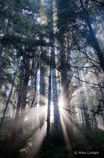
The most striking thing about this photograph is the fantastic light, with sunbeams radiating through the mist from behind tall trees. Light is the essence of photography. When we press the shutter we’re not recording objects, we’re capturing light. Often great light is enough to make a great photograph, even if the subject isn’t that interesting. These trees are nice, but without those sunbeams this would be a rather ordinary scene.
The exposure for such strong backlight can be tricky, but Mike handled it well. We see detail in all but the darkest parts of the tree trunks, yet the only the very brightest highlights are blown out. This is one of those rare instances where it’s okay to have some small washed-out areas in the photo, because this is something we would see in real life: looking at this scene the sun and adjacent sky would be blinding, and we wouldn’t expect to see detail in those areas in a photograph.
Mike said that he “exposed hoping to keep some life in the shadows.” As a result, he had to (in Lightroom) “damp the highlights pretty heavily, Recovery pushed to +81 and Brightness dropped to +29.” I guess that’s testimony to how much hidden detail can reside in seemingly overexposed highlights in Raw files. But if I were photographing this scene I’d keep my options open by bracketing exposures, allowing me to blend two or more images together later if necessary.
While the light in this photograph is exceptional, even great light could be ruined by a poor composition. Fortunately it wasn’t. The composition is clean and simple, with a strong focal point, the sunbeams, and some nice repetition created by the lines of the tree trunks. Mike chose a vertical orientation to emphasize the height of the trees. The sunbeams are centered from left to right, a configuration that works well in most vertical compositions (see my post about Sideways Photography).
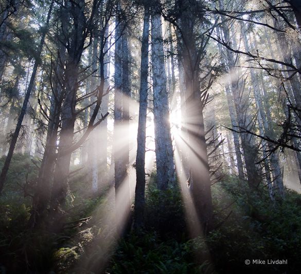
That vertical orientation, however, with the sunbeams near the bottom of the frame, leaves a lot of space in the top half of the photo. The bottom part of the image is clearly the most eye-catching area, and I always think it’s best to fill the frame with the most interesting stuff. There seems to be a natural horizontal composition here, including only the areas around the sunbeams:

Alternate, horizontal crop
I think this tighter, horizontal framing has more impact, but it doesn’t convey the trees’ height, and loses some sense of place as well. So it’s a tradeoff. Which version do you prefer? Post a comment to share your thoughts on this.
Mike said that he handheld this photograph, leaning against a tree, at 1/15th sec. and 5.6 with an ISO of 400. Since this shutter speed resulted in a slightly soft photo, he added extra sharpening in Lightroom. In a larger view some of the closest branches are a bit soft, indicating that the wide f/5.6 aperture wasn’t enough to keep everything in focus. Obviously a tripod would have been a good idea here—it would have prevented camera movement while allowing a smaller aperture with more depth of field.
The post-processing looks well done; the white balance looks right, and the heavy use of the Recovery tool created a perfect range of contrast—small areas of black, small areas of white, with a full range of tones in between.
Overall this is well done—beautiful light composed well.
Thanks Mike for sharing your image! You can see more his work on Flickr.
If you like these critiques, share them with a friend! Email this article, or click on one of the buttons below to post it on Facebook or Twitter.
As part of being chosen for this week’s critique Mike will receive a free 16×20 matted print courtesy of the folks at Aspen Creek Photo. If you’d like your images considered for future critiques, just upload them to the Flickr group I created for this purpose. If you’re not a Flickr member yet, joining is free and easy. You’ll have to read and accept the rules for the group before adding images, and please, no more than five photos per person per week. I’ll be posting the next critique in two weeks. Thanks for participating!
 One solution might have been moving the camera position to the right, but since Richard was standing at the end of a dock that probably wasn’t possible. Perhaps he could have pointed the camera more to the right, but I don’t know what was over there—maybe something distracting. As we see it here, just cropping the left side makes this image feel off balance. But cropping both sides and creating a vertical composition does seem to work—it’s simpler, and emphasizes the most interesting things in the frame: the water, central trees, and mist. However, it’s more abstract, with less sense of place. This is a tough call for me; I think I prefer the cropped version, but I’d have to live with it for awhile.

