by Michael Frye | Dec 2, 2010 | Critiques

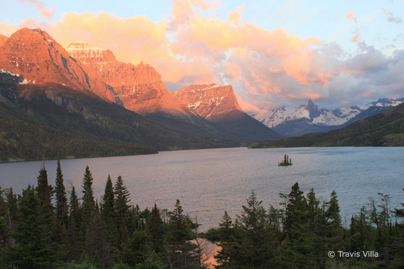
“Wild Goose Overlook” by Travis Villa
Composition and Light
This week’s photograph was made by Travis Villa in Glacier National Park, Montana. Travis wrote on Flickr, “This is one of the most spectacular sunrises I have ever seen, complemented by an already beautiful location. I felt very grateful to have a good balance (not too many or too few) of clouds in the sky that morning.”
Indeed it is a spectacular scene. Wish I had been there! The color and light are dramatic; I especially like the clouds over the pointed peak on the right half of the frame. (I’m sure someone knows the name of the peak.)
(more…)
by Michael Frye | Nov 12, 2010 | Critiques

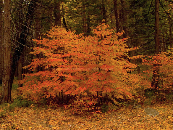
“Dogwood” by Mark Wilburn
This week’s photograph was made by Mark Wilburn in Yosemite Valley. By having his image chosen for this critique Mark will receive a free 16×20 matted print from Aspen Creek Photo. If you’d like your images considered for future critiques you can upload them to the Flickr group I created for this purpose.
Overview, Composition, and Light
This image was made just a few days ago, on November 6th, near the peak of fall color in Yosemite Valley this year. In fact I was nearby, teaching a private workshop, when Mark made this photograph. I exchanged some pleasantries with a man who said he read my blog, but I didn’t get his name. Then when I contacted Mark about using this image for a critique he told me that was him!
Anyway, I know exactly where these dogwoods are: near Gates of the Valley, also known as Valley View. The dogwoods in this area are striking right now, but not necessarily easy to photograph. It’s one thing to find a colorful subject; it’s another to build a strong composition around that color.
(more…)
by Michael Frye | Oct 7, 2010 | Critiques
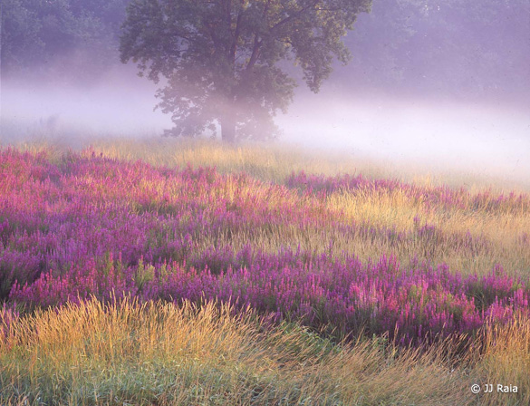
“Meadow of Loosestrife” by J.J. Raia
This week’s photograph was made by J.J. Raia at Troy Meadows, Green Acres, New Jersey. By having his image chosen for this critique J.J. will receive a free 16×20 matted print from Aspen Creek Photo. If you’d like your images considered for future critiques you can upload them to the Flickr group I created for this purpose.
Before I get to the critique, I’d like to once again thank all of you who have submitted photographs for this series. There are many outstanding images in the collection, and I wish I could write about all of them!
(more…)
by Michael Frye | Sep 24, 2010 | Critiques
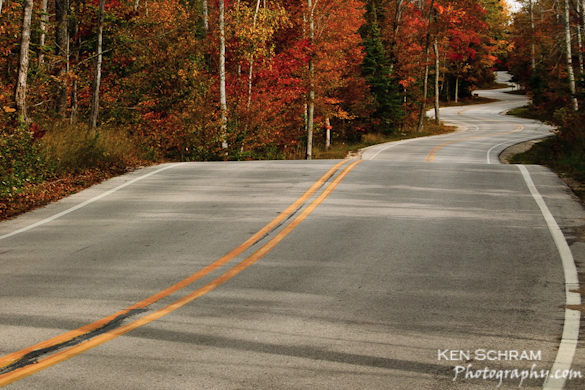
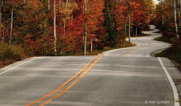
“Winding Road” by Ken Schram
This week’s photograph was made by Ken Schram in Door County, Wisconsin. By having his image chosen for this critique Ken will receive a free 16×20 matted print from Aspen Creek Photo. If you’d like your images considered for future critiques you can upload them to the Flickr group I created for this purpose.
Wednesday was the autumn equinox, so it seems appropriate to show some fall color—in this case from Wisconsin. The photograph depicts the road leading to the Washington Island Ferry.
A twisting road like this is an irresistible subject. Most landscape photographers have probably tried to capture a similar view at one time or another—I certainly have. As you click the shutter you imagine the large checks that your stock agency will soon be sending you for licensing this classic stock photo subject… only to get jolted back to reality when you realize how many other curving road photographs are out there. But I digress…
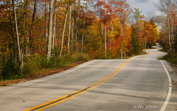
Ken said that with his 18-55mm lens (the only one he owned at the time) he couldn’t compress the curves. He meant that with a longer lens he could have zoomed in on the curviest section of road in the upper-right part of the image to emphasize the zigzags. So he decided instead to “take the viewer on a journey through the frame.” He cropped the photograph (you can see an uncropped, unprocessed version here) to eliminate the washed-out sky, and decided to “start the double-yellow line at the bottom-left corner so the eye would follow the road up to the upper-right third.”
In the original version, that large bright sky at the top of the frame pulls our attention away from the real stars of the scene, the road and fall color. So that sky either needed to be cropped, as Ken did, or darkened. Ken’s crop emphasizes the strong lines of the road and creates a clean, simple, and compelling composition with a crisp autumn feeling.
While I like the idea of cropping out the sky, I’m not sure about the double-yellow line meeting the corner of the frame, and about where the other lines of the road meet the edges of the photograph. If you’ve tried to capture this kind of subject you probably soon realized that the foreground presents a problem. The edges of the road have to enter the frame somewhere near the bottom, but where exactly? Should those lines touch the sides of the frame? The bottom? The corners? One edge on the side, the other on the bottom? And what about that center line?
While I try not to be dogmatic about any aspect of composition, I usually avoid making prominent lines meet the corner of the frame. I’m not sure why exactly, but a line touching a corner seems to divide the photograph awkwardly. And with a road image like this it usually works best to make the lines symmetrical—that is, have both edges of the road meet the bottom of the frame, both meet the sides, or, possibly, both meet the corners.
If you go to Flickr and search for “road” you’ll find examples of every possible composition: both edges of the road touching the sides of the frame, both meeting the bottom, one touching the side and the other the bottom, or one or more lines reaching the bottom corners. To me the most effective of these have that symmetry I was talking about—both edges of the road meeting the sides of the frame, or both meeting the bottom, and usually at about the same distance from the corner. But there are successful, asymmetrical exceptions. (There are also several photographs of the same stretch of road; see here, here, and here.)
Getting back to Ken’s photograph, to me this is a case where the double-yellow line coming out of the corner of the frame looks awkward. Also, the right edge of the photograph is cropped a bit too tightly. Looking at the original, uncropped version I can see that there was more space on that right edge. I’m guessing that Ken chose to trim that side to eliminate messy leaves and pine needles along the side of the road, but that made the white line almost touch the edge of the frame, and to me that feels too cramped.
Given the short focal length lens he had to work with, I think Ken would have been better off standing closer to the center of the road and making both edges of the road meet the sides of the frame, and having the double-yellow line touch the bottom of the photograph. But with the camera position he chose, is there a better crop? I think so—here’s one example with the yellow line meeting the bottom of the frame. This tight framing highlights another problem though: where the double-yellow line crests the foreground hill it meets the edge of the road in the distance. Again, stepping to the left would have avoided this merger.

There’s also another option. The sky isn’t really washed out. It’s light, but has detail, and could be darkened. I did just that by taking the original, unprocessed version and using the Adjustment Brush in Lightroom with “Auto Mask” checked. I also added a slight overall S-curve to punch up the contrast, and trimmed the bottom edge. Including more of this now-darkened sky gives the image a more expansive feeling, like I’m taking that journey through the frame that Ken talked about.
The original image with the sky darkened, a slight increase in contrast, and the bottom edge trimmed
Even though I like this version with more sky, I still think Ken might have been better off standing in the middle of the road. Well, the photograph might have been better, but his health might not!
This image is technically well-executed. Everything appears to be in focus, and the overall exposure looks just right. I think the contrast is a little too high in the finished image, making it feel a bit harsh. In my re-worked version with the darkened sky I added some contrast, but not as much, as I wanted to keep a bright, crisp, autumn feeling.
As always, I’d like to hear your thoughts. Which crop do you prefer? How do you feel about the contrast? And if you’ve tried photographing road scenes like this, how did you deal with the way the lines met the edges of the frame?
Thanks Ken for sharing your image! You can see more his work on Flickr, and on his web site.
If you like these critiques, share them with a friend! Email this article, or click on one of the buttons below to post it on Facebook or Twitter.
As part of being chosen for this week’s critique Ken will receive a free 16×20 matted print courtesy of the folks at Aspen Creek Photo. If you’d like your images considered for future critiques, just upload them to the Flickr group I created for this purpose. If you’re not a Flickr member yet, joining is free and easy. You’ll have to read and accept the rules for the group before adding images, and please, no more than five photos per person per week. I’ll be posting the next critique in two weeks. Thanks for participating!
by Michael Frye | Aug 26, 2010 | Critiques

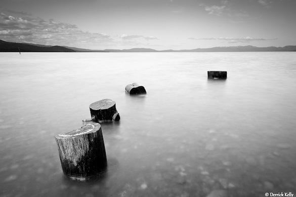
“Kiva” by Derrick Kelly
This week’s photograph was made by Derrick Kelly at Kiva Beach in South Lake Tahoe, California. By having his image chosen for this critique Derrick will receive a free 16×20 matted print from Aspen Creek Photo. If you’d like your images considered for future critiques you can upload them to theFlickr group I created for this purpose.
If you’ve been reading these critiques you know that I’m a fan of clean, simple compositions. This photograph epitomizes that. The four stumps stand out clearly against the smooth water, creating a serene, zen-like composition.
The image seems nicely balanced, and I like the way the stumps form a subtle curve through the foreground. The only thing about the composition I can nitpick is the visual merger between the two stumps closest to the camera; it would be great to see clean separation and balanced spacing between all the stumps.
Gaining that separation would have required either raising the camera, moving forward, or stepping to the right and pointing the camera more to the left. I don’t know if any of those options was feasible: the tripod might have been as high as it could go, stepping forward would probably have required wading, and moving to the right and pointing left could have introduced unwanted distractions in the background. But I point this out to make you more aware of such mergers in your own compositions; if you notice problems like this in the field then you have a chance to fix them by changing the camera position.
Derrick seemed to have a clear vision of how he wanted this photograph to look before he pressed the shutter. When I first viewed this image I thought it was captured at dusk, but it was actually made in midday light. Derrick put on a four-stop neutral-density filter, allowing him to use a 15-second exposure. This blurred and smoothed the water, giving the photograph a dusky, long-exposure look.
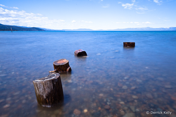
Derrick also knew from the beginning that he would convert this to black and white. He told me, “I like black and white because I feel it allows me to be more expressive in the image, with less ambiguity about my artistic intent, than does color photography.” Just for comparison, here’s the color version. To me the black-and-white image is indeed more expressive, and makes a stronger statement, than the color one. In color we see what stumps in water look like. In black and white we get that feeling of space and simplicity.

Color version
I’ve talked about this in a previous critique, but it’s worth mentioning again how black and white can simplify a photograph. Sometimes color can just be a distraction; here, for example, the rocks underneath the water stand out more in the color image, pulling our eyes away from the stumps.
Derrick said that he processed the single Raw file twice in Lightroom, darkening one version to bring out detail in the sky, lightening the other to provide the feeling he wanted in the foreground. He then converted both to black and white and merged them together in Photoshop.
As with many things in the digital darkroom, there were probably several different techniques that could have created a similar look. But the particular tools don’t matter. What does matter is having a clear idea of what you want to convey in the photograph. If you can do that, then you can make the right decisions along the way to convey that vision, from the choice of composition, exposure, shutter speed, depth of field, and filters, to the steps of post-processing.
In his books The Camera, The Negative, and The Print, Ansel Adams stressed the importance of visualization. He said, “The term visualization refers to the entire emotional-mental process of creating a photograph, and as such, it is one of the most important concepts in photography. It includes the ability to anticipate a finished image before making the exposure, so that the procedures employed will contribute to achieving the desired result.”
I think Derrick did a great job of visualization here. He didn’t want a literal representation of reality. He wanted something more expressive, and took the necessary steps to create that, starting with the 15-second exposure to smooth the water, and finishing with some skillful digital-darkroom work.
What do you think of this photograph? Do you like the black-and-white version better? Does the visual merger of the two stumps bother you? As always, I look forward to hearing your comments.
Thanks Derrick for sharing your image! You can see more his work on Flickr.
If you like these critiques, share them with a friend! Email this article, or click on one of the buttons below to post it on Facebook or Twitter.
As part of being chosen for this week’s critique Derrick will receive a free 16×20 matted print courtesy of the folks at Aspen Creek Photo. If you’d like your images considered for future critiques, just upload them to the Flickr group I created for this purpose. If you’re not a Flickr member yet, joining is free and easy. You’ll have to read and accept the rules for the group before adding images, and please, no more than five photos per person per week. I’ll be posting the next critique in two weeks. Thanks for participating!

