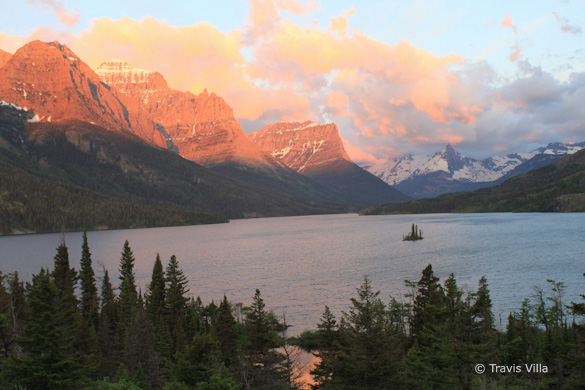
“Wild Goose Overlook” by Travis Villa
Composition and Light
This week’s photograph was made by Travis Villa in Glacier National Park, Montana. Travis wrote on Flickr, “This is one of the most spectacular sunrises I have ever seen, complemented by an already beautiful location. I felt very grateful to have a good balance (not too many or too few) of clouds in the sky that morning.”
Indeed it is a spectacular scene. Wish I had been there! The color and light are dramatic; I especially like the clouds over the pointed peak on the right half of the frame. (I’m sure someone knows the name of the peak.)
The basic composition works pretty well. Travis said that he included the dark trees at the bottom of the photo to add contrast to the scene—which they do. But by including those trees the most interesting, eye-catching parts of the photograph—the colorful peaks and clouds—are relegated to the top third of the frame. Travis told me that in hindsight he would have included a bit more sky, and I agree with that, as I think a little more room at the top would help balance the composition.
Could he have just pointed the camera up more, focusing on the peaks and clouds, and eliminating the dark trees at the bottom? Not easily. There’s no way to get rid of those foreground trees entirely without also deleting the lake, and I think the lake would be missed. Cropping out part of the trees would leave just their tips sticking into the frame—a distraction. I think you need to have that dark band going all the way across the bottom, or not include any of those trees. So the best solution was probably, as Travis suggested, to just zoom out a bit and include more sky, but leave those trees at the bottom.
I might also like to see a bit more room along the left edge. It looks like there are more colorful peaks and clouds just out of the frame, and mentally I want to see them. There’s nothing essential near the right edge of the frame here, so perhaps just pointing the camera slightly more to the left, in addition to zooming out, would have helped.
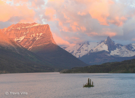
Tight crop of the island, peaks, and clouds
Another alternative was to use a longer lens and focus on the small island and the peaks above it. I’ve posted a cropped version here to show what this would look like. This is simpler, and fills the frame with perhaps the most interesting parts of the scene, but it’s missing some of the grandeur of the wider view.
So all things considered I like Travis’s original composition, but would have included a bit more room at the top, and pointed the camera slightly to the left. Oh, and straightened that horizon too.
Exposure
This photograph looks overexposed: the snow at the top of the peak on the left side lacks detail, and the colors seem washed out. Yet viewing a luminance histogram in Photoshop shows nothing technically blown out—nothing pushed up against the right edge of the histogram.
This illustrates one of the challenges of photographing colorful subjects with digital cameras. Colorful highlights need to be exposed with more care than highlights that are white or light gray.
With Raw files I’m willing to let small patches of not-colorful highlights (like snow or the edges of clouds) be washed out. I know I can use the Recovery tool in Lightroom or Camera Raw to bring back detail. But with colorful subjects—flowers, fall leaves, or sunrise clouds like these—I look at the individual color channels on my camera’s histogram and make sure none of these are pushed up against that right edge, or even near that right edge. I’ve found it’s difficult to make “hot” colors—colors that are technically not overexposed, but close—look right; inevitably I’ll end up with blotchy patches of color that lack detail.
Click here to view a screen shot of this image’s histograms (luminance at the top, individual color channels below). If you were photographing this scene and just looked at the luminance histogram you might think the exposure was okay. But checking the individual color channels would show that both the red and blue channels were pushed against the right edge—overexposed—and that you should make a darker exposure.
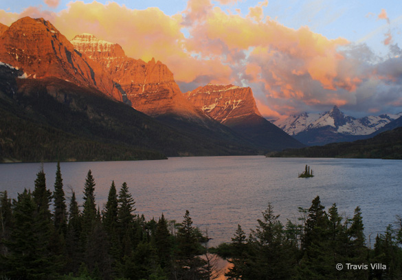
While you have to be careful exposing colorful highlights with Raw files, the problems are much worse with JPEGs. This image was captured in JPEG mode, and is shown straight out of the camera with no processing. I took the photograph into Lightroom and used the Exposure and Recovery tools, plus a slight darkening S-curve, to darken the image and try to bring back highlight detail. For good measure I straightened the tilted horizon, cropped a little off the right edge, and used the Adjustment Brush to darken the sky and mountains. I think the modified version has better color, and captures more of the drama of the scene. But because two of the color channels are clipped, and because it’s harder to recover highlights with JPEGs, the clouds have a splotchy look that I couldn’t easily fix.
Darkened, straightened, and cropped along the right edge
If you want more information about reading histograms, I’ve written an article that explains some of the basics. Looking at the individual color channels is perhaps beyond the basics, but an important refinement that will help you make better exposures of colorful scenes like this.
Final Thoughts
Travis told me that he got his first DSLR only a week before making this image, and used the automatic “Landscape” mode (the exposure was 1/30 at f/5.6, 250 ISO). “In hindsight, with all I have learned in my class the past two months, I would have done some bracketing, checked my histogram, and used a tripod.”
I remember my first SLR—an Olympus OM-1 (boy does that date me). This was an all-manual camera, but the learning curve was still steep. Today’s SLRs are both easier and more difficult to use—easier because digital capture allows you to see the results right away, but more difficult because of the innumerable buttons and labyrinthian menus. The learning curve is still steep.
Considering his lack of experience with the camera, Travis did a good job of composing and capturing this scene. Even better, he took a class and learned some technical fundamentals. Sometimes only painful experience teaches us that we can’t always keep the camera in full auto mode. Kudos to Travis for learning these lessons so quickly!
Regardless of how much experience we have behind the camera, all of us would like to make photographs that express our vision, and capture what we really see and feel. Doing that requires a willingness to learn and grow, to stretch both our technical abilities and our eye for light and composition. I learn something every time I pick up a camera, and every time I write one of these critiques. I hope you learn something by reading them.
Your Comments
I’m always interested in hearing your thoughts. Do you like the revised, darker version of this photograph, or do you prefer the original? Do you see other possible compositions?
Thanks Travis for sharing your image, and for braving the slings and arrows of a critique! You can see more of his work on Flickr.
If you like these critiques, share them with a friend! Email this article, or click on one of the buttons below to post it on Facebook or Twitter.
As part of being chosen for this week’s critique Travis will receive a free 16×20 matted print courtesy of the folks at Aspen Creek Photo. If you’d like your images considered for future critiques, just upload them to the Flickr group I created for this purpose. If you’re not a Flickr member yet, joining is free and easy. You’ll have to read and accept the rules for the group before adding images, and please, no more than five photos per person per week. I’ll be posting the next critique in two weeks. Thanks for participating!



Michael,
I like the darkened, straightened version. I also had a crash course about getting off of full auto not long after I bought my first DSLR. I have some wonderful images from full auto. I also had to delete many that were not fixable. I rather like the composition but probably would have zoomed out further to capture more sky, like you mentioned. I would have cropped to a wide screen/panoramic ratio, cropping out some of the trees, to keep the mountains and sky. Humans see in panoramic ratios, and I prefer that ratio for shots like this.
The color of the clouds isn’t very pretty (dirt?). I guess that’s the result of early morning light reflecting off of dirt?? Is there a way to adjust the color a bit so they look prettier? I doubt Travis stood there and thought “WOW, dirt colored clouds. How beautiful!” Or is the JPG just not editable enough?
This nice for anyone let alone a beginner.
Thanks for sharing your thoughts on this image Brad. I think a panorama is a good idea here – I’d like to see more room on the left especially.
The cloud color doesn’t look like dirt to me, but, as I mentioned in the critique, those clouds do have a strange, splotchy look to them. I think this is due to the image being slightly overexposed and the red channel being clipped, and to the fact that this was captured in JPEG mode, which limited the adjustments that could be made later. In Raw mode you could also have chosen a different camera profile, which also might have helped with that cloud color. (I made a video about camera calibration and profiles which you can see here: https://www.michaelfrye.com/2010/07/27/camera-calibration-for-raw-files/)