Critiques
by Michael Frye | May 20, 2010 | Critiques

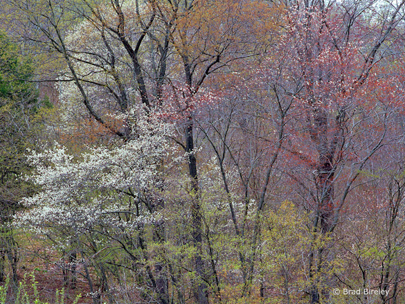
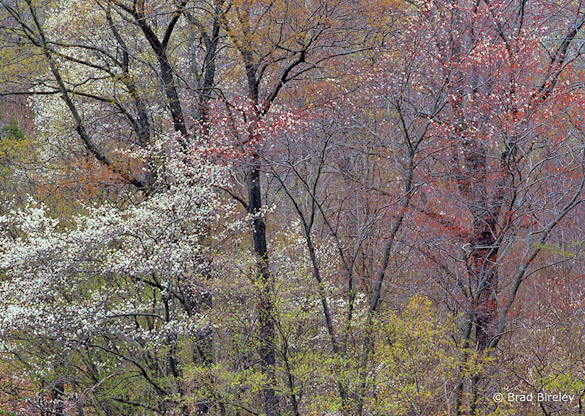
“Springtime in Potter County, PA” by Brad Bireley
Note: I’ve decided to do these critiques every other week from now on, instead of every week. I enjoy doing them, and they’ve been popular and well-received, but I’d like to devote more time to discussing other things that I think will interest you, the readers. Stay tuned!
This week’s photograph was made by Brad Bireley in Potter County, Pennsylvania. By having his image chosen for this critique Brad will receive a free 16×20 matted print from Aspen Creek Photo. If you’d like your images considered for future critiques you can upload them to the Flickr group I created for this purpose.
The soft light of an overcast day was perfect for this photograph. The even illumination helped simplify this complex scene, while sunlight would have created confusing splotches of light and dark. Soft light also helped bring out the beautiful, subtle colors. The varying shades of green, gold, red, and white create a pleasing and varied palette, with a nice warm-cool, red-green color contrast.
Overall the composition is well seen. Brad focused on the area with the most interesting color and texture. He put design before subject and didn’t feel compelled to include the tops or bottoms of the trees out of some misguided attempt to show the whole subject.
The lines of the tree trunks provide structure and prevent the image from becoming a random mish-mash of leaves. The thousands of tiny spots created by the leaves and blossoms add texture and another subtle, repeating pattern, almost like a pointillist painting.
Two small things, however, bother me about the composition. First, the branches in the lower-left corner are slightly out of focus, and their shapes don’t mesh with everything else. Luckily it’s easy to crop a little off the bottom of the photo to eliminate those branches.
The other problem is the bright patch of sky in the upper-right corner. Bright areas draw the eye, and this one pulls viewer’s attention away from all those interesting colors and textures and right out of the frame. Unfortunately, this patch of sky isn’t easily cropped, as trimming the top would also cut off some interesting forks in the upper branches of the left-hand tree.
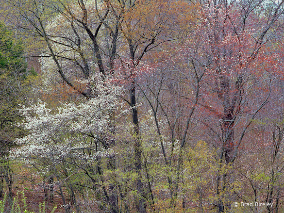
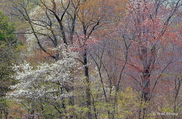
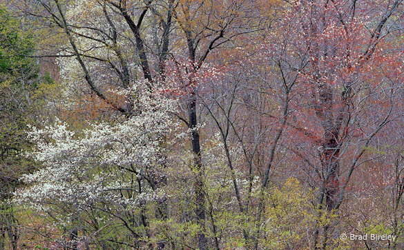
In search of a solution, I tried darkening the upper-right corner, and several different crops. At the end of this post you’ll find four alternate versions of this image. In version A I darkened the upper-right corner as much I could without making the image look fake and unnatural, but didn’t crop anything. In version B I trimmed a little from the bottom and just enough off the top to eliminate the brightest part of the sky. With C I lopped off all of the sky, and in D also cropped the left and right edges to fill the frame with texture.
I like tight compositions, so I’m partial to Version D, but honestly it’s a tough choice. Let me know what you think!
Technically this is well-executed: the exposure is perfect, and everything is in focus except the small vertical green branches in the lower-left corner I mentioned earlier. The overall contrast looks just right, with small areas of pure black and pure white, just enough to give the image some punch, but not enough to make it look harsh.
Brad said that he didn’t do much to the scan, perhaps adding a bit of saturation. I think a color balance adjustment would also help, as the image has slight blue/purple tint, visible in the branches on the right side of the frame. (I adjusted the white balance slightly in the versions below.)
Despite my nitpicking this is a beautiful photograph, with great colors and textures. Thanks Brad for sharing your image! You can see more his work on Flickr.
As part of being chosen for this week’s critique Brad will receive a free 16×20 matted print courtesy of the folks at Aspen Creek Photo. If you’d like your images considered for future critiques, just upload them to the Flickr group I created for this purpose. If you’re not a Flickr member yet, joining is free and easy. You’ll have to read and accept the rules for the group before adding images, and please, no more than five photos per person per week. I’ll be posting the next critique in two weeks. Thanks for participating!
—Michael Frye

Version A, with the upper-right corner darkened

Version B, with top and bottom edges trimmed

Version C, with the sky cropped out completely

Version D, a tighter crop
by Michael Frye | May 13, 2010 | Critiques

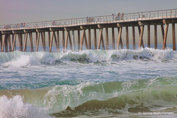
“Pacific Waves” by Jenna Beth Fender
This week’s photograph was made by Jenna Beth Fender at Manhattan Beach (or maybe Hermosa Beach) in southern California. By having her image chosen for this critique Jenna will receive a free 16×20 matted print from Aspen Creek Photo. To learn how you can submit photos for this series, and possibly win a free print, see the end of this post.
We’ve looked at several images where slow shutter speeds were used to blur the motion of water, but here a fast shutter speed of 1/400 sec. effectively froze the water’s motion, preserving the curling shape of the waves and texture of the water.
Those waves, along with the pier, provide the structure and design of this image, creating three long, slightly diagonal lines running across the frame. The overall composition is clean, simple, and strong, with some interesting details added by the spray, figures, and structural posts underneath the pier.
It was the waves, with their strong lines and almost palpable texture, that originally attracted me to this image. Jenna timed this well, catching both waves as they were curling over. Of course she may have simply held down the shutter button and picked the best one later, but that’s a perfectly valid technique—it’s what I would have done!
While the composition is strong overall, one thing that bothers me slightly is the bright spot in the lower-left corner. Since it’s on the edge it pulls my eye out of the frame. I’d rather see more room along the whole bottom edge of the photo, as that would give more breathing room to the foreground wave, which is such an important part of the composition. As it is, just darkening that lower-left corner would help.
Technically, the exposure looks good overall, although some areas of white water lack detail. The fast shutter speed worked well to freeze motion, but the trade-off was that the short exposure required a medium aperture, f/8, which didn’t provide enough depth of field to keep everything in focus (in a larger view you can see that the foreground wave is slightly soft). This image was captured at 100 ISO; by pushing the ISO up to 400 ISO Jenna could have used the same shutter speed, 1/400 sec., with an f-stop of f/16, getting both the motion-freezing short exposure time along with a small aperture to keep everything in focus. The tradeoff would have been more noise from the higher ISO, but I think the increased sharpness would have been worth the small increase in noise. Also, it would have helped to focus closer to the foreground rather than on the background. I don’t have space here to describe proper focusing technique in detail, but I do so in two of my books, The Photographer’s Guide to Yosemite and Digital Landscape Photography.
There are some hints of magenta/purple along the left edge of the image that seem unnatural and out of place. Jenna told me that she didn’t use any filters or do anything else to the photograph except use the Topaz Adjust filter with the “Photo Pop” option. I haven’t used that software, but I suspect that “Photo Pop” was the culprit in creating those strange colors. In general I’m not a big fan of automated options like this, whether from software plugins, commercially available Lightroom presets, or whatever. Every image is different, and it’s hard to create a standard set of development adjustments that will work on more than a few photographs. While pre-made settings can serve as a starting point, each image must be evaluated and adjusted based on its own unique characteristics.
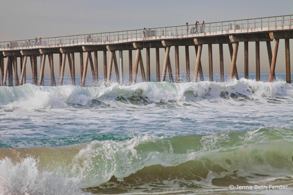
With that in mind, I took this image into Lightroom and removed some magenta and purple saturation to get rid of the unusual colors. Then I added a lightening S-curve to brighten the photograph and increase the contrast, and also darkened that lower-left corner. While the improvements weren’t dramatic, every bit helps. Here’s the result:

With the magenta cast removed, the lower-left corner darkened, and a bit more contrast added
The great thing about digital technology is that it’s given photographers tremendous control over the appearance of their images. The bad thing about digital technology is that it’s given photographers tremendous control over the appearance of their images. The tools can be used for good or evil—to enhance the expression and meaning of an image, or to ruin an otherwise perfectly good photograph. For better or worse, learning the software tools—and, more importantly, learning the judgement to use them wisely—has become an essential part of photography today.
Having said all that, the slight magenta/purple cast in this image is a minor problem, easily fixed, and overall I like this photograph very much—it has a clean, strong, graphic composition, great texture, and captures the feeling of a southern California beach quite well.
Thanks Jenna for sharing your image! You can see more of her work on Flickr.
As part of being chosen for this week’s critique Jenna will receive a free 16×20 matted print courtesy of the folks at Aspen Creek Photo. If you’d like your images considered for future critiques, just upload them to the Flickr group I created for this purpose. If you’re not a Flickr member yet, joining is free and easy. You’ll have to read and accept the rules for the group before adding images, and please, no more than five photos per person per week. I’ll be posting the next critique on May 18th or 19th. Thanks for participating!
by Michael Frye | Apr 28, 2010 | Critiques

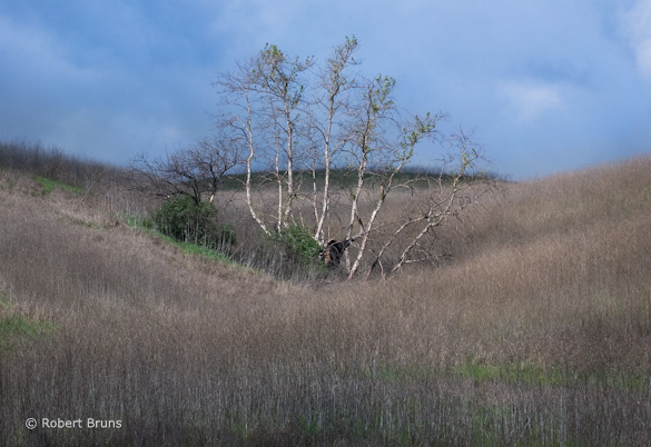
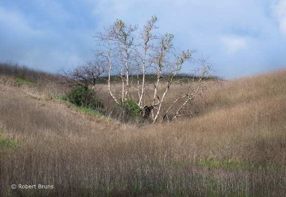
“Chino Hills SP 1” by Robert Bruns
This week’s photograph was made by Robert Bruns in Chino Hills State Park, California. What initially attracted me to this image was its strong composition. It’s simple and clean, with a prominent focal point—the central trees. It’s full of diagonal lines and triangles: a large, long triangle in the lower-right corner, another in the middle left, a small one behind the trees, more within the trees themselves, and subtle triangles in the negative space of the sky in the upper-left and upper-right corners. It’s very well seen.
I could go on here about another successful violation of the rule of thirds, but I’ll just refer you to previous critiques here and here.
Last week I discussed the conflict that photographers often face between finding a strong composition and conveying a sense of place. Robert managed to walk that line pretty well here—the design is exemplary, and we get a feeling for the kind of area this is, with its dry, grassy hills. Robert said that this area had burned the previous year, and “It was nice to see it coming back to life.”
Technically this is well executed—the exposure looks perfect, and everything appears to be in focus. The white balance looks neutral, but I might prefer something a bit warmer. More contrast would also liven up the image a bit. Here’s a modified version with both warmer color balance and added contrast, plus lightened a bit overall:

Lightened version with warmer color balance and more contrast
Despite the strong composition, and the changes I made, this image still seems to be missing something. I enjoy contemplating the design, but it’s not the kind of photograph that makes you stand up and say “Wow!” Yet it’s hard to find ways to improve it. One issue is the subject. A strong design can sometimes overcome an ordinary subject, and nearly did here, but not enough to completely captivate me. The other problem is the light—it’s rather bland. Some warm, low-angle sunlight would be perfect. I think low frontlight would be best, but sidelight or backlight might also work.
Of course you can’t always catch perfect light, but I suspect that Robert lives close to this spot, since not many out-of-state visitors put Chino Hills on their itinerary. And while Chino Hills may not be Yosemite, any natural place—heck any place, period—has its charms. And proximity is a great advantage—you can return repeatedly, learn where some of the best locations and subjects are, get to know the weather patterns, and plan to come back to certain spots when the light and weather are right.
I think we all make better photographs of places and subjects that we know well, and that we’re passionate about. Sometimes I hear people say that it’s easy to take good pictures in Yosemite: ”Just point the camera anywhere.” But if you’ve tried to make good photographs of this park you know how untrue that statement is. It can be very difficult to convey the beauty and grandeur of such a place in a photograph. If I’ve had any success at it, it’s because I know Yosemite well, and I’m passionate about it.
The New Jersey shore might seem like a far cry from Yosemite. But one of my online students last year showed many beautiful images of that coastline. They had great color, and a wonderful feeling of space and light. He knew the area well, loved it, and it showed.
Another student once showed me a portfolio of landscape photographs. They seemed rather ordinary. Then, almost as an afterthought, he showed photographs of his kids—and they were great. This was clearly a subject that he was passionate about.
So photograph places and subjects that you know and love. Your passion and knowledge will make the mundane seem magical. And it helps if you can work close to home, and visit your subjects again and again.
Thanks Robert for sharing your image! You can see more of his work on Flickr.
I’ll be taking next week off to teach a workshop, but will post another critique on May 11th or 12th.
As part of being chosen for this week’s critique Robert will receive a free 16×20 matted print courtesy of the folks at Aspen Creek Photo. If you’d like your images considered for future critiques, just upload them to the Flickr group I created for this purpose. If you’re not a Flickr member yet, joining is free and easy. You’ll have to read and accept the rules for the group before adding images, and please, no more than five photos per person per week. I’ll be posting the next critique on May 11th or 12th. Thanks for participating!
by Michael Frye | Apr 21, 2010 | Critiques
“Rock Creek—Beautiful Stream” by Steve Williams
I’m pleased to announce that, beginning this week, each person who’s image is selected for a critique will receive a free 16×20 matted print courtesy of the folks at Aspen Creek Photo. Aspen Creek was created by Rich and Susan Seiling, the founders of West Coast Imaging. I’ve used West Coast Imaging for all my drum scans, and know they set high standards and produce great results. Aspen Creek Photo offers excellent prints, similar in many ways to the high-end work produced at West Coast Imaging, at very affordable prices.
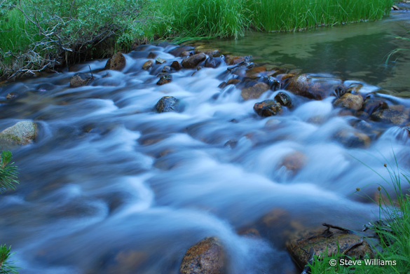
Now, on to the critique… This week’s photograph was made by Steve Williams along Rock Creek, on the eastern slope of my home mountain range, the Sierra Nevada. The small cascade is an intriguing subject, and the slow shutter speed (1/2 second) that Steve chose works well, giving the water that silky, flowing look, and creating a contrast in textures betweensmooth, ethereal water and solid rocks and grasses. There’s a nice, quiet, intimate feeling to the image; it seems like a peaceful place that I would enjoy spending time at.
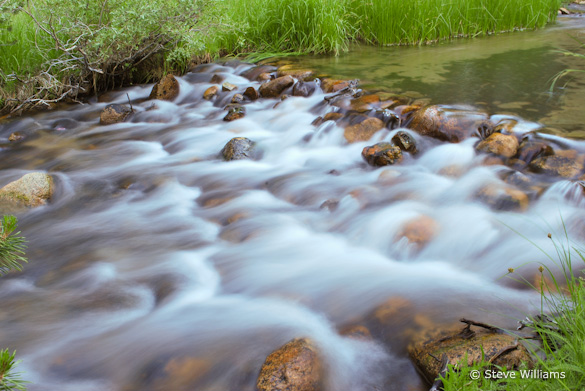
A small aperture, f/20, kept everything in focus. At first glance the exposure seemed a bit dark to me, and the white balance looked too blue—the white water, or what should be white water, has a distinct blue cast. Using the eyedropper tool in Lightroom, I clicked on the white water, and that made an immediate improvement. The photograph seems warmer, the colors livelier, and the scene more inviting. This color temperature change also boosted the red and green channels, making the image appear brighter as well as warmer. The exposure now looks perfect.
After the white balance was adjusted with the eyedropper in Lightroom
How you handle white balance (or color temperature, or color balance) depends, to a great degree, on whether you’re shooting Raw or JPEG. With Raw the white balance isn’t set in the camera, so it’s easy to adjust later in software. I always shoot in Raw, and usually just leave the camera set to automatic white balance, because it’s a simple matter to make corrections later in Lightroom with the eyedropper or color temperature slider. If the color balance might be tricky, as when photographing flowers or fall foliage at dusk, I include a white or gray card in one of the frames, then click on that card with the Eyedropper later in Lightroom and apply that same white balance setting to the other images made in the same light.
With JPEGs the white balance is set in the camera. While you can adjust it later in software, big changes can be problematic, so it becomes more critical to get it right in the field. You’ll need to set the white balance manually more often.
When you do need to adjust the white balance of a JPEG in software, it’s much easier to do so in Lightroom or Camera Raw, using that Eyedropper tool and the Color Temperature slider, than in Photoshop proper. (To open JPEGs in Camera Raw, select the image in Bridge, then choose File > Open in Camera Raw.)
First crop, eliminating distracting elements along the bottom and left edges
Changing the white balance in this photograph made a big improvement, but the composition still seemed a bit messy. Edges are always critical, and there are a number of objects here that are half-in, half-out of the frame, including the tips of two branches on the left edge, a rock just above them, and a rock along the bottom edge. The lower-right corner also seems a bit cluttered.
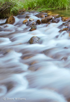
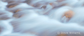
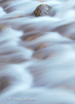
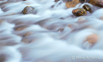
With that in mind I cropped this into a vertical, including just the cascade and the far bank. This was better, but it still seemed like there was something missing. When in doubt I ask myself what catches my eye the most. In this case the answer was easy: the flowing water. So I made several other, tighter crops, picking out interesting sections of the small rapid.
While Steve’s original composition is not exactly a wide, sweeping landscape, it does capture enough of the scene to give us some sense of place—a quiet, grass-lined creek. While I think my tighter crops are stronger designs, they lose some of that feeling and sense of place. This points to a dilemma that photographers often confront. We may prefer to capture a wider view, one that shows what an area looks like. Sometimes we can do so and make a clean, strong composition in the process, but often that wide view includes extraneous clutter. If we pick out a detail, a small piece of that scene, we can often make a strong design out of it, but then lose the context and sense of place.
So what do you do? Capture both. Take the wide view, but then keep looking, and find those interesting details.
When evaluating the images later, you’ll probably find the abstract close-ups more compelling. In photography, design always trumps subject. There’s something about interesting lines, shapes, and patterns that catches our attention and intrigues us as viewers. A photograph needs an incredibly compelling subject—like an exploding volcano, or a wolf dragging down a caribou—to overcome poor design.

One more thing: By making these crops I’m trying to show alternate compositions, things that might have worked better than the original image, and trying to give you ideas for finding better compositions in the field. But I don’t mean to suggest that it’s okay to be sloppy, to capture a wide view with the intention of cropping later. Removing large sections of an image throws away too many of those megapixels you’ve paid so much for, leaving you with a low-resolution image that can’t be enlarged. While minor trimming is fine, it’s always better to frame the scene as precisely as possible in the camera, and keep as much of that precious resolution as possible.

Fourth crop
Thanks Steve for sharing your image! You can see more of his work on Flickr.
As part of being chosen for this week’s critique Steve will receive a free 16×20 matted print courtesy of the folks at Aspen Creek Photo. If you’d like your images considered for future critiques, just upload them to the Flickr group I created for this purpose. If you’re not a Flickr member yet, joining is free and easy. You’ll have to read and accept the rules for the group before adding images, and please, no more than five photos per person per week. I’ll be posting the next critique on April 27th or 28th. Thanks for participating!
by Michael Frye | Apr 14, 2010 | Critiques
Cataract Catwalk” by Paul Porter
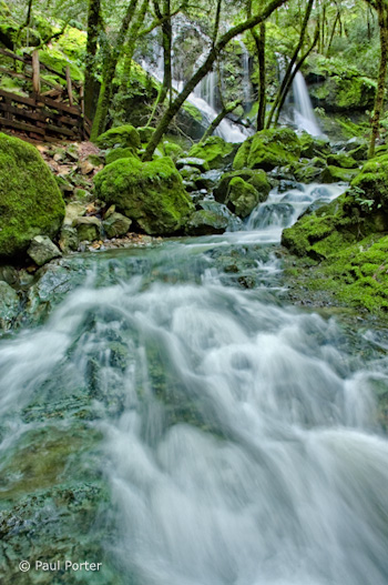
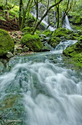
This week’s photograph was made by Paul Porter at Mount Tamalpais State Park, north of San Francisco. While last week’s image was a model of simplicity, this scene is much more complex, with cascades, rocks, trees, and the boardwalk railing. I think Paul did a great job of integrating all those elements together and creating a strong composition.
The foreground water is the dominant feature—it fills up almost half the frame. The converging lines of the stream point toward the waterfall at the top, leading our eyes there and creating a nice near-far juxtaposition. That prominent foreground and it’s leading lines hold all the complex elements of the scene together and make a coherent statement out of what could have been a visual mess.
The walkway railing is a man-made object in an otherwise natural scene, and it’s color, lines, and shapes are different from everything else in the frame. Yet despite all that it’s fairly unobtrusive, and you could even make an argument that it adds interest and a human element, allowing viewers to imagine that they could be part of this scene.
One thing that does bother me slightly is the tree trunk in the upper-right corner. Any object that lives on the edge like this can be distracting, and it’s worse if it’s partially cut off—that is, not completely in the photograph or out of it. In this case it’s easy to crop a bit off the right side and eliminate it, and I’ve uploaded another version to show what that looks like. I also trimmed a little off the bottom as well, as after cropping the right edge the bottom of the image seemed a bit too elongated.
Right and bottom edges trimmed
The focal length was 18mm on an APS-size sensor (equivalent to about 28mm on a full-frame sensor). Since wide-angle lenses like this include so much of the scene, it’s easy to allow extraneous elements to creep in and clutter up the image, and it can be challenging to keep the compositions simple. But the strength of short focal lengths is creating the kind of near-far juxtaposition that we see here. Wide-angle lenses make distant objects seem smaller, thereby exaggerating the apparent size difference between near and far, and creating an illusion of depth.
There are two keys to creating that sense of depth with a wide-angle lens. First, you have to put the camera close to something in the foreground—usually no more than five feet away—otherwise everything will look small and distant. Second, you need to keep everything in focus. Paul did both of those things here: the foreground rocks and water appear to be less than three feet from the camera, and everything looks sharp, at least in this small enlargement. Even though this image isn’t the kind of sweeping grand landscape we usually associate with that near-far juxtaposition, there’s a palpable sense of depth and distance between the rocks and water at the bottom of the frame and the trees and fall near the top. You almost feel as though you could walk—or rather wade—into this scene.
Telephoto lenses do the opposite—they compress space and make objects look closer together than they really are. This is great for creating patterns, as you can bring similar lines and shapes into close visual proximity even when they’re physically far apart. From this spot, for example, you could use a longer focal length to zoom in on the trees and waterfall and the top of the frame, working with the patterns created by the trunks and strands of water.
The soft, overcast light was a perfect complement to this scene. Sunlight would have been a contrasty nightmare. Aside from creating severe exposure problems, splotchy highlights and shadows would have added complexity and confusion. Even with the overcast conditions Paul said that he needed to blend two exposures together in Photoshop, since the upper falls were quite a bit brighter than the shadier foreground. This post-processing looks very well done. The merge is seamless—you’d never know that two images had been combined. (I discuss exposure blending in my Digital Zone System article for Outdoor Photographer, and in more detail in my Digital Landscape Photography book.)
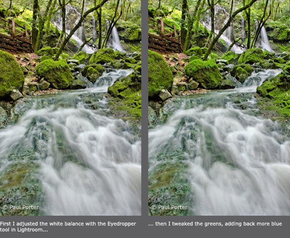
The overall contrast and saturation look great. In fact Paul said that he reduced the saturation in some areas after some of the adjustments he made “created a little undesired over-saturation.” The only thing I could quibble with about the processing is the white balance, which to me looks a little blue. This is especially noticeable in the water. To correct this, I used the eyedropper tool in Lightroom and clicked on the water to make it neutral. This worked well for the water, but made the greens a bit too yellow for my taste, so I tweaked the greens to push them closer to their original color. Here are both of these versions for comparison.

Paul used a shutter speed of 1/2 second for both exposures. This looks about right—slow enough to give the water that silky, flowing look, yet fast enough to prevent the water from losing all texture. There’s a nice contrast between the smooth water and the rough textures of the mossy trees and rocks.
Overall this is very well done—nicely composed, technically well-executed, and skillfully processed.
Thanks Paul for sharing your image! You can see more of his work on Flickr.
If you’d like your images considered for future critiques, just upload them to the Flickr group I created for this purpose. If you’re not a Flickr member yet, joining is free and easy. You’ll have to read and accept the rules for the group before adding images, and please, no more than five photos per person per week. I’ll be posting the next critique on April 20th or 21st. Thanks for participating!
by Michael Frye | Apr 7, 2010 | Critiques

“Outward Momentum, Panther Beach, Davenport, California” by Sudheendra Kadri
This week’s image, by Sudheendra Kadri, was made at Panther Beach in Davenport, California (just north of Santa Cruz).
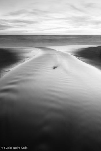
What initially caught my eye was this photograph’s zen-like simplicity. The entire image consists of only a few lines and shapes. The dominant visual element is the curving X of the stream, resembling a whale’s tail, which in turn is flanked by two triangles of darker sand, then topped by a band of water and lighter expanse of sky. The small dark rock in the center of the frame could be a distraction under different circumstances, but here I think it’s a nice touch, adding a subtle focal point.
In photography, less is usually more, and this image provides a great example of that. The simple, graphic design grabs our attention in a way that more cluttered compositions don’t. But simplicity isn’t simple—in fact it’s quite difficult. The universe wasn’t constructed with photographers in mind; much of the time the world seems to consist of random clutter, with bits of junk and debris thrown in for good measure. The photographer’s job is to find order within that chaos (to paraphrase Robert Glenn Ketchum), to see designs and patterns in the random configurations of the universe.
I talked about seeing abstractly—focusing on lines, shapes, and patterns, rather than thinking about the subject—in my critique from March 24th. I also discuss this in my Digital Landscape Photographybook, and in every workshop I teach. I must think it’s important! Sudheendra said on Flickr, “The way this stream turned sharply before meeting the oncoming waves caught my eyes and I thought this would bring some nice curves and lines into this frame.” So clearly he was thinking abstractly, and that mindset allowed him to see the potential of this scene.
This image’s simple design could only have been created from a particular point of view, which looks like it was the middle of the creek! I asked Sudheendra about that and he confirmed that, yes, he was standing in the water. I guess photographers sometimes have to sacrifice for their art.
The dusk light allowed a 30-second exposure that smoothed the foreground water, giving it that porcelain glow and increasing the level of abstraction by lessening the water’s texture. That soft, glowing, dusky light can be effective for many subjects; the great John Sexton seems to use it almost exclusively.

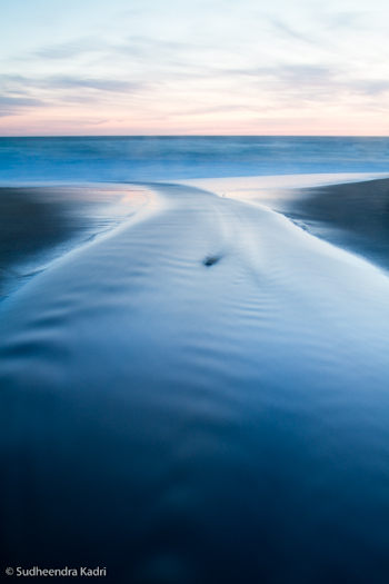
Sudheendra wrote on Flickr, “Shot after sundown, initially I liked the blue-hour colors, but once I saw how it looked in black and white, I wanted to stick with it.” I think that was a key decision, and a good one. Here you can see the color version that Sudheendra sent me for comparison (I added a little contrast to the file to make it closer to the black-and-white version). While the blues and pinks have some appeal, to me the black-and-white image is stronger. By taking away the color the image becomes that much more abstract, focusing our attention on just the lines and shapes, and emphasizing the strong design. We also notice the glassy texture of the foreground water more.
Even if you intend to make the final image black and white it’s usually better to capture the image in full color, as this gives you more options for making that conversion and translating the colors into shades of gray. (With Raw files that’s the only choice—they’re always in color—but some cameras can process JPEGs into black and white.)
Starting with that color image you can use the “Grayscale Mix” in Lightroom or Adobe Camera Raw, or a black-and-white adjustment layer in Photoshop, to alter the tonal relationships between different colors. A classic example is a red apple next to a green apple. A straight black-and-white conversion would make both apples appear medium gray. By adjusting the Grayscale Mix you can make the red apple lighter and the green apple darker, or vice versa. In this “Outward Momentum” photograph, lightening blues would make the foreground water a lighter shade of gray, while darkening magentas would lower the tones of the sky near the horizon. (I discuss these concepts in more detail in my Digital Landscape Photography book.)
But before making these adjustments you have to decide when to convert an image to black and white, and when to leave it in color. Any photograph that lacks color to begin with—a snow scene, or gray tree trunks against gray rocks—is a good candidate for black and white. But other situations are less obvious. To me the question to ask is whether color is adding to photograph’s message and mood, or distracting from it.
In Sudheendra’s photograph, although the original colors are interesting, it turns out that they actually take attention away from the strong, abstract design, which is really the point of the image. As a contrary example, my photograph from Tunnel View that I posted on this blog on February 9th, isn’t particularly colorful, so I tried it in black and white, but decided that the subtle colors, particularly the gold hues in the clouds, actually enhanced the mood, so I kept it in color.
Overall Sudheendra’s photograph is very well done. The only improvement I can think of is to darken the sky a bit, especially near the top, as it’s a bit bright and tends to pull the viewer’s eye out of the frame. But that’s a small thing.
Thanks Sudheendra for sharing your image! You can see more of his work on Flickr.

