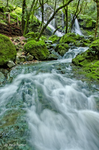
This week’s photograph was made by Paul Porter at Mount Tamalpais State Park, north of San Francisco. While last week’s image was a model of simplicity, this scene is much more complex, with cascades, rocks, trees, and the boardwalk railing. I think Paul did a great job of integrating all those elements together and creating a strong composition.
The foreground water is the dominant feature—it fills up almost half the frame. The converging lines of the stream point toward the waterfall at the top, leading our eyes there and creating a nice near-far juxtaposition. That prominent foreground and it’s leading lines hold all the complex elements of the scene together and make a coherent statement out of what could have been a visual mess.
The walkway railing is a man-made object in an otherwise natural scene, and it’s color, lines, and shapes are different from everything else in the frame. Yet despite all that it’s fairly unobtrusive, and you could even make an argument that it adds interest and a human element, allowing viewers to imagine that they could be part of this scene.
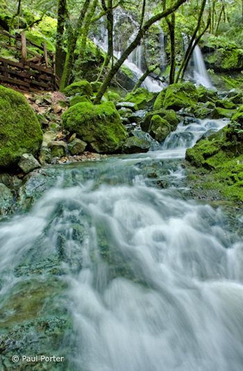
One thing that does bother me slightly is the tree trunk in the upper-right corner. Any object that lives on the edge like this can be distracting, and it’s worse if it’s partially cut off—that is, not completely in the photograph or out of it. In this case it’s easy to crop a bit off the right side and eliminate it, and I’ve uploaded another version to show what that looks like. I also trimmed a little off the bottom as well, as after cropping the right edge the bottom of the image seemed a bit too elongated.
The focal length was 18mm on an APS-size sensor (equivalent to about 28mm on a full-frame sensor). Since wide-angle lenses like this include so much of the scene, it’s easy to allow extraneous elements to creep in and clutter up the image, and it can be challenging to keep the compositions simple. But the strength of short focal lengths is creating the kind of near-far juxtaposition that we see here. Wide-angle lenses make distant objects seem smaller, thereby exaggerating the apparent size difference between near and far, and creating an illusion of depth.
There are two keys to creating that sense of depth with a wide-angle lens. First, you have to put the camera close to something in the foreground—usually no more than five feet away—otherwise everything will look small and distant. Second, you need to keep everything in focus. Paul did both of those things here: the foreground rocks and water appear to be less than three feet from the camera, and everything looks sharp, at least in this small enlargement. Even though this image isn’t the kind of sweeping grand landscape we usually associate with that near-far juxtaposition, there’s a palpable sense of depth and distance between the rocks and water at the bottom of the frame and the trees and fall near the top. You almost feel as though you could walk—or rather wade—into this scene.
Telephoto lenses do the opposite—they compress space and make objects look closer together than they really are. This is great for creating patterns, as you can bring similar lines and shapes into close visual proximity even when they’re physically far apart. From this spot, for example, you could use a longer focal length to zoom in on the trees and waterfall and the top of the frame, working with the patterns created by the trunks and strands of water.
The soft, overcast light was a perfect complement to this scene. Sunlight would have been a contrasty nightmare. Aside from creating severe exposure problems, splotchy highlights and shadows would have added complexity and confusion. Even with the overcast conditions Paul said that he needed to blend two exposures together in Photoshop, since the upper falls were quite a bit brighter than the shadier foreground. This post-processing looks very well done. The merge is seamless—you’d never know that two images had been combined. (I discuss exposure blending in my Digital Zone System article for Outdoor Photographer, and in more detail in my Digital Landscape Photography book.)
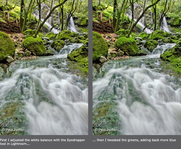
The overall contrast and saturation look great. In fact Paul said that he reduced the saturation in some areas after some of the adjustments he made “created a little undesired over-saturation.” The only thing I could quibble with about the processing is the white balance, which to me looks a little blue. This is especially noticeable in the water. To correct this, I used the eyedropper tool in Lightroom and clicked on the water to make it neutral. This worked well for the water, but made the greens a bit too yellow for my taste, so I tweaked the greens to push them closer to their original color. Here are both of these versions for comparison.
Paul used a shutter speed of 1/2 second for both exposures. This looks about right—slow enough to give the water that silky, flowing look, yet fast enough to prevent the water from losing all texture. There’s a nice contrast between the smooth water and the rough textures of the mossy trees and rocks.
Overall this is very well done—nicely composed, technically well-executed, and skillfully processed.
Thanks Paul for sharing your image! You can see more of his work on Flickr.
If you’d like your images considered for future critiques, just upload them to the Flickr group I created for this purpose. If you’re not a Flickr member yet, joining is free and easy. You’ll have to read and accept the rules for the group before adding images, and please, no more than five photos per person per week. I’ll be posting the next critique on April 20th or 21st. Thanks for participating!



I know a lot about photography, but I love to learn new things about it, so I’m looking for an online photo class that is FREE to take. I really want one that is interactive and has a community/active teacher so that I can get my work critiqued. Once again it must be FREE to take the WHOLE class! It should also give out daily/weekly assignments and have lots of info to learn from. Thanks!
Well good luck with that – I don’t know of anything that fits those criteria.