The image I chose for the first critique in this series was made with a 4 x 5 view camera; this one was captured with a Canon Powershot SD1000—a point-and-shoot. But great photos can be made with any equipment, whether a 4 x 5, digital SLR, point-and-shoot, or pinhole camera. Vision is always more important than equipment.
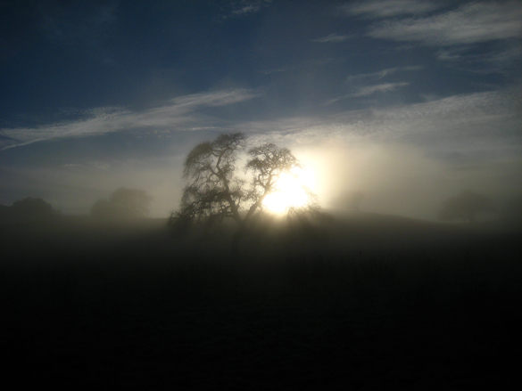
Joe Navratil captured a great moment here, with the sun breaking through fog and silhouetting stately oaks. There’s a wonderful, optimistic mood to the photograph. The composition is pretty simple, and simplicity is always a good thing. One problem is that the main focal points—the sun and the largest tree—are centered. Now I’m not a stickler for the rule of thirds, or any rule for that matter. As Edward Weston said, “To consult the rules of composition before making a picture is a little like consulting the law of gravitation before going for a walk.” But the rule of thirds reminds us that photographs are usually more interesting if you place the main subject off-center—like a third of the way from the left or right edge of the frame. And I think that applies here: this image would be more dynamic if the main tree wasn’t centered.
Of course centered subjects are a common problem with point-and-shoot cameras, as putting the main subject off-center might cause the autofocus to latch onto the wrong thing. But you can always press the shutter button halfway to lock the focus (and usually the exposure too) on your subject, then, while holding the button down, recompose the picture and press the button all the way.
A more fundamental principle than the rule of thirds is simplicity. The best compositions contain only the essentials of the scene or subject, and nothing extra. Or, to quote Weston again, “To compose a subject well means no more than to see and present it in the strongest manner possible.” To me there’s too much empty space in this photograph—too much sky at the top, and too much dark foreground at the bottom. The image would have more impact if the most interesting areas, like the sun and that central tree, filled up more of the frame.
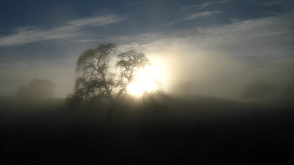
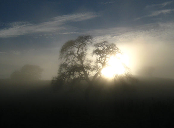
To illustrate what I’m talking about, I’ve cropped this photo two different ways. In the first version (Crop A) I’ve trimmed the image into a long, somewhat panoramic shape. This gets the main subject out of the center, and emphasizes the two longest lines—the horizon and the clouds. This framing also adds rhythm and repetition by giving more visual weight to the flanking trees, which echo the shape of the largest oak. The second version (Crop B) is tighter, more square, and fills the frame with the sun and that central tree.
Crop A is perhaps more elegant, while crop B has more impact. But I think they both work. And this gets back to that rule of thirds. Crop A fits the rule well, placing the main subject off-center on the left side. Crop B violates the rule by putting the main subject in the center, but it still works because there’s no extraneous space. The whole frame is filled with interesting stuff, so the composition seems balanced and natural. A centered subject only becomes a problem when there’s too much room around it.
Of course it’s always better to crop in the camera—to zoom in, or move closer—than do it after the fact. It’s okay to do minor trimming later, but major cropping like this throws away valuable pixels and leaves you with a lower resolution image, and limited potential for enlargement.
This is an extremely contrasty scene, and no camera would be able to capture detail in both the brightest and darkest areas here. In such high contrast situations I’m usually more concerned about the exposure for highlights than shadows. Why? First, our eyes are drawn to bright areas, so viewers immediately notice if they’re overexposed. Second, in real life we can always see detail in bright spots (except when looking at the sun itself, or the sun reflected in water or glass), but we can’t always see detail in shadows. It seems unnatural to find washed-out highlights in a photograph, yet it feels perfectly normal to see regions of pure black.
Here the brightest highlights around the sun are washed out, but this doesn’t seem unnatural because we’re looking right at the sun. If I had been standing next to Joe when he took this photo I wouldn’t have been able to look directly at the sun without hurting my eyes. However, the washed-out area here is a big splotch, with abrupt transitions from pure white to the surrounding golds. A more expensive camera in Raw mode would probably have been able to smooth this out, adding intermediate tones and giving the highlights a more natural look.
The dark region at the bottom of the frame is almost black, with only hints of detail. This seems natural—again we’re used to seeing dark shadows in real life—but as noted before it’s a compositional problem because it makes a large part of the picture rather uninteresting. Overall though I think Joe got the exposure right. This might have been a lucky auto-exposure accident, but we can see detail in the key areas like sky, fog, and trees.
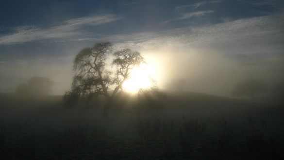
Many people would be tempted to lighten up the bottom, or even bracket exposures and use HDR (or another method of blending exposures) to retain some shadow detail. Here’s another version of this image (using Crop A) where I lightened the foreground:
This demonstrates a couple of things: First, it’s often possible to bring out detail in digital captures from seemingly black areas, but doing so usually reveals terrible noise—not really visible at this size, but obvious when viewed larger. Second, aside from the noise issue, bringing out this shadow detail is not always a good idea. In this case I think the loss of blacks robs this photograph of some of its punch, and the weeds that were revealed are distracting rather than interesting.
In this age of HDR shadow detail has become an end in itself for some photographers. Black shadows are seen as something to be avoided at all costs. But blacks add drama and power to a photograph. Look at an Ansel Adams print and you’ll almost always see a bit of black. And lightening a shadow only makes sense if you’re revealing something interesting, something that adds to the message of the photograph—otherwise that extra detail becomes a distraction.
Let me emphasize that I’m talking about small areas of black. Large dark swaths can look heavy and seem superfluous, which is why I cropped the bottom of this image. And of course every photograph is different; sometimes a softer look, without any black, fits better (here’s one example). I’m not disparaging HDR or exposure blending either; I use both techniques in high-contrast situations when it’s important to see shadow detail. The image from my last post is a blend of two exposures; I needed to keep detail in the clouds as well as in Yosemite Valley and Bridalveil Fall, but that was impossible with one frame.
Sometimes shadow detail is good, sometimes it’s distracting—the key is knowing the difference. When in doubt, ask yourself whether you’re revealing vital information that adds to the photograph’s message, or just pulling the viewer’s eye away from more important things.
But the main lesson I want to emphasize this week is to keep your compositions simple: Ask yourself what caught your eye in the first place, make the image about that, and keep everything else out of the frame if possible. Oh, and don’t be afraid of a little black.
Thank you Joe for sharing your photograph! You can see more of his work on Flickr.
If you’d like your images considered for future critiques, just upload them to the Flickr group I created for this purpose. If you’re not a Flickr member yet, joining is free and easy. You’ll have to read and accept the rules for the group before adding images, and please, no more than five photos per person per week. I’ll post the next critique on February 16th or 17th. Thanks for participating!



Trackbacks/Pingbacks