First, my new eBook, Light & Land: Landscapes in the Digital Darkroom, will actually be released tonight at 1:00 a.m. PST, not today as I said previously. I’ll have more details in my next post tomorrow morning.
On to the critique…
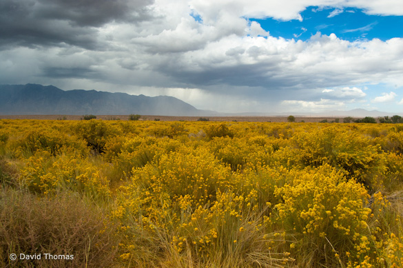
This week’s photograph was made by David Thomas near Bishop, California, on the eastern side of the Sierra Nevada.
Light
David said that he and his dad were driving north on Highway 395 when he noticed a storm gathering over the Sierra crest beyond this dense field of rabbitbrush, “perfectly arranged, waiting to be composed.” The clouds, falling rain, and patch of blue sky provide a dramatic background, and the yellow flowers add an eye-catching foreground. There’s actually not much sun in the scene, but that works well here, especially on the rabbitbrush, where sunlight would have created harsh shadows and visual confusion. The soft light brings out the yellow color of the bushes and helps simplify the scene. The combination of blue sky and yellow flowers creates a nice warm-cool color contrast.
Composition
The background here has plenty of drama, so the first compositional question is whether to include the foreground at all. The yellow flowers are certainly appealing, but simpler photographs are usually best, and by deciding to include a foreground—even a good one—you’re adding complexity and potentially distracting from something more interesting.
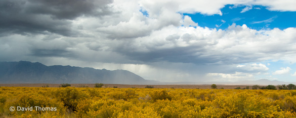
Zooming in on the peaks and clouds, or simply pointing the camera up more, could have worked here. The sky has enough drama to hold its own without help from the foreground. Here’s a panoramic crop that shows one possibility, although this idea might have worked better with more sky—and either way it lacks a real focal point.
But what attracted David to this scene was that juxtaposition between the rabbitbrush and background storm. And I think it’s good to pay attention to your original idea. Your inspiration for picking up your camera can help guide you through the whole process, from composition and exposure to post-processing.
So I think including both the flowers and clouds is a good idea—I know I would have tried it. But composing a scene like this can be tricky. The first problem is that there’s no natural design or structure to the field of rabbitbrush; it’s just a mass of yellow. The foreground really needs a focal point for the eyes to latch on to, or a strong pattern to hold it all together.
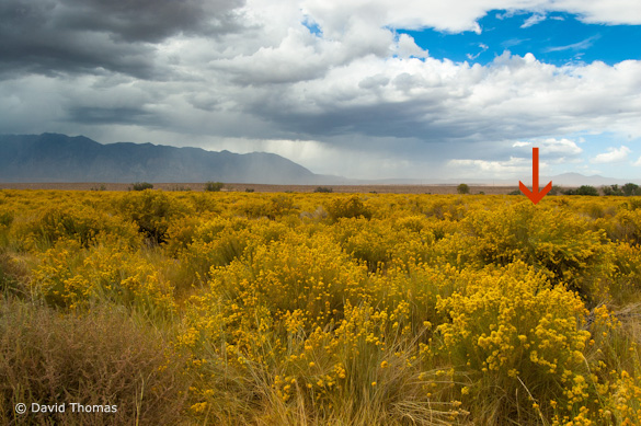
The best solution was probably to find one particularly interesting or prominent shrub and make that a focal point. That large rabbitbrush near the right edge jumps out at me. There appear to be some interesting patterns within the bush itself. By getting the camera close to this bush and using a wide-angle lens you could fill up most of the bottom part of the frame with those patterns, and create a more dynamic foreground.
Here’s a link to another photograph from the eastern Sierra with a stormy background. Notice how this photographer found a foreground arrangement that created a strong pattern, with triangles that echo the shapes of the background peaks. (Who is that guy anyway? He’s pretty good.)
The horizon presents another dilemma. Should you point the camera up and include more sky, point it down and emphasize the foreground, or put the horizon in the middle?
Centered horizons can work for reflections—a peak reflected in a lake for example. In those cases the centered horizon creates symmetry and repetition. Here’s an example in from of my recent blog posts (the second image).
But without that symmetry it’s difficult to make a centered horizon work. That line across the middle divides the image into equal halves, and it often looks like two different photographs have been stuck together. It’s usually better to point the camera up or down—to emphasize either foreground or background, but not give them equal weight.
In this case it probably would have been preferable to either point the camera down and include more of the foreground, as I suggested when I talked about placing that one large rabbitbrush in front of the lens, or point the camera up and include more sky. The choice depends on what interests you more, or just what seems to work, but either approach would be better than dividing the photograph into equal halves.
Technical Considerations
This image was made with a Nikon D40 and 18mm lens. The exposure was 1/80 sec at f/16, 200 ISO with a polarizing filter. The polarizer was a good idea here—it darkened the blue sky, making the clouds more prominent, and probably helped cut atmospheric haze. The small aperture was essential for keeping everything in focus—there’s a lot of depth here. The exposure looks perfect, a good compromise between bright white clouds and darker shaded foreground, with no hot spots in the highlights and plenty of detail in the shadows.
Post-Processing
David said he added contrast and saturation to the Raw file in post-processing, and used Lightroom’s Graduated Filter tool to balance the bright sky with the darker foreground. This processing looks great. The image has, to me, just the right amount of contrast. There are small areas of pure black underneath a few bushes—just enough to give the image some punch without making it harsh. The brightest clouds are nearly white but not washed out. The foreground doesn’t look unnaturally light compared to the background. The saturation also looks just right—not too much, not too little. Great work!
Conclusions
David did a good job of honing in on the elements that caught his eye. The composition is simple and strong, including only the most essential components; only the arrangement of the foreground needed more work. Technically this is very well executed.
Your Comments
I’m always interested in hearing your thoughts. Would you opt for pointing the camera down, or up? Do you see other possible compositions?
Thanks David for sharing your image! You can see more of his work on Flickr.
If you like these critiques, share them with a friend! Email this article, or click on one of the buttons below to post it on Facebook or Twitter.
As part of being chosen for this week’s critique David will receive a free 16×20 matted print courtesy of the folks at Aspen Creek Photo. If you’d like your images considered for future critiques, just upload them to the Flickr group I created for this purpose. If you’re not a Flickr member yet, joining is free and easy. You’ll have to read and accept the rules for the group before adding images, and please, no more than five photos per person per week. I’ll be posting the next critique in two weeks. Thanks for participating!

