In the Moment:
Michael Frye's Landscape Photography Blog
by Michael Frye | Apr 14, 2010 | Critiques
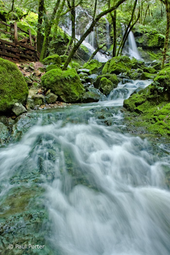
Cataract Catwalk” by Paul Porter
This week’s photograph was made by Paul Porter at Mount Tamalpais State Park, north of San Francisco. While last week’s image was a model of simplicity, this scene is much more complex, with cascades, rocks, trees, and the boardwalk railing. I think Paul did a great job of integrating all those elements together and creating a strong composition.
The foreground water is the dominant feature—it fills up almost half the frame. The converging lines of the stream point toward the waterfall at the top, leading our eyes there and creating a nice near-far juxtaposition. That prominent foreground and it’s leading lines hold all the complex elements of the scene together and make a coherent statement out of what could have been a visual mess.
The walkway railing is a man-made object in an otherwise natural scene, and it’s color, lines, and shapes are different from everything else in the frame. Yet despite all that it’s fairly unobtrusive, and you could even make an argument that it adds interest and a human element, allowing viewers to imagine that they could be part of this scene.
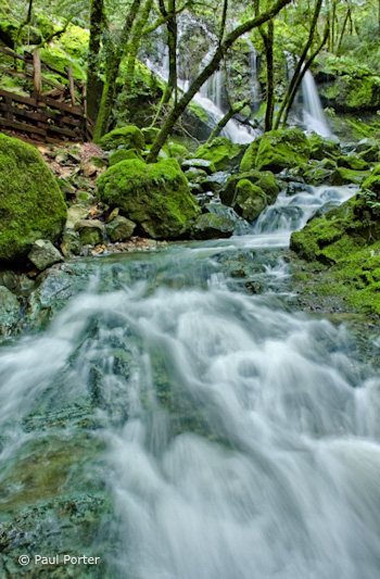
One thing that does bother me slightly is the tree trunk in the upper-right corner. Any object that lives on the edge like this can be distracting, and it’s worse if it’s partially cut off—that is, not completely in the photograph or out of it. In this case it’s easy to crop a bit off the right side and eliminate it, and I’ve uploaded another version to show what that looks like. I also trimmed a little off the bottom as well, as after cropping the right edge the bottom of the image seemed a bit too elongated.
Right and bottom edges trimmed
The focal length was 18mm on an APS-size sensor (equivalent to about 28mm on a full-frame sensor). Since wide-angle lenses like this include so much of the scene, it’s easy to allow extraneous elements to creep in and clutter up the image, and it can be challenging to keep the compositions simple. But the strength of short focal lengths is creating the kind of near-far juxtaposition that we see here. Wide-angle lenses make distant objects seem smaller, thereby exaggerating the apparent size difference between near and far, and creating an illusion of depth.
There are two keys to creating that sense of depth with a wide-angle lens. First, you have to put the camera close to something in the foreground—usually no more than five feet away—otherwise everything will look small and distant. Second, you need to keep everything in focus. Paul did both of those things here: the foreground rocks and water appear to be less than three feet from the camera, and everything looks sharp, at least in this small enlargement. Even though this image isn’t the kind of sweeping grand landscape we usually associate with that near-far juxtaposition, there’s a palpable sense of depth and distance between the rocks and water at the bottom of the frame and the trees and fall near the top. You almost feel as though you could walk—or rather wade—into this scene.
Telephoto lenses do the opposite—they compress space and make objects look closer together than they really are. This is great for creating patterns, as you can bring similar lines and shapes into close visual proximity even when they’re physically far apart. From this spot, for example, you could use a longer focal length to zoom in on the trees and waterfall and the top of the frame, working with the patterns created by the trunks and strands of water.
The soft, overcast light was a perfect complement to this scene. Sunlight would have been a contrasty nightmare. Aside from creating severe exposure problems, splotchy highlights and shadows would have added complexity and confusion. Even with the overcast conditions Paul said that he needed to blend two exposures together in Photoshop, since the upper falls were quite a bit brighter than the shadier foreground. This post-processing looks very well done. The merge is seamless—you’d never know that two images had been combined. (I discuss exposure blending in my Digital Zone System article for Outdoor Photographer, and in more detail in my Digital Landscape Photography book.)
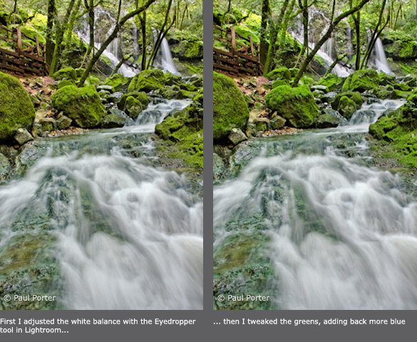
The overall contrast and saturation look great. In fact Paul said that he reduced the saturation in some areas after some of the adjustments he made “created a little undesired over-saturation.” The only thing I could quibble with about the processing is the white balance, which to me looks a little blue. This is especially noticeable in the water. To correct this, I used the eyedropper tool in Lightroom and clicked on the water to make it neutral. This worked well for the water, but made the greens a bit too yellow for my taste, so I tweaked the greens to push them closer to their original color. Here are both of these versions for comparison.

Paul used a shutter speed of 1/2 second for both exposures. This looks about right—slow enough to give the water that silky, flowing look, yet fast enough to prevent the water from losing all texture. There’s a nice contrast between the smooth water and the rough textures of the mossy trees and rocks.
Overall this is very well done—nicely composed, technically well-executed, and skillfully processed.
Thanks Paul for sharing your image! You can see more of his work on Flickr.
If you’d like your images considered for future critiques, just upload them to the Flickr group I created for this purpose. If you’re not a Flickr member yet, joining is free and easy. You’ll have to read and accept the rules for the group before adding images, and please, no more than five photos per person per week. I’ll be posting the next critique on April 20th or 21st. Thanks for participating!
by Michael Frye | Apr 11, 2010 | Travels and Stories

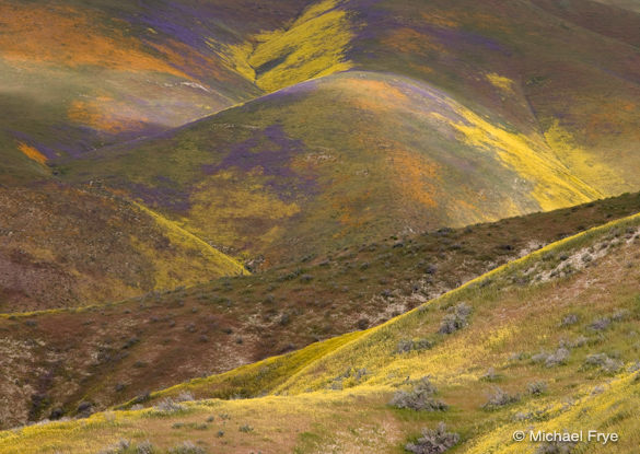
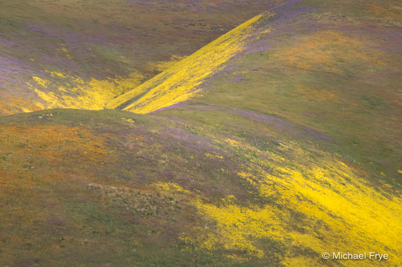
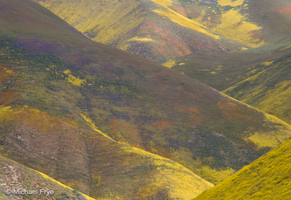
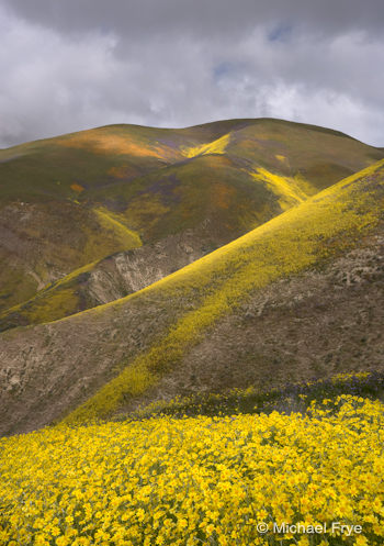
Painted hills in the Temblor Range
Yosemite is a beautiful place, a gift to the eyes, but sometimes I must vary my visual diet. Hearing reports of great wildflowers from the Temblor Range, on the edge of Carizzo Plain National Monument, I tried to get away to photograph the area, but deadlines and obligations kept me home. Finally last Friday I was able to escape for one night. Arriving at the Temblors in the afternoon I saw vivid patches of yellow, orange, and purple flowers on hillsides high above. Somehow I had to get up there.
Luckily I’d photographed this area in 2006 (you can see a photo on my other blog), so I knew a route that led to one of the best-looking spots. The ascent was steep, and got my heart and lungs working, but it wasn’t difficult. I flushed a bobcat out of some tall grass half way up. About 1200 feet above the valley floor I reached the area with the densest flowers.

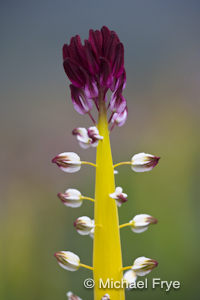
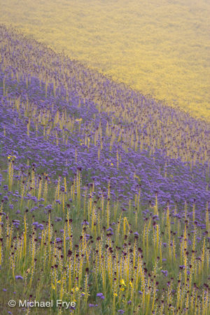
When you see distant patches of yellow, orange, and purple in southern California during spring, you assume you’re looking at goldfields, poppies, and lupine. But that’s not what I found. These gardens contained yellow hillside daisies, orange San Joaquin blazing stars, and purple phacelia, plus dense fields of desert candles. The flowers often grew in pure stands, devoid of grass—a splash of yellow here, purple there. It looked like someone had dripped paint on the hills.
Everywhere I turned another photograph demanded to be taken—and another, and another, and another. I circumnavigated a small, steep draw packed with flowers, photographing it from every angle. I tried to capture layers of desert candles mixed with phacelia. Forced down by gathering darkness I still couldn’t resist photographing yet another colorful hillside across the canyon, making 30-second exposures in the gathering gloom, finally reaching the car in the dark.
The next morning I was surprised to see fog. I had intended to climb that hill on the opposite side of the canyon, the one I’d photographed at dusk, but wondered if that was still a good idea. After mulling my options over breakfast I decided to stick with the plan; maybe the flowers would look interesting through the mist.

The fog wasn’t too thick at lower elevations, so it was easy to find the correct ridge to climb. Higher up the fog got thicker. At a misty knoll I faced a decision: should I follow the ridge as it angled to the left, or cross a gully and go straight ahead? Knowing that the best flower patches were somewhere to the left, I decided to follow the ridge. After a while I butted up against a barely-visible hillside draped in orange, yellow, and purple. Somehow I’d stumbled into the exact right spot.
The fog was too thick to photograph anything more than a few feet away, so I concentrated on closeups. Occasional rifts presented tantalizing views of colorful hillsides. Gradually the rifts lengthened, allowing photographs of more distant scenes.
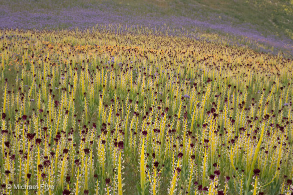
I climbed up and down the hills, looking for every possible angle. I found the mother lode of desert candles—acres of them. This area, which didn’t look as spectacular from below as the spot across the canyon, turned out to be even richer photographically.
The flowers were just on the far side of their peak, and I knew I wouldn’t be able to return before they faded, so it was hard to tear myself away, but eventually I had to start walking down. Even on the descent I saw fantastic compositions that demanded stops; in fact the image at the top of this post was one of the last ones I made. I’m glad I cut the chains to my desk, even for one night—it was easily the most spectacular wildflower display I’ve ever seen or photographed.
Abstract expressionist painting
Dense patch of desert candles
Sun breaking through the fog
by Michael Frye | Apr 7, 2010 | Critiques

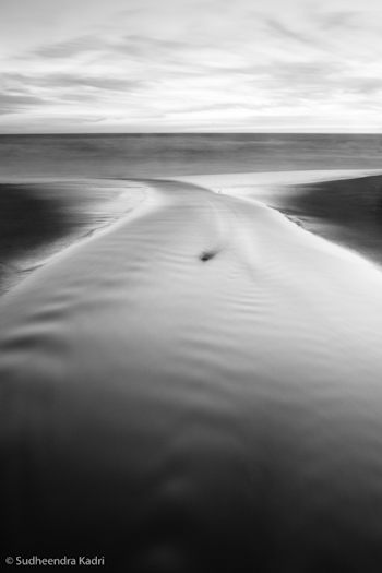
“Outward Momentum, Panther Beach, Davenport, California” by Sudheendra Kadri
This week’s image, by Sudheendra Kadri, was made at Panther Beach in Davenport, California (just north of Santa Cruz).
What initially caught my eye was this photograph’s zen-like simplicity. The entire image consists of only a few lines and shapes. The dominant visual element is the curving X of the stream, resembling a whale’s tail, which in turn is flanked by two triangles of darker sand, then topped by a band of water and lighter expanse of sky. The small dark rock in the center of the frame could be a distraction under different circumstances, but here I think it’s a nice touch, adding a subtle focal point.
In photography, less is usually more, and this image provides a great example of that. The simple, graphic design grabs our attention in a way that more cluttered compositions don’t. But simplicity isn’t simple—in fact it’s quite difficult. The universe wasn’t constructed with photographers in mind; much of the time the world seems to consist of random clutter, with bits of junk and debris thrown in for good measure. The photographer’s job is to find order within that chaos (to paraphrase Robert Glenn Ketchum), to see designs and patterns in the random configurations of the universe.
I talked about seeing abstractly—focusing on lines, shapes, and patterns, rather than thinking about the subject—in my critique from March 24th. I also discuss this in my Digital Landscape Photographybook, and in every workshop I teach. I must think it’s important! Sudheendra said on Flickr, “The way this stream turned sharply before meeting the oncoming waves caught my eyes and I thought this would bring some nice curves and lines into this frame.” So clearly he was thinking abstractly, and that mindset allowed him to see the potential of this scene.
This image’s simple design could only have been created from a particular point of view, which looks like it was the middle of the creek! I asked Sudheendra about that and he confirmed that, yes, he was standing in the water. I guess photographers sometimes have to sacrifice for their art.
The dusk light allowed a 30-second exposure that smoothed the foreground water, giving it that porcelain glow and increasing the level of abstraction by lessening the water’s texture. That soft, glowing, dusky light can be effective for many subjects; the great John Sexton seems to use it almost exclusively.

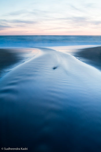
Sudheendra wrote on Flickr, “Shot after sundown, initially I liked the blue-hour colors, but once I saw how it looked in black and white, I wanted to stick with it.” I think that was a key decision, and a good one. Here you can see the color version that Sudheendra sent me for comparison (I added a little contrast to the file to make it closer to the black-and-white version). While the blues and pinks have some appeal, to me the black-and-white image is stronger. By taking away the color the image becomes that much more abstract, focusing our attention on just the lines and shapes, and emphasizing the strong design. We also notice the glassy texture of the foreground water more.
Even if you intend to make the final image black and white it’s usually better to capture the image in full color, as this gives you more options for making that conversion and translating the colors into shades of gray. (With Raw files that’s the only choice—they’re always in color—but some cameras can process JPEGs into black and white.)
Starting with that color image you can use the “Grayscale Mix” in Lightroom or Adobe Camera Raw, or a black-and-white adjustment layer in Photoshop, to alter the tonal relationships between different colors. A classic example is a red apple next to a green apple. A straight black-and-white conversion would make both apples appear medium gray. By adjusting the Grayscale Mix you can make the red apple lighter and the green apple darker, or vice versa. In this “Outward Momentum” photograph, lightening blues would make the foreground water a lighter shade of gray, while darkening magentas would lower the tones of the sky near the horizon. (I discuss these concepts in more detail in my Digital Landscape Photography book.)
But before making these adjustments you have to decide when to convert an image to black and white, and when to leave it in color. Any photograph that lacks color to begin with—a snow scene, or gray tree trunks against gray rocks—is a good candidate for black and white. But other situations are less obvious. To me the question to ask is whether color is adding to photograph’s message and mood, or distracting from it.
In Sudheendra’s photograph, although the original colors are interesting, it turns out that they actually take attention away from the strong, abstract design, which is really the point of the image. As a contrary example, my photograph from Tunnel View that I posted on this blog on February 9th, isn’t particularly colorful, so I tried it in black and white, but decided that the subtle colors, particularly the gold hues in the clouds, actually enhanced the mood, so I kept it in color.
Overall Sudheendra’s photograph is very well done. The only improvement I can think of is to darken the sky a bit, especially near the top, as it’s a bit bright and tends to pull the viewer’s eye out of the frame. But that’s a small thing.
Thanks Sudheendra for sharing your image! You can see more of his work on Flickr.
by Michael Frye | Apr 6, 2010 | Yosemite Photo Conditions
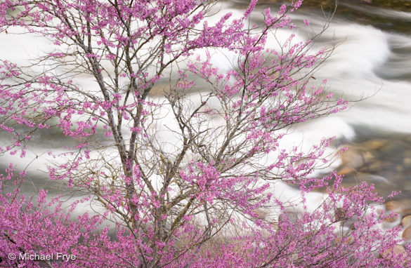
Redbud and rapids along the Merced River, April 5th, 2010
Just a quick note to let you know that the redbud in the Merced River Canyon west of Yosemite are at about peak right now. A few have begun to leaf out, but most are prime. I expect they will remain in good condition for the next week or so, but after that will start fading quickly.
by Michael Frye | Apr 1, 2010 | Critiques

Sorry I’m late posting this—I’ve been chasing flowers. Hope this is worth the wait!
Before I start I’d like to once again thank all of you who have submitted photographs for this critique series. You’ve added many outstanding images in the collection—I wish I had time to write about all of them.
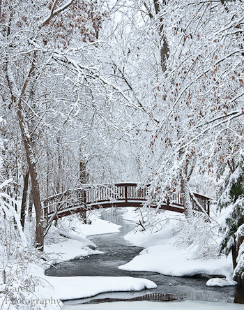
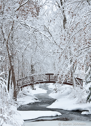
This week’s image, by Garen Johnson, was made near his home in Kildeer, Illinois, a Chicago suburb, after a late-February snow-and-ice storm. The snowy trees, bridge, and winding creek made great subjects for a photograph, and I can certainly see why Garen wanted to capture this image.
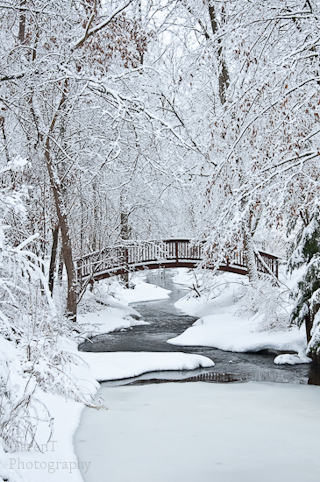
The composition is nicely arranged. The meandering creek, bridge, and overarching trees all seem well balanced within the frame. Garen sent me the original, uncropped version, which I’ve displayed below. You can see that he trimmed a little off the top and left sides, eliminating some slightly messy and distracting branches. He also cropped the bottom to reduce the big expanse of blank ice. That was a good idea, but I think he might have gone a bit too far; I’d prefer to see just a bit more space below a key feature like the reflection of the bridge. I’d also crop the right side a little as well; the tree trunk along the bottom half of the right edge is darker than anything else in the photo, so it’s a bit distracting. I show my preferred crop below as well.

While all that cropping is relatively minor, it’s always better to frame as precisely as possible in the camera so that you’re not throwing away too many pixels and reducing resolution.
Garen wrote on Flickr that he wished the reflection of the bridge were bigger, but it was blocked by the ice at the bottom of the frame. I actually love that little hint of a reflection—it’s a nice, subtle detail that doesn’t leap out at you right away, yet adds a lot to the image once you see it. A full reflection of the bridge might have seemed a bit too cliché.
Garen told me that “the light was terrible that day, it was completely overcast with complete cloud cover.” He was hoping for some sun to bring out “shimmering reflections” from the icy trees. I’m not so sure sunshine would have improved this image. Sunlight filtering through the trees would have created random splotches of sun and shade, adding complexity and confusion. If the spots of light struck just the right places that might have worked, but the odds were against that. This soft, even lighting helped to simplify the composition, and contributed to the quiet, peaceful, wintry mood.
I talked about mood in my critique ofSteve Deligan’s dramatic image from March 17th. This week’s photograph effectively conveys a completely different feeling. Drama isn’t essential for conveying mood—sometimes a solo flute can be as powerful as a whole orchestra.

It’s worth taking a moment to look at the elements that contribute to the mood of this photo. Weather is certainly one of them—the snow and ice speak clearly of winter. The laden trees, the lack of footprints or other signs of people, the squiggly line of the creek, the calm reflections, and the muted color palette all convey quiet and serenity. We see vertical, horizontal, curved, and diagonal lines in the frame. Vertical and horizontal lines suggest stateliness and calm, while diagonals are energetic, and curved lines add rhythm and flow. All those fit with the mood here except the diagonals, but luckily they’re not too overwhelming, and most of them are at least slightly bent.
The exposure looks perfect—the snow appears white, but not washed out. The overall contrast seems just right. The color balance is just a tad blue, which helps convey the cold, but I’d prefer to have the snow neutral in this case, which would make the whole image a little warmer. This could also look great in black and white.
Garen said that he couldn’t use a tripod because he had little time and the “snowplows were on my heels.” Since he needed to keep the shutter speed fairly quick to avoid camera movement, he used a medium aperture—f/8—and consequently didn’t get as much depth of field as he would have liked. To me things look pretty sharp overall, even when viewing a larger version. Although some of the branches in the lower-left corner, the ones closest to the camera, are a bit soft, that minor problem doesn’t detract from the message of the photograph.
Garen told me that, “What I learned most is to shoot it anyway; had I not shot that day because of the ‘bad’ light, or snow plows or lack of tripod, I would never have taken this one…” And that’s a great lesson. I’m glad he captured this, despite the problems he encountered.
Thanks Garen for sharing your image! You can see more of his work on Flickr.
If you’d like your images considered for future critiques, just upload them to the Flickr group I created for this purpose. If you’re not a Flickr member yet, joining is free and easy. You’ll have to read and accept the rules for the group before adding images, and please, no more than five photos per person per week. I’ll be posting the next critique on April 6th or 7th. Thanks for participating!

