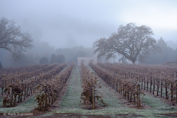
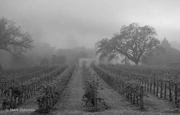
“Fog Shrouded Merlot” by Mark Zukowski
This week’s photograph was made by Mark Zukowski in Sonoma County, California. By having his image chosen for this critique Mark will receive a free 16×20 matted print from Aspen Creek Photo. If you’d like your images considered for future critiques you can upload them to the Flickr group I created for this purpose.
Mark made this image at his own vineyard. Nice place! Finding photogenic areas near your home can reap rewards, allowing you to take advantage of fleeting weather conditions. Mark did that here, using the fog to create a wonderfully moody photograph.
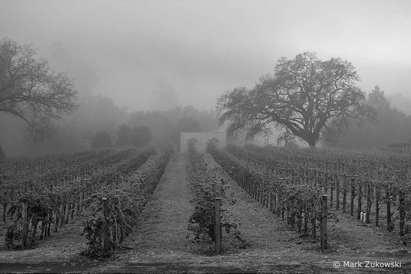
This image was originally captured in color, in Raw. Mark said he initially struggled with the white balance, and that’s one of the reasons he tried converting this to black and white. Here’s the color version, and I see what he means about the white balance: something seems off about the color, although it’s hard to pinpoint whether it’s color temperature or camera calibration. But even if the color could be improved this photograph would still be better in black and white. The slightly warm-toned monochrome treatment adds to the mood and gives the image an old-world feeling that seems appropriate for this setting.
I like the way the rows of grapevines lead my eyes right to the building in the background. The craggy oak right of center has a great shape, and adds an interesting focal point. Overall the composition works well.
One thing that bothers me however is the patch of dark ground at the very bottom of the frame, as it draws my attention away from more interesting things above. Trimming this edge a bit to eliminate the darkest patches of ground seems to help:
After trimming the bottom edge
We see only part of the tree along the left side, and that’s normally a problem, as prominent elements like this can become distracting when hanging along the edge. Here though that tree seems to work, as it adds an echo to the tree right of center, and cropping it out leaves the left side of the picture somewhat empty.
But perhaps this might have worked even better if Mark had included all of that left-edge tree, creating even stronger repetition between the shapes of the two oaks. Of course there may have been some distracting element just outside the picture that prompted Mark to frame the image this way. Even if there wasn’t, including all of that left-hand tree would have required zooming out and adding either more sky or more foreground, neither of which would be desirable. But cropping into more of a panoramic shape probably would have solved that.
Another idea would have been stepping further to the left, which would have brought the two trees closer together visually. From a certain angle the building could have been neatly framed between the two trees. Of course moving to the left would have changed the alignment of the grapevines, so instead of leading our eyes right to the house they would lead toward the trees left of the house. Another issue is that, as we see it now, the tree right of center stands out clearly against a lighter background; there seems to be a small gap in the trees behind it, allowing lighter fog to show through. Stepping to the left probably would have positioned that tree against the darker vegetation that we now see on the right edge of the frame. So maybe moving to the left wouldn’t have worked, but it’s always worth thinking about different camera positions when you’re there, behind the camera, and have a chance to improve the composition.
Mark used a 70 mm lens on a Nikon D700, giving the image a short telephoto perspective with this full-frame sensor. The exposure was 1/125 sec. at f/5.6 with 200 ISO. This is a pretty wide aperture, and while everything appears looks in focus at this small size, a bigger enlargement might reveal softness in the foreground or background. A smaller aperture, like f/11 or more, might have been a better choice to expand the depth of field and ensure that everything was in focus. Of course this would have required a slower shutter speed and necessitated a tripod.
The exposure and contrast look just right. The sky in the upper-right corner is the brightest part of the scene, but not really where you want people to look most, so that area should probably be darkened a bit.
But overall this photograph is very well done. It has a great mood, enhanced by the warm-toned black-and-white treatment. If you communicate a feeling, you’ve done your job as a photographer.
Thanks Mark for sharing your image! You can see more his work on Flickr.
If you like these critiques, share them with a friend! Email this article, or click on one of the buttons below to post it on Facebook or Twitter.
As part of being chosen for this week’s critique John will receive a free 16×20 matted print courtesy of the folks at Aspen Creek Photo. If you’d like your images considered for future critiques, just upload them to the Flickr group I created for this purpose. If you’re not a Flickr member yet, joining is free and easy. You’ll have to read and accept the rules for the group before adding images, and please, no more than five photos per person per week. I’ll be posting the next critique in two weeks. Thanks for participating!

