In the Moment:
Michael Frye's Landscape Photography Blog
by Michael Frye | Feb 24, 2010 | Critiques

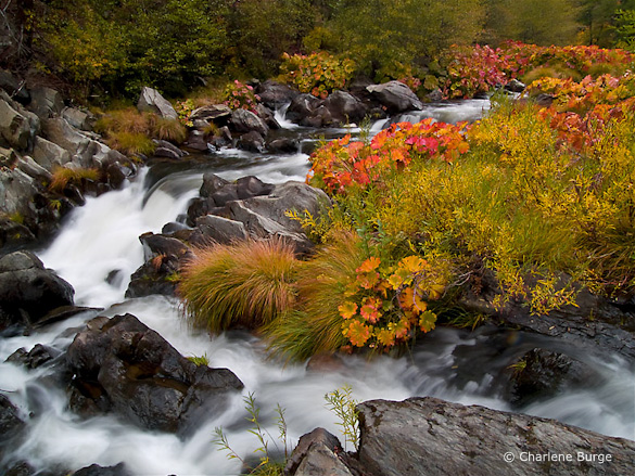
“A Walk Along the Cascades” by Charlene Burge
This week’s photograph, by Charlene Burge, is from the Plumas National Forest near the northern end of my home mountain range, the Sierra Nevada. The colorful plants along the creek are called wild rhubarb or Indian rhubarb. They’re found in a few places in and around Yosemite, but I was pleasantly surprised to discover this photo and see that they grow further north as well. It’s hard to tell from this image, but their leaves are quite large, sometimes more than a foot in diameter. Since they’re colorful in the fall, and grow along creeks, these plants make great photo subjects.
Color is one of the most appealing things about this image. The reds and oranges of the rhubarb draw the eye and contrast with the greens of the grasses and trees. The soft light of an overcast day worked perfectly for this subject. Sunlight would have been too harsh, creating bright highlights and dark shadows that would have overwhelmed the colors.
This seems counterintuitive to many beginning photographers—they assume that sunlight is a requirement for good photos, and that overcast is inherently dull. And that’s true for many subjects—the gray granite of El Capitan, for instance, seems lifeless on a cloudy day. But colorful subjects often look best with soft light. The even illumination gives prominence to color contrast rather than light-and-dark contrast.
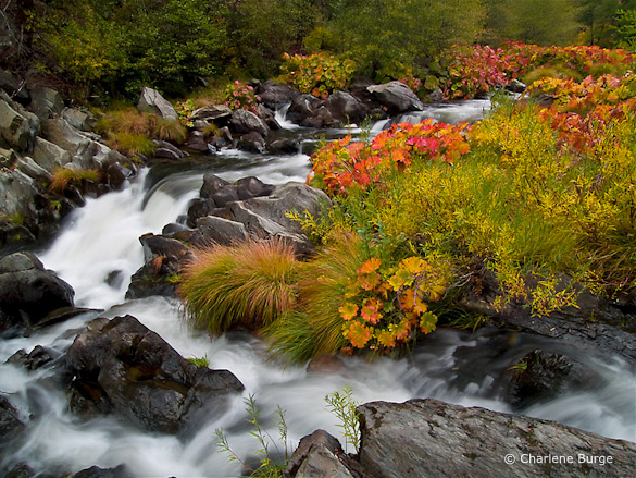
While we’re on the subject of color, the white balance looks good here—the rocks and white water appear neutral, and everything else is the appropriate hue, except perhaps the greens, which look a bit too red to me. Usually I see the opposite problem—greens that look blue-green. Here the greens are too warm, so they blend with the surrounding golds and oranges, and some of the natural warm-cool color contrast has been lost. I used Lightroom to remove some of that reddish tint in this next version. The difference is subtle, and takes a good monitor to see, but to me it’s significant.

With the greens adjusted to remove the reddish tint
This image was captured at f/22 with a 1/2 second shutter speed. These were appropriate choices for showing the movement of the water and getting enough depth of field to keep everything in focus. The blurred, silky look of the water creates a nice textural contrast with the rocks and vegetation. The largest cascade, however, near the middle of the frame along the left side, lacks definition—it’s mostly the same shade of white. I might have tried a slightly faster shutter speed, like 1/4 sec. or 1/8 sec., to try to keep more texture in that area without losing the flowing appearance of the water. Of course that would have required opening the aperture to f/16 or f/11, creating possible depth of field problems, or using a higher ISO, which would have added noise. In photography, everything is a compromise.
The two branches of the creek form a nice semi-circular shape and give the image structure. The top and right edges of the frame seem well placed. The lower-left corner, however, is troublesome. Bright areas along the edge of a photograph are often distracting, and here the white water in the lower-left corner pulls my eye out of the frame and away from the main centers of interest.
But having identified this problem, there may not have been a solution. Charlene told me that she couldn’t include anything to the left because she couldn’t hang out further over the water. I’m guessing that intervening vegetation blocked the view. Even if she could have pointed the camera down and to the left more, the creek obviously continues in that direction, and white water would have touched the edge of the frame somewhere. In those situations I try to put dark rocks along as much of the edge as possible, but sometimes there’s no perfect solution.
These dilemmas are common in landscape photography. A subject catches your eye, yet somehow it defies your attempts to make a clean composition. Some annoying, distracting element can’t be eliminated without losing an essential component of the scene.
Most of my best photographs have practically composed themselves; the right framing was immediately obvious. When I struggle with the composition I rarely like the end result. But there are exceptions, situations where I’ve worked with a subject for half an hour and finally found a good solution. And even if it doesn’t work I often learn something in the process. So it’s worth the effort, even if resulting image isn’t successful.
In researching my most recent book I found this quote from Ansel Adams: “I have found that when I have to labor over a composition I seldom achieve anything worthwhile.” So even the great Adams faced the same problem!
With the composition we see here, the only thing that might help prevent the eye from leaking out of that lower-left corner is to darken the water a bit, and I’ve done that in this next version. For good measure I also darkened and added contrast to that cascade near the middle-left edge to try to bring out more texture. I can’t say these changes made a big difference, but every little bit helps.

Water along the left side darkened, plus more contrast added to the large cascade
Despite my nitpicks this is a pleasing photograph of an intimate landscape. It makes me wish I had been there.
Thank you Charlene for sharing your image! You can see more of her work on Flickr.
If you’d like your images considered for future critiques, just upload them to the Flickr group I created for this purpose. If you’re not a Flickr member yet, joining is free and easy. You’ll have to read and accept the rules for the group before adding images, and please, no more than five photos per person per week. I’ll post the next critique on March 2nd or 3rd. Thanks for participating!
by Michael Frye | Feb 21, 2010 | Yosemite Photo Conditions
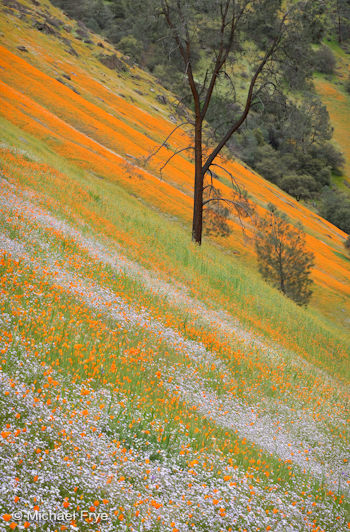
Poppies, tri-colored gilia, and a gray pine, March 2009
After a long dry stretch we’ve encountered some wet weather. Rain fell yesterday, and a more significant storm arrived today. This one is cold enough to produce snow in Yosemite Valley. The storm is predicted to end tomorrow morning, and whenever a system like this breaks there’s a chance of seeing classic Yosemite clearing storm conditions. The forecast calls for “unsettled” weather the rest of the week.
A reliable source—namely my frequent workshop assistant Mike Osborne—told me that some poppies, along with a few other flowers, have started to bloom in the Merced River Canyon west of Yosemite. Last year, of course, was a fabulous year for poppies, the best I’ve seen in over 25 years. While it’s unlikely that this year will be as spectacular, we could still have an above-average season since last year’s poppies must have left a lot of seeds, and the ash deposited by the Telegraph Fire of 2008 may still provide left-over benefits. On the other hand, the grass is already quite high and may crowd out the flowers.
I just returned from the NANPA (North American Nature Photography Association) Summit in Reno, Nevada. We heard some great speakers—for example, check out Wild Wonders of Europe, the amazing project co-founded by Friday morning’s keynote speaker, Staffan Widstrand of Sweden.
But the best part of the conference was simply connecting with other photographers. Gary Crabbe told me the astounding story of his freakish accident last year. He literally fell off a forty-foot cliff in the dark. Jed Manwaring entertained us with tales of assisting high-powered advertising photographer Jim Sugar. I traded books with Brenda Tharp and Stephen Ingram, exchanging my new book, Digital Landscape Photography, for an advance copy of the revised edition of Brenda’s (deservedly) popular Creative Nature & Outdoor Photography, and Stephen’s beautiful Cacti, Agaves, and Yuccas of California and Nevada.
But aside from the camaraderie and book trades, I learned a lot. I think we sometimes underestimate the vast knowledge of our fellow photographers. They’re the ones who can get beyond the theories and tell us their practical experiences with equipment and locations. Fellow professionals can help us avoid book contract pitfalls or hassles with permits at a national park. I learned a lot from discussions with other pros about voice-recognition software, something I’ve been trying lately. (If you’re interested in this topic, here’s a great video blog about it.)
Gordon Illg and I had an interesting discussion about why we go to the NANPA Summit. He told me that at his first Summit he had all these plans for meeting editors and photo buyers and showing them his portfolio. Then after a couple of years he stopped trying so hard to make connections and sales, and as a result enjoyed himself more and made more connections and sales. I told him I had the same experience. Once I relaxed I met lots of interesting people. Some were photo buyers, but most were other photographers. And it’s really those connections with my peers that have been the most valuable, that have really helped my photography and enriched my life. There’s nothing like talking to real people face to face, especially those you have something in common with. Social networking started long before the internet.
by Michael Frye | Feb 17, 2010 | Critiques

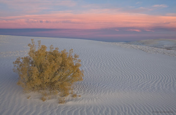
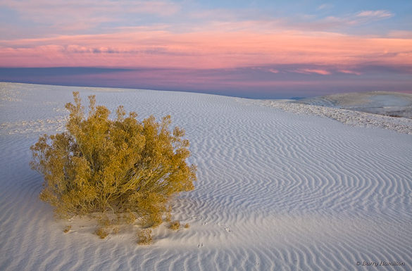
“Scrub, Before the Dawn” by Barry Hamilton
This week’s photo, by Barry Hamilton, is from White Sands National Monument, New Mexico. It features a simple, strong composition, with a clear focal point—the bush. That bush is too near the left edge of the photograph to qualify for the rule of thirds, but I think it works because it’s balanced by the ripples in the dune and the pink clouds. Yet another successful violation of the rule of thirds!
The pre-dawn glow is beautiful. Even though the sun wasn’t up yet, the light has a strong direction from the right, bringing out the texture of the dune. (Soft light with direction is one the subtleties I talk about in this article from Outdoor Photographer.) The pinks, golds, and blues form a pleasing color palette. Viewed larger you can see some nice details, like the animal tracks in the sand.
Barry says he found this shrub while scouting the day before. In my critique from two weeks ago I talked about the importance of flexibility, of adapting to conditions when the light and weather don’t meet your expectations. But that doesn’t mean you shouldn’t plan; planning and scouting are still vital components of landscape photography. The more intimately you know a location, the better your photographs will be. When traveling I’d rather spend two weeks in one area, getting to know the best viewpoints and understanding how the light changes, than spend two days apiece in seven different spots.
Technically this photograph is well executed. The contrast in this scene was low, so that made the exposure easy. There’s a lot of depth—the bush was only a few feet away from the camera—but everything appears to be in focus. That seems surprising, since the aperture was only f/9, but Barry told me that he took three frames, each focused at different distances, and blended them together in Photoshop to get the necessary depth of field.
This is a technique I use fairly often when I can’t get everything in focus with my smallest aperture. But with a wide-angle lens like this (28mm), properly focused, it should have been relatively easy to get enough depth of field at a small aperture like f/22. I can only guess that Barry was concerned that his lens wouldn’t be sharp at its smallest opening. Small apertures can cause diffraction, and a theoretical softening of the image. But I don’t believe theories unless I’ve tested them myself. I haven’t used Barry’s lens, a Canon 24-105mm f/4L, but with my 17-40 f/4L and 70-200 f/4L lenses I’ve found that while the center is sharper at middle apertures like f/8 and f/11—which fits with the theory—the corners are much crisper at f/22. So I’d rather sacrifice a little bit of sharpness in the center to gain a lot at the edges. Portrait photographers may not care about corner detail, but landscape photographers should. It’s important to test your equipment under conditions that are typical for you and the type of images you make.
One thing that struck me immediately about this photograph is that it looks flat—that is, lacking in contrast, especially in the foreground. Raw files often seem rather dull at first. (This is an issue I address in my Zone System article for Outdoor Photographer.) Here’s another version where I increased the contrast and lightened the foreground. The added contrast incidentally boosted the saturation as well.

Modified version with the contrast increased and foreground lightened
I also warmed up the color balance slightly, but not enough to eliminate the blue tint in the shadowed sides of the ripples. Part of what makes this image effective is the color contrast between the warm yellowish tint of the bush and the cooler blues in the dune, and I didn’t want to lose that by completely neutralizing the tones of the sand. A neutral color balance is not always as expressive as one with a subtle tint.
Digital imaging has given us tremendous power and flexibility in processing our images and changing their appearance. Most people, if they set their minds to it, can learn the tools of Photoshop, Lightroom, Nikon Capture, or whatever software they prefer. I think it’s more difficult to know what to do with those tools—to find the right color balance, or know when you’ve added enough contrast, but not too much. Of course these things are subjective; there are no right or wrong answers. But I think it helps to gain a frame of reference by spending time in galleries and museums. Look at the contrast in prints by Edward Weston and Ansel Adams, or the treatment of color balance and saturation by a modern color darkroom master like Christopher Burkett.
Thanks Barry for sharing your photograph! You can view more of Barry’s work on Flickr.
If you’d like your images considered for future critiques, just upload them to the Flickr group I created for this purpose. If you’re not a Flickr member yet, joining is free and easy. You’ll have to read and accept the rules for the group before adding images, and please, no more than five photos per person per week. I’ll post the next critique on February 23rd or 24th. Thanks for participating!
by Michael Frye | Feb 15, 2010 | Yosemite Photo Conditions
In my post about Horsetail Fall from February 1st I said that the ideal scenario would include a stretch of warm clear days during the peak window of light. Well we’re in that window, the weather is warm and clear, and there’s plenty of water in the fall, so conditions are perfect. It looks like somebody’s going to get some good Horsetail photos this week. The one caveat is that clouds have partially blocked the light the last few evenings. Even with mostly clear skies, a few thin clouds to the west near sunset can dull the glow. Also, the same conditions that have been bringing lots of fog to the Central Valley can create low-hanging clouds along the ridges just west of Yosemite Valley, blocking the light late in the day.
This warm weather has encouraged some flowers to bloom in the Sierra foothills, but so far I haven’t seen or heard about any poppies. Normally I wouldn’t even be thinking about poppies this early, but last year I saw them blooming on February 21st. Of course, that turned out to be the best poppy year ever in the Merced River Canyon west of Yosemite (see my posts from February, March, and April of 2009), and it’s unlikely that will happen again this year.
by Michael Frye | Feb 12, 2010 | Advanced Techniques, Photography Tips
My latest article for Outdoor Photographer magazine, The Digital Zone System, appears in the March issue, which is just hitting newsstands and mailboxes now. Click here to read it online.
