In the Moment:
Michael Frye's Landscape Photography Blog
by Michael Frye | Jun 12, 2010 | Yosemite Photo Conditions
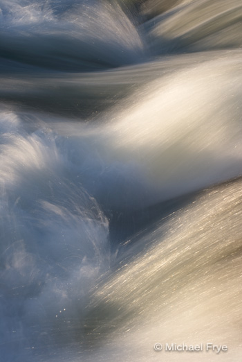 While the snow at high elevations in Yosemite is melting rapidly, there’s still plenty around,enough to keep the water flow high as it melts. While the snow at high elevations in forecast calls for warmer temperatures Sunday and Monday, so the water volume in Yosemite Valley should increase—maybe not to the level we saw last weekend, but close. After that, temperatures are supposed to cool down again, so that may be the end of the highest water this year, as most of the snow will be gone soon.
by Michael Frye | Jun 7, 2010 | Yosemite Photo Conditions
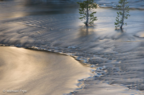
Flooded lodgepole pines along Tenaya Creek
My wife Claudia and I drove over Tioga Pass on Saturday, the first day the road was open this year. There’s a lot of snow up there! Patches of bare ground were scarce, and in some places the snow was still five or six feet deep. Tenaya, Tioga, and Ellery Lakes were still mostly frozen.
We arrived at our home-away-from-home, Murphey’s Motel in Lee Vining, at about 4 p.m. Around seven o’clock, as we drove back over the pass for some photography, we noticed that a large avalanche had covered part of a snow basin just east of Ellery Lake. We had both looked at that slope three hours earlier, and hadn’t seen evidence of an avalanche, so it had apparently fallen within that time.
All the snow was melting fast, and water was everywhere. I saw waterfalls I don’t remember seeing before, and innumerable creeks, streams, and ponds. Just above Tenaya Lake I found a spot where swollen Tenaya Creek had enveloped a stand of lodgepole pines, with the water reflecting a sunlit ridge above.
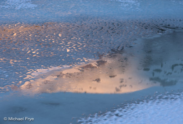
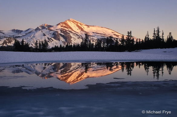
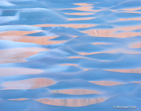
The next morning we rose early and drove up to Tioga Lake, where I photographed snowy peaks reflected in the partially frozen lake, and wonderful ice patterns near the shore. Of course I got too near the edge and received a boot full of water when one of my feet broke through the ice to the lake below.
With the opening of this road the Yosemite high country will be more easily accessible throughout the summer and fall, providing access to many great photo locations. But the snow and ice won’t last long.
We didn’t get into Yosemite Valley, but I’m sure it’s beautiful, with the waterfalls roaring and the meadows flooded. Did any of you make it into the valley this weekend?
Gaylor Peak reflected in Tioga Lake
by Michael Frye | Jun 4, 2010 | Yosemite Photo Conditions
Mammoth Peak from near Tioga Pass
Tioga Pass is scheduled to open tomorrow morning at 8 a.m. When it does, there should be lots of snow at higher elevations, creating some great opportunities to photograph snowy peaks and icy lakes.
The Glacier Point Road opened last Saturday, providing access to some of Yosemite’s best views, and the some of the prettiest meadows in Yosemite, like Summit, McGurk, and Westfall. These meadows should be sprouting corn lilies, which I wrote about on my other blog.
The National Weather Service has issued a flood watch for Yosemite Valley. They’re expecting the Merced River to crest above flood stage on Sunday and Monday mornings, and possibly Tuesday as well. This minor flooding shouldn’t impact travel, but means that the waterfalls will be roaring, and meadows will be partially flooded, creating nice reflecting ponds everywhere.
You can still find dogwoods blooming in Yosemite Valley, although they’re rather ragged. Although I haven’t had a chance to check them, the dogwoods at higher elevations should still be in good shape. My favorite place to photograph dogwoods outside the valley is in the Tuolumne Grove, where you can find them blooming next to giant sequoias.
Speaking of the high country, a space has opened up in my Hidden Yosemite workshop in July. This has always been a really fun class, featuring short hikes to some of the best locations near Tenaya Lake, Tioga Pass, Tuolumne Meadows. Click here for more information.
Melting Ice near Middle Gaylor Lake
by Michael Frye | Jun 3, 2010 | Critiques

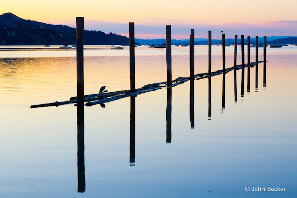
“SunriseSausalito” by John Becker
This week’s photograph was made by John Becker in Sausalito, north of San Francisco. By having his image chosen for this critique Brad will receive a free 16×20 matted print from Aspen Creek Photo. If you’d like your images considered for future critiques you can upload them to the Flickr group I created for this purpose.
The most striking thing about this photograph is the pattern formed by the vertical poles and their reflections. It reminds me of one of my own photographs that I made years ago in another part of San Francisco Bay. These old piers, pilings, and other harbor artifacts can often create interesting designs.

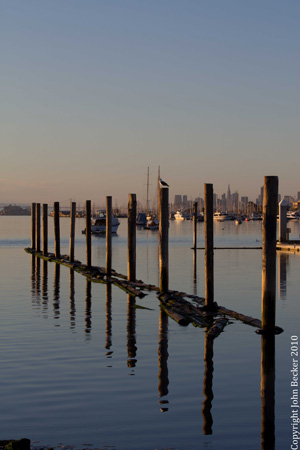
Another composition, made on the same morning, showing San Francisco in the background
John told me that he rose early to drive to this location, and immediately found these posts. He tried various compositions, including some that included the San Francisco skyline in the background (here’s one example), but found too many distractions in that direction. In the end he liked the photograph at the top the best, with the sunrise glow in the sky and without the city skyline.
I certainly agree with this choice. It might have been okay to include San Francisco in the background if there weren’t so many other distractions in that direction—namely all the boats. But what originally attracted John to this scene was the poles and their reflections, not the city. The image at the top, the one John preferred, shows that subject cleanly, with minimal distractions and beautiful light.
The silhouetted heron and gull add nice accents—especially that heron, which is perfectly positioned within the frame. It seems like a small thing, but I don’t think I’d like this photograph nearly as much without the birds. I also love how the reflections of the poles look like they’ve been sliced into little pieces near their tips.
By excluding the San Francisco skyline, John avoided a common photographic disease called “Adding On.” This virus infects photographers when they find an interesting subject or scene, but then say, “Oh, look at that—that’s interesting too. Oh, and I like that also. I wonder if I can fit all those things together in one photograph.” The resulting composition becomes cluttered, and the original idea—the inspiration for the photograph—gets lost and forgotten.
The cure is obvious—stick to the original idea. Ask yourself what caught your eye in the first place, then find a way to show that to it’s best advantage. And make your answer to this questions as precise as possible. In other words, instead of saying, “That tree,” say “The shapes of those branches,” or “The color of the moss on the trunk,” or “The way the light is shining through those leaves.”
John did the first part of that process well here. He was most interested in the poles and their reflections, so he concentrated on those, and resisted the temptation—at least for some images—to include the San Francisco skyline in the background. He found a nice balanced arrangement of the poles and reflections that included the birds and the nice pastel colors.
But there is still some background clutter in the top part of the frame. The distant boats and hills break up the clean lines of the poles and detract from power of all that repetition. Of course it’s hard to find a solution for this; to include the tops of the poles without also including the hills and boats would have required a higher vantage point, something that I assume wasn’t available.
But perhaps John could have gone further and asked himself what it was about those poles and reflections that attracted him. I can’t answer that question for him, but for me it’s the lines and patterns created by those poles and their reflections. I could add other things, like the birds, and the reflections of those pole tips, but they’re not essential.
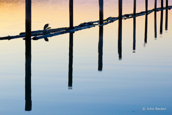
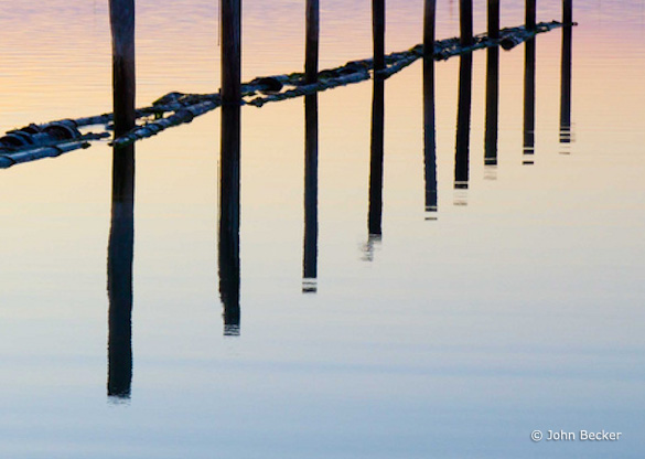
If you say it’s the poles and their reflections that are most interesting, then there’s no way to avoid the background clutter because you have to include each pole in its entirety. But if you say it’s the lines and patterns that are most captivating, then it becomes possible to show those, without including the boats and hills, by cutting off the tops of the poles. I’ve included a couple of crops that do just that.
Is it worth losing the tops of those poles, and the symmetry and balance they provide, to eliminate the background clutter? I think so, but I’m not sure—I’d have to live with these variations for awhile before making a final decision. The cropped versions are more abstract, which will appeal to some people more than others. The lack of a horizon is also somewhat disorienting, which could be intriguing or confusing, depending on your point of view. As always, I’d love to hear your opinions about this.

Crop A

Crop B
But regardless of which version you prefer, my point is that when you’re behind the camera you’ll create more options for yourself if you can be as specific as possible about what attracted you to a scene in the first place. By doing so you may find alternate compositions and approaches and that you wouldn’t have thought of otherwise.
Technically this photograph is well executed—the exposure looks perfect, everything appears to be in focus, and the contrast looks about right. John mentioned that he thought he added a bit too much saturation in this version he posted on Flickr, and in later versions backed off a bit. I’ll concur with that; it’s a fine line, but my first impression was that the saturation was a bit too high and unnatural looking.
An intriguing side note to this image is that John made it just after taking a two-day private workshop in Yosemite with my friend Mike Osborne. John rose early and went to Sausalito to try to take what he had learned from Mike and “do it on my own.” Mike is an excellent teacher who has assisted me in many workshops, and it looks like John learned his lessons well. (For what it’s worth, I didn’t know about this story until after I picked this image for the critique—John does not even have his last name on Flickr, nor would I have recognized it if he did.) Of course I also teach private workshops in Yosemite through The Ansel Adams Gallery.
Thanks John for sharing your image!
As part of being chosen for this week’s critique John will receive a free 16×20 matted print courtesy of the folks at Aspen Creek Photo. If you’d like your images considered for future critiques, just upload them to the Flickr group I created for this purpose. If you’re not a Flickr member yet, joining is free and easy. You’ll have to read and accept the rules for the group before adding images, and please, no more than five photos per person per week. I’ll be posting the next critique in two weeks. Thanks for participating!
by Michael Frye | May 20, 2010 | Critiques

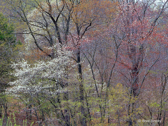
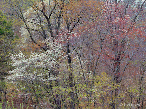
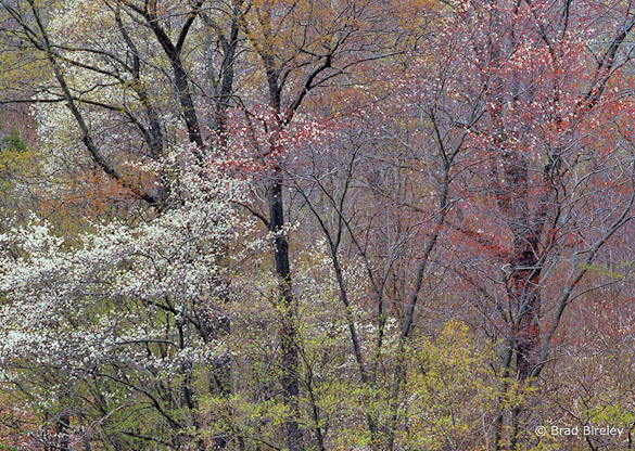
“Springtime in Potter County, PA” by Brad Bireley
Note: I’ve decided to do these critiques every other week from now on, instead of every week. I enjoy doing them, and they’ve been popular and well-received, but I’d like to devote more time to discussing other things that I think will interest you, the readers. Stay tuned!
This week’s photograph was made by Brad Bireley in Potter County, Pennsylvania. By having his image chosen for this critique Brad will receive a free 16×20 matted print from Aspen Creek Photo. If you’d like your images considered for future critiques you can upload them to the Flickr group I created for this purpose.
The soft light of an overcast day was perfect for this photograph. The even illumination helped simplify this complex scene, while sunlight would have created confusing splotches of light and dark. Soft light also helped bring out the beautiful, subtle colors. The varying shades of green, gold, red, and white create a pleasing and varied palette, with a nice warm-cool, red-green color contrast.
Overall the composition is well seen. Brad focused on the area with the most interesting color and texture. He put design before subject and didn’t feel compelled to include the tops or bottoms of the trees out of some misguided attempt to show the whole subject.
The lines of the tree trunks provide structure and prevent the image from becoming a random mish-mash of leaves. The thousands of tiny spots created by the leaves and blossoms add texture and another subtle, repeating pattern, almost like a pointillist painting.
Two small things, however, bother me about the composition. First, the branches in the lower-left corner are slightly out of focus, and their shapes don’t mesh with everything else. Luckily it’s easy to crop a little off the bottom of the photo to eliminate those branches.
The other problem is the bright patch of sky in the upper-right corner. Bright areas draw the eye, and this one pulls viewer’s attention away from all those interesting colors and textures and right out of the frame. Unfortunately, this patch of sky isn’t easily cropped, as trimming the top would also cut off some interesting forks in the upper branches of the left-hand tree.
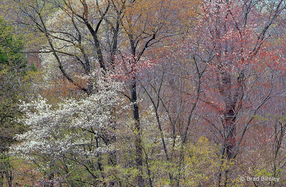
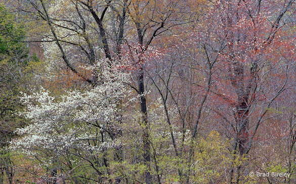
In search of a solution, I tried darkening the upper-right corner, and several different crops. At the end of this post you’ll find four alternate versions of this image. In version A I darkened the upper-right corner as much I could without making the image look fake and unnatural, but didn’t crop anything. In version B I trimmed a little from the bottom and just enough off the top to eliminate the brightest part of the sky. With C I lopped off all of the sky, and in D also cropped the left and right edges to fill the frame with texture.
I like tight compositions, so I’m partial to Version D, but honestly it’s a tough choice. Let me know what you think!
Technically this is well-executed: the exposure is perfect, and everything is in focus except the small vertical green branches in the lower-left corner I mentioned earlier. The overall contrast looks just right, with small areas of pure black and pure white, just enough to give the image some punch, but not enough to make it look harsh.
Brad said that he didn’t do much to the scan, perhaps adding a bit of saturation. I think a color balance adjustment would also help, as the image has slight blue/purple tint, visible in the branches on the right side of the frame. (I adjusted the white balance slightly in the versions below.)
Despite my nitpicking this is a beautiful photograph, with great colors and textures. Thanks Brad for sharing your image! You can see more his work on Flickr.
As part of being chosen for this week’s critique Brad will receive a free 16×20 matted print courtesy of the folks at Aspen Creek Photo. If you’d like your images considered for future critiques, just upload them to the Flickr group I created for this purpose. If you’re not a Flickr member yet, joining is free and easy. You’ll have to read and accept the rules for the group before adding images, and please, no more than five photos per person per week. I’ll be posting the next critique in two weeks. Thanks for participating!
—Michael Frye

Version A, with the upper-right corner darkened

Version B, with top and bottom edges trimmed

Version C, with the sky cropped out completely

Version D, a tighter crop
 While the snow at high elevations in Yosemite is melting rapidly, there’s still plenty around,enough to keep the water flow high as it melts. While the snow at high elevations in forecast calls for warmer temperatures Sunday and Monday, so the water volume in Yosemite Valley should increase—maybe not to the level we saw last weekend, but close. After that, temperatures are supposed to cool down again, so that may be the end of the highest water this year, as most of the snow will be gone soon.
