This week’s photograph was made by Ken Schram in Door County, Wisconsin. By having his image chosen for this critique Ken will receive a free 16×20 matted print from Aspen Creek Photo. If you’d like your images considered for future critiques you can upload them to the Flickr group I created for this purpose.
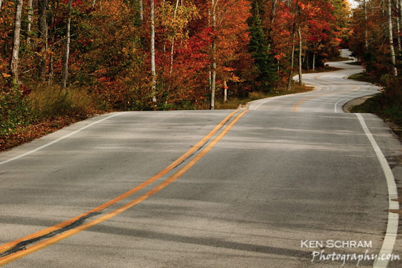
Wednesday was the autumn equinox, so it seems appropriate to show some fall color—in this case from Wisconsin. The photograph depicts the road leading to the Washington Island Ferry.
A twisting road like this is an irresistible subject. Most landscape photographers have probably tried to capture a similar view at one time or another—I certainly have. As you click the shutter you imagine the large checks that your stock agency will soon be sending you for licensing this classic stock photo subject… only to get jolted back to reality when you realize how many other curving road photographs are out there. But I digress…
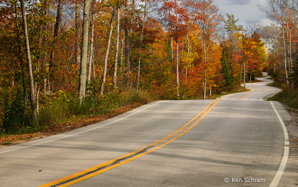
Ken said that with his 18-55mm lens (the only one he owned at the time) he couldn’t compress the curves. He meant that with a longer lens he could have zoomed in on the curviest section of road in the upper-right part of the image to emphasize the zigzags. So he decided instead to “take the viewer on a journey through the frame.” He cropped the photograph (you can see an uncropped, unprocessed version here) to eliminate the washed-out sky, and decided to “start the double-yellow line at the bottom-left corner so the eye would follow the road up to the upper-right third.”
In the original version, that large bright sky at the top of the frame pulls our attention away from the real stars of the scene, the road and fall color. So that sky either needed to be cropped, as Ken did, or darkened. Ken’s crop emphasizes the strong lines of the road and creates a clean, simple, and compelling composition with a crisp autumn feeling.
While I like the idea of cropping out the sky, I’m not sure about the double-yellow line meeting the corner of the frame, and about where the other lines of the road meet the edges of the photograph. If you’ve tried to capture this kind of subject you probably soon realized that the foreground presents a problem. The edges of the road have to enter the frame somewhere near the bottom, but where exactly? Should those lines touch the sides of the frame? The bottom? The corners? One edge on the side, the other on the bottom? And what about that center line?
While I try not to be dogmatic about any aspect of composition, I usually avoid making prominent lines meet the corner of the frame. I’m not sure why exactly, but a line touching a corner seems to divide the photograph awkwardly. And with a road image like this it usually works best to make the lines symmetrical—that is, have both edges of the road meet the bottom of the frame, both meet the sides, or, possibly, both meet the corners.
If you go to Flickr and search for “road” you’ll find examples of every possible composition: both edges of the road touching the sides of the frame, both meeting the bottom, one touching the side and the other the bottom, or one or more lines reaching the bottom corners. To me the most effective of these have that symmetry I was talking about—both edges of the road meeting the sides of the frame, or both meeting the bottom, and usually at about the same distance from the corner. But there are successful, asymmetrical exceptions. (There are also several photographs of the same stretch of road; see here, here, and here.)
Getting back to Ken’s photograph, to me this is a case where the double-yellow line coming out of the corner of the frame looks awkward. Also, the right edge of the photograph is cropped a bit too tightly. Looking at the original, uncropped version I can see that there was more space on that right edge. I’m guessing that Ken chose to trim that side to eliminate messy leaves and pine needles along the side of the road, but that made the white line almost touch the edge of the frame, and to me that feels too cramped.
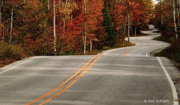
Given the short focal length lens he had to work with, I think Ken would have been better off standing closer to the center of the road and making both edges of the road meet the sides of the frame, and having the double-yellow line touch the bottom of the photograph. But with the camera position he chose, is there a better crop? I think so—here’s one example with the yellow line meeting the bottom of the frame. This tight framing highlights another problem though: where the double-yellow line crests the foreground hill it meets the edge of the road in the distance. Again, stepping to the left would have avoided this merger.
There’s also another option. The sky isn’t really washed out. It’s light, but has detail, and could be darkened. I did just that by taking the original, unprocessed version and using the Adjustment Brush in Lightroom with “Auto Mask” checked. I also added a slight overall S-curve to punch up the contrast, and trimmed the bottom edge. Including more of this now-darkened sky gives the image a more expansive feeling, like I’m taking that journey through the frame that Ken talked about.
Even though I like this version with more sky, I still think Ken might have been better off standing in the middle of the road. Well, the photograph might have been better, but his health might not!
This image is technically well-executed. Everything appears to be in focus, and the overall exposure looks just right. I think the contrast is a little too high in the finished image, making it feel a bit harsh. In my re-worked version with the darkened sky I added some contrast, but not as much, as I wanted to keep a bright, crisp, autumn feeling.
As always, I’d like to hear your thoughts. Which crop do you prefer? How do you feel about the contrast? And if you’ve tried photographing road scenes like this, how did you deal with the way the lines met the edges of the frame?
Thanks Ken for sharing your image! You can see more his work on Flickr, and on his web site.
If you like these critiques, share them with a friend! Email this article, or click on one of the buttons below to post it on Facebook or Twitter.
As part of being chosen for this week’s critique Ken will receive a free 16×20 matted print courtesy of the folks at Aspen Creek Photo. If you’d like your images considered for future critiques, just upload them to the Flickr group I created for this purpose. If you’re not a Flickr member yet, joining is free and easy. You’ll have to read and accept the rules for the group before adding images, and please, no more than five photos per person per week. I’ll be posting the next critique in two weeks. Thanks for participating!



Hey Michael!
I was searching for winding road photos for another project and found this photo. The funny thing is I recognized it immediately, because I go to Washington Island every summer and have since I was born. My father was born there and my family owns property up there.
I love the composition of your photos of this road in Gills Rock before the ferry. Just thought I’d throw that little tidbit of info in there and let you know I appreciate your site!
Glad you like this photo Andy. Just to clarify, this image was made by Ken Schram, but most of the other photos on this site are mine.
I really like the perspective!
Indeed – me too!