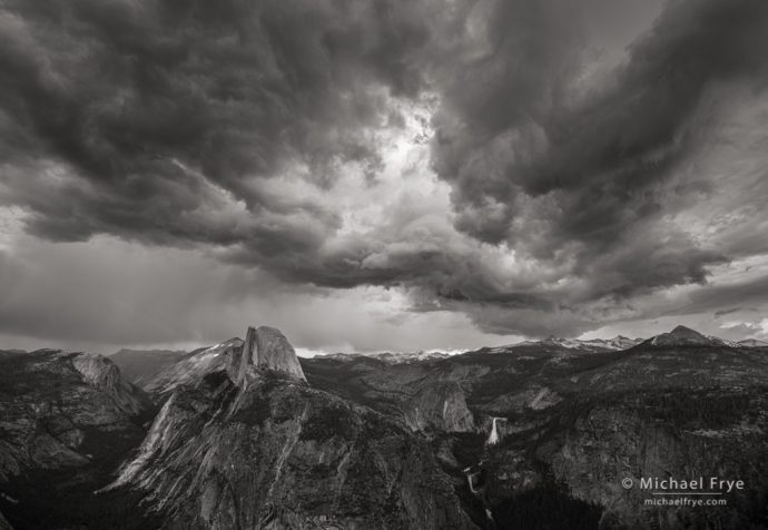
Storm clouds over Half Dome and Nevada Fall from Glacier Point, Yosemite
When we look at a photograph our eyes are usually drawn to light areas, bright colors, and contrast. Therefore I always try to avoid having bright spots, vivid colors, or anything contrasty and eye-catching along the edges of my photographs. I’d rather put the most visually-prominent elements closer to the middle of the picture, to draw the viewer’s eye into the frame, rather than out of it.
I was very conscious of that last Monday when composing the photograph above. Thunderstorms had formed over the Sierra crest, so Claudia and I drove up to Glacier Point, hoping to photograph some interesting weather. We arrived just as a thunderstorm was approaching from the northeast, bringing dark, dramatic clouds. There was no sunlight, but the sky had great textures, and lent a nice, stormy mood to the scene. I used my widest lens (16mm) to include as much of that brooding sky as possible.
The clouds were moving quickly from left to right, forcing me to continually adjust my composition to emphasize the most interesting arrangement of clouds at any particular moment. And among all the dark clouds there was a bright patch. I knew that bright spot would pull the viewer’s eye, so I pointed the camera up to avoid having that light area meet the top of the frame, and to leave a strip of dark clouds along the top edge. That bright patch of clouds serves as a visual focal point, drawing the eye up toward the sky (to me the most interesting part of the photograph), but not out of the picture.
Here’s another example, a sunset image from our recent trip to the Northern California coast. The sun and the sunlit reflections in the water catch your eye because they’re the brightest and most colorful parts of the photograph. The pyramid-shaped sea stacks and silhouetted trees also draw some attention because they have interesting shapes that contrast with their surroundings. But none of these things touch the edge of the frame, so your eye gets pulled into the picture. And I deliberately left a strip of dark rocks along the bottom, along with a band of dark clouds along the top, to hold your eye in the frame:
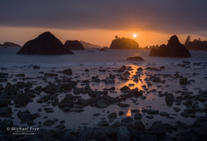
Rocky coast at sunset, northern California
This next situation was more troublesome. Sun was breaking through the fog in a redwood forest, and in some places I could see a white fogbow. I found this scene with a fogbow and sunlit redwood trunk, but the sun was also hitting the vegetation along the bottom of the picture:
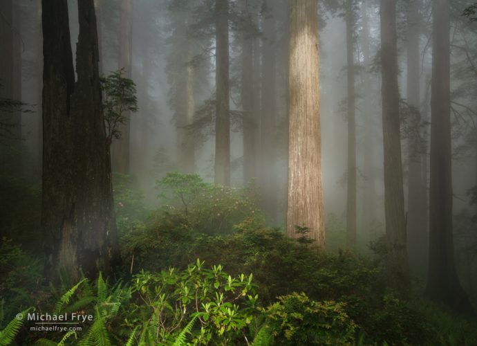
Fogbow in a redwood forest, northern California. The bright patch of sunlight along the bottom edge is distracting, and pulls the eye out of the frame.
Since that patch of sunlight extended all the way down to my feet there was no way to include a dark border along the bottom of the frame. So I took the picture anyway, and hoped I could darken the bottom edge in a natural-looking way. Here’s the final image where I darkened that bright area along the bottom using the Color Range Mask with Lightroom’s Adjustment Brush. I also lightened the center of the photograph to draw the eye toward the fogbow and sunlit trunk. That’s better, but still not as good as having a naturally-dark edge:
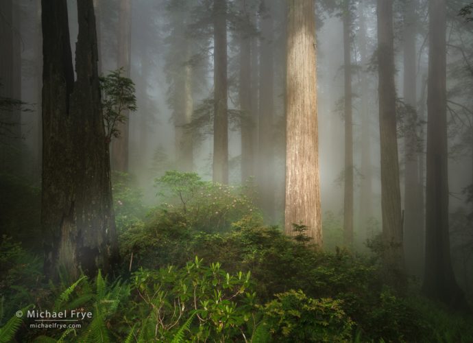
Fogbow in a redwood forest, northern California. Here I darkened that bright patch along the bottom, and lightened the middle to pull the viewer’s eye into the picture.
I could show a hundred more examples, because in every composition I try to avoid including distractions along the edges, and draw the viewer’s eye into, rather than out of, the picture. (In fact I wrote about a similar topic previously, but it’s important enough to bear repeating!) Sometimes, as with the fogbow image above, there is no perfect solution. Selectively darkening bright edges in software can help, but there are limits to how far you can go without the effect becoming obvious, so it’s better to just avoid the problem in the first place. That starts by paying attention to the edges of your frame, and making a conscious effort to avoid including bright areas, bright colors, and other distractions along the edges. Look for ways to use light and color to draw the viewer’s eye into the frame, rather than out of it.
— Michael Frye
P.S. There’s still time – barely – to get 25% off on prints of two of my images, as the The Ansel Adams Gallery print sale ends at 6:00 p.m. Pacific Time tonight. Click here to see the details. And to those of you have already purchased one of these prints, thank you so much!
Related Posts: Avoiding Bright Edges; Simple and Complex; Ansel Adams Gallery Print Sale!
Michael Frye is a professional photographer specializing in landscapes and nature. He is the author or principal photographer of The Photographer’s Guide to Yosemite, Yosemite Meditations, Yosemite Meditations for Women, Yosemite Meditations for Adventurers, and Digital Landscape Photography: In the Footsteps of Ansel Adams and the Great Masters. He has also written three eBooks: Light & Land: Landscapes in the Digital Darkroom, Exposure for Outdoor Photography, and Landscapes in Lightroom: The Essential Step-by-Step Guide. Michael has written numerous magazine articles on the art and technique of photography, and his images have been published in over thirty countries around the world. Michael has lived either in or near Yosemite National Park since 1983, currently residing just outside the park in Mariposa, California.


Thank you for that reminder Michael, along with some excellent examples. I really love the B&W from Glacier Point.
Thanks John!
Thanks, Michael. One of the earliest things I learned about landscape photography technique was to pay attention to the edges of my composition. This post certainly strengthens that importance, something I always keep a close eye on. Lovely b/w image from Glacier Point!
As I was walking down a street in the historic center of Florence this morning, there was an American family of four walking in front of me. One of the boys was wearing a t-shirt with a large Yosemite logo in the back—made me smile.
Thanks Bob! Leave it to the Americans to wear a Yosemite t-shirt in Florence. 🙂
Excelent post with really nice examples, your newsletter is one of the few ones that I expect regularly. Keep the good job!!!
Regards from Chile…
Andrés
Thanks so much Andrés!