Light
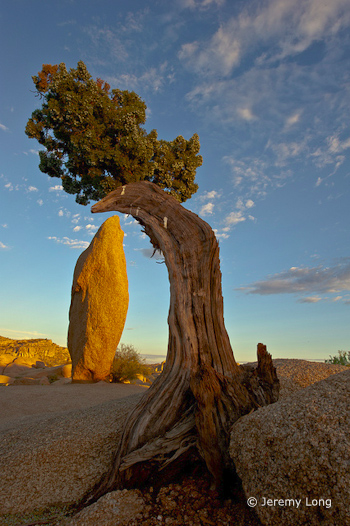
This week’s photograph was made by Jeremy Long in Joshua Tree National Park, California. The image is an interesting study
of both composition and light. Of course it’s impossible to separate the two, as one always affects the other, but when analyzing a photograph it helps to consider each aspect on its own.
Warm, early-morning sunlight rakes across the scene from right to left, highlighting the rock obelisk and making it look three-dimensional. Most of the foreground juniper remains in the shade; a rock formation probably blocked the sun from hitting the tree. Initially I thought it might be better to see sunlight striking the juniper as well, but the shade sets up a nice contrast with the lighter background, focusing attention on the shape of the tree rather than it’s color and texture, and that emphasis on shape works well here.
The clouds add a nice touch. While I wouldn’t call this spectacular light, it’s very good, and perfectly appropriate for the subject.
Composition
The main feature of this photograph is the juxtaposition between the arching tree and the rock obelisk. The fact that this idea comes through so clearly demonstrates how well Jeremy composed the image. The design is clean and simple, and the main elements stand out clearly, with little extraneous clutter.
There are only two small things I can nitpick about the composition. First, I’d like to see a little more breathing room between the top of the rock and the juniper. Although they don’t actually merge, they come close, and putting a bit more space between these two elements would help the main idea stand out more clearly, and make the whole photograph feel more balanced. Just lowering the camera position a few inches would have accomplished this.
Second, the two main elements are in the center and left of center, with mostly empty space to the right. Perhaps Jeremy was trying to show more of the clouds, but to me those clouds, while nice, don’t carry the same weight as the rock and tree, and the image would feel more balanced if the camera were pointed slightly more to the left.
Technical Considerations
Jeremy captured this image with a Nikon D700 and 14-24 mm lens at 24 mm. The shutter speed was 1/10 sec. at f/22 and 200 ISO.
That small aperture helped keep everything in focus, and the photograph looks quite sharp. The exposure also looks perfect, with detail in the clouds and all but the darkest shadows. The overall contrast looks about right.
This kind of situation presents a difficult white balance problem. If you watched my first white balance video you’ll remember that I usually recommend color temperatures around 5000K to 5500K—daylight—for images with sunlight, like this one. Setting a higher color temperature makes an image more amber or yellow, which enhances warm tones in objects lit by low-angle sunlight, like the rocks in this photograph. But warming the image also adds yellow to the blue sky, and blue and yellow are opposites. Push the color temperature high enough and the sky will turn gray. Raising it even a little will make the sky muddy.
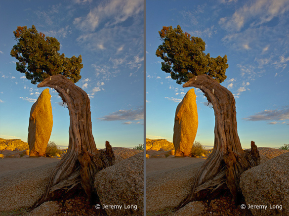
Jeremy told me that he set the color temperature to 6686K. This warm color balance made the rocks look great, but the blue sky has lost some of its vibrance. So I took this image into Photoshop and used a Selective Color adjustment layer to subtract yellow from just the blues. This helped purify the sky color and restore some of it’s natural brilliance. I also subtracted cyan from the yellows, making the rock obelisk a bit warmer. The differences are subtle, so I’ve included a side-by-side comparison.
In my next, and last, video on white balance I’ll explain exactly how to use Photoshop’s Selective Color tool to get rich, warm tones on the landscape while keeping vivid blues in the sky.
Conclusions
This photograph has good light, a clean, simple composition, and is technically well executed. Overall it’s very well done.
What I’d say to Jeremy, and to anyone else who can compose and execute a photograph this well, is to try and take the next step, and make photographs that capture a mood, or somehow convey the feeling of what it was like to stand in a particular place at a particular time. The juxtaposition of the rock and tree in this photograph is interesting and eye-catching, but not particularly moving. And I know Jeremy is capable of capturing a great mood—here’s one example.
Your Comments
I’d love to hear your thoughts about this photograph. Do you agree that there should be more space between the tree and rock? What do you think about the sky color?
Thanks Jeremy for sharing your image! You can see more of his work on Flickr.
If you like these critiques, share them with a friend! Email this article, or click on one of the buttons below to post it on Facebook or Twitter.
As part of being chosen for this week’s critique Jeremy will receive a free 16×20 matted print courtesy of the folks at Aspen Creek Photo. If you’d like your images considered for future critiques, just upload them to the Flickr group I created for this purpose. If you’re not a Flickr member yet, joining is free and easy. You’ll have to read and accept the rules for the group before adding images, and please, no more than five photos per person per week. I’ll be posting the next critique in two weeks. Thanks for participating!


