In the Moment:
Michael Frye's Landscape Photography Blog
by Michael Frye | Nov 21, 2014 | Composition, Vision and Creativity
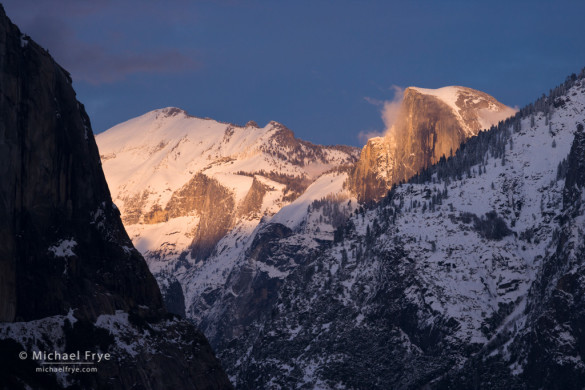
Half Dome at sunset from Tunnel View, Yosemite. The dramatic light might grab your attention here, but the interlocking diagonal lines create a cohesive design and a sense of energy.
One of the keys to learning composition is to think abstractly. As Ian Plant says in his excellent ebook about composition, Visual Flow, “Learning to think abstractly about visual elements is the single most important thing you can do to improve your compositional skills.” The less you think about the subject, and the more you think about the underlying abstract design – the lines, shapes, and patterns – the better your compositions will be.
It’s often easier to think abstractly when photographing a small subject, like a pattern of leaves, or a series of cracks in ice. But it’s just as important to look for repeating lines and shapes in big, sweeping landscapes. One of the most common – and powerful – designs in these big scenes is a series of interlocking diagonal lines. Most hilly or mountainous areas have an abundance of diagonals, and diagonal lines give a photograph a sense of dynamic energy and motion – a perfect fit for dramatic landscape images.
(more…)
by Michael Frye | Jul 23, 2013 | Light and Weather, Photography Tips, Vision and Creativity
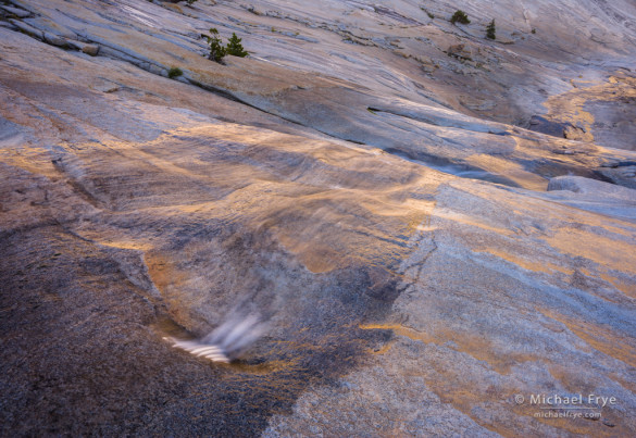
Creek descending through a granite basin. The sun was hitting the rocks just beyond the top of the frame, reflecting the gold color into the water, and even onto some of the polished rocks on the right.
When people think of photographing a reflection, they usually think of a mirror reflection, like a mountain reflected in a tranquil lake. I’ve done my share of those, but I think it’s often more interesting to just look at the colors, textures, and patterns on the water’s surface.
During my just-completed Hidden Yosemite workshop we had many opportunities to photograph reflections of all kinds. The accompanying photographs represent a mini-gallery of reflection photographs that I made during and just prior to the workshop, with extended captions to explain the thought process behind each image. Most of these are not mirror reflections; instead, they’re focused on the water’s colors and textures.
(more…)
by Michael Frye | Sep 27, 2012 | Advanced Techniques, Night Photography, Photography Tips

Sierra juniper and the Milky Way, Olmsted Point, Yosemite
Gear Doesn’t Matter—Except When it Does
Regular readers know that I’m not much of an equipment geek. It’s not that I don’t think equipment is important—a photographer needs good tools. It’s just that I think light, composition, technique, vision, and imagination are more important. In other words, how you use the tools is more important than what tools you use.
But sometimes the right gear can make a difference. Two weeks ago I was recording video segments for some online courses I’m working on (more about that later!), and needed a digital SLR that could record video—something my trusty old Canon 1Ds Mark II can’t do—for some “through-the-lens” views. So I called up my friend Jim Goldstein. Many of you know Jim through his popular blog and social media streams. Jim also works for Borrowlenses.com, and he set me up with a Canon 5D Mark III for my video shoot, and then asked, “Is there anything else you need?” Hmm… well I’ve been wanting to test the Canon 24mm f/1.4L lens for night photos, so yes, there was something else!
(more…)
by Michael Frye | Aug 29, 2012 | Composition, Photography Tips, Vision and Creativity

(A) Clouds and reflections, Tenaya Lake, Yosemite
At Tenaya Lake last week my workshop student and I watched and photographed a spectacular, constantly-changing cloud display for over two hours. I made many images, including the one at the top of this post (you can see two more here and here). With the lake in the foreground every composition included a prominent horizon line, so I was often thinking about where to place the horizon in the frame.
It’s not always an easy decision. If you’ve ever read any books on composition you probably learned about the rule of thirds. And when applied to horizons this means you should place the horizon a third of the way from the top or bottom of the photograph. And you probably also read that you should, at all costs, avoid putting the horizon in the center of the frame.
As many of you already know, I’m not a big fan of the rule of thirds. It’s too restrictive, too limiting when applied to the infinite number of possible subjects and situations a photographer can encounter. It’s useful sometimes, but shouldn’t be taken as dogma.
I think this applies to horizons as well. Sometimes putting the horizon a third of the way from the top or bottom works. Sometimes it’s better to ignore the rule and put the horizon right in the middle, or near the top or bottom of the frame.
(more…)
by Michael Frye | Aug 16, 2012 | Vision and Creativity

Reeds and Cloud Reflections no. 1
Planning
The future is uncertain, so we try to control it by planning. We think that if we do A and B the result will be C. But sometimes there are too many variables that we can’t account for, so the result might not be C—it could be D, or E, or even Z.
Photographers often try to plan. We imagine that if we go to a certain location at a certain time we’ll capture a certain photograph. Sometimes this works, but frequently the weather doesn’t cooperate or conditions aren’t right.
(more…)


