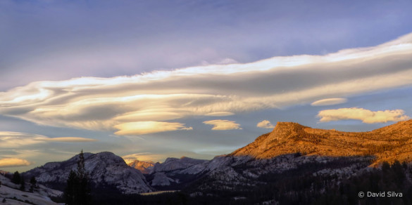
Posts Tagged ‘critique’

Photo Critique Series: Re-Processing a Misty Forest Scene

Tuesday, December 20th, 2011

Photo Critique Series: “Mist” by David Eaton, Part 1 (direct link to YouTube)

Photo Critique Series: “Mist” by David Eaton, Part 2: Processing (direct link to YouTube)

Yes, the critiques are back—finally! This critique features a beautiful forest image called “Mist,” by David Eaton. The photograph was made in an area called The Chase near Birmingham, England.

This is my second video critique, and I’ve broken it into two parts. The first video discusses the processing (briefly), light, composition, exposure, and sharpness. In the second video I demonstrate how I re-processed the image in Lightroom.

(more…)

Rejects From the Critique Pool

Thursday, September 29th, 2011

I continue to get lots of great submissions for my photo critique series. Thanks to all of you who have submitted work!

When selecting images to critique I usually pick photos that are good, but could be improved in some way. That gives me something to talk about, and I think these good-but-not-perfect photos are usually very instructive.

But that means many great images don’t get picked, and lie in obscurity in the Flickr critique pool. So for this post I thought I’d do something different and showcase some beautiful photos that I haven’t critiqued because I can’t figure out how to improve them. There are many more, and I wish I could show them all, but for now here are eleven rejects from the critique pool—rejected because they’re just too good:

"San Francisco" by Neal Pritchard

"San Francisco" by Neal Pritchard

I love the layers of hills leading to the barely-visible but still recognizable San Francisco skyline. You can see more of Neal’s work on his web site and Flickr stream.

(more…)

Photo Critique Series: An Intimate, Wide-Angle Composition from Scotland

Thursday, September 1st, 2011

Photo Critique Series: “Finnich Gorge” by David Dalziel from Michael Frye on Vimeo.

I decided to try something new for this latest critique, and record my thoughts with video screen capture. I hope this will create a more interactive, immersive experience, as if you were watching me do a portfolio review in a workshop. Let me know how you like it!

To see the best detail, be sure to watch the video in HD and click the four arrows in the lower-right corner of the video to expand it. Once expanded, I prefer to turn scaling off (in the upper-right corner).

This week’s photo was made by David Dalziel in Finnich Gorge, just north of David’s home in Glasgow, Scotland. Recently I wrote about the third dimension in photography, and how lens choice can affect our perception of depth and space in a photograph. Then in my last critique I showed an example of how a telephoto lens can compress space, flatten perspective, and create patterns. This time we’ll look at the opposite: a wide-angle composition that creates a sense of depth, even though it’s not a grand, sweeping landscape.

(more…)

A Photograph From the Archives: My Self-Critique

Thursday, August 18th, 2011
Wildflowers, Tuolumne Meadows, 1986

Wildflowers, Tuolumne Meadows, 1986

It’s wildflower season in the Yosemite high country, which made me think about this image that I made 25 years ago, in August of 1986, in Tuolumne Meadows.

In the 1980s large swaths of Lemmon’s paintbrush and shooting stars were common in Tuolumne Meadows in the summer. But 1986 brought the best bloom I’ve ever seen there, with this great mix of paintbrush, little elephant’s heads, lupine, shooting stars, penstemons, and… that yellow flower (arrowhead butterweed?). For some reason though wildflowers have diminished in Tuolumne Meadows in recent years, and those great blooms seem to be a thing of the past.

In the summer of 1986 I was working at The Ansel Adams Gallery in Yosemite Valley. On the day I made this photograph I drove up to the high country after work. A thunderstorm had rolled through, leaving the meadows wet and the skies overcast. But just before sunset the sun crawled underneath the clouds and lit up the peaks in the distance.

I actually think I did a pretty good job with the composition here. I needed to find some kind of structure or design to hold the foreground together and lead the viewer’s eyes into the distance. The little V- shaped group of flowers at the bottom of the frame accomplished both those things, giving the foreground some structure and leading viewer’s eyes toward the background. As a bonus, that V-shape mirrors the upside down Vs of the peaks.

The horizon line is high, but I think that’s appropriate here: the foreground is much more interesting than the sky. I’m glad I wasn’t overly concerned about putting the horizon a third of the way from the top.

(more…)

Photo Critique Series: Patterns, Focal Points, and Telephoto Compression in a Palouse Country Landscape

Wednesday, July 27th, 2011
"Steptoe Beauty" by Greg Speasl

"Steptoe Beauty" by Greg Speasl

This week’s photograph, titled “Steptoe Beauty,” was made by Greg Speasl in the Palouse country of eastern Washington. The image is an interesting study of how a telephoto lens can compress space and create patterns.

Light

Sidelight is usually a great way to bring out textures, and here the low-angle, late-afternoon sun raking across the fields from right to left brings out the beautiful textures and forms of the landscape. The alternating patterns of green and amber also create a nice color contrast.

Composition

Recently I wrote about depth in photography, and how wide-angle lenses can help create an illusion of depth, while longer focal lengths can flatten the perspective and emphasize patterns. This is a great example of the latter—Greg used a telephoto lens (210mm on a full-frame sensor) to zoom in, compress the space, and pick out an intriguing pattern in the sculptured hills. In fact we see two overall patterns here, one formed by the interplay between light and dark, the other created by the color contrast between regions of green and amber.

(more…)

Photo Critique Series: “Sunrise at Sunset Point” by Raymond

Friday, June 17th, 2011
"Sunrise From Sunset Point" by Raymond

"Sunrise From Sunset Point" by Raymond

The critiques are back! With my trip to Utah, and then having to restore the blog, it’s been awhile, but I’m happy to be able to present another photo critique this week, and I hope it won’t be so long until the next one. Thanks for your patience!

Light

This week’s photograph was made by Raymond in Bryce Canyon National Park, Utah. Perhaps the most striking feature of this image is the colorful sky, with clouds appearing to radiate out from the sun just before it clears the horizon. The warm hues of the red-orange clouds, along with the rusty rocks, form a nice color contrast with the cool blues of the sky and distant mountains.

Composition

What I like most about this composition is how the foreground and background complement each other. Those radiating lines in the clouds are subtly echoed by the folds in the landscape below.

Raymond said, “I found the scene to have many things going on—the snow, the hoodoos, the colored bands across the canyon sides, the ridges running down the sides, etc. In circumstances like that I find it difficult to feel “sure” of how the elements are arranged. I basically placed the horizon at the one-third point and placed the sun at the left/right midpoint. With my fingers crossed, I was hoping the colored bands would help lead the eye into the distance and the canyon’s bowl-like shape to cradle the elements of the scene.”

(more…)

Photo Critique Series: “Bonsai Waves” by Mat Malone

Thursday, April 28th, 2011

"Bonsai Waves" by Mat Malone

"Bonsai Waves" by Mat Malone


Composition

This week’s photograph was made by Mat Malone along the eastern shore of Lake Tahoe, Nevada. What first caught my eye about this image was the composition, with the layered, repeating shapes of the foreground rocks leading the eyes toward the more distant rock with the “bonsai” trees.

In some other critiques I’ve taken issue with foregrounds that didn’t seem to work, that really didn’t add to the photograph. This, on the other hand, is a strong foreground, something that contributes greatly to the overall effect of the image.

Mat told me, “When I was composing this I was really trying find an interesting set of lines that I could incorporate into the foreground. Along the shore I found a few large boulders next to each other that also lined up with the bonsai rock. Then it was just a matter of finding a perch for my tripod with a height that gave the rocks the separation I liked, and waiting for the light.”

(more…)

Photo Critique Series: “Another Lousy Sunset” by Ken Hornbrook

Friday, February 25th, 2011

"Another Lousy Sunset" by Ken Hornbrook

“Another Lousy Sunset” by Ken Hornbrook

The critique is finally here—thanks for your patience!

Light

This week’s photograph was made by Ken Hornbrook at Bandon Beach along the Oregon coast. There’s some wonderful sunset color in the sky, plus blue and orange reflections in the water, creating great color contrasts throughout much of the frame. Any photographer standing at this beach that evening would be excited about the possibilities. But what do you do with that light, that color?

Composition

Ken found a great camera position to take advantage of the colorful sunset and interesting shapes of the rocks. It looks like he moved into a small cove or gap between cliffs or sea stacks. This created a nice window, with dark shapes on the sides framing the view of the stacks beyond. The curving, colorful V-shape of the water in the foreground leads our eyes smoothly from bottom to top. It even has a bit of an S-curve. I’ve pointed out problems with foregrounds in previous critiques, but I think this one really works, and adds a lot to the photograph.

(more…)

Photo Critique Series: “Badwater Lake” by Grant Kaye

Friday, January 28th, 2011

“Badwater Lake” by Grant Kaye

“Badwater Lake” by Grant Kaye

This week’s photograph was made by Grant Kaye at Badwater in Death Valley National Park, California. The water in this place may be bad to drink, but it’s good for photography. It’s always interesting to see water in the desert, and this spot often has great reflections, especially with clouds at sunrise or sunset, like the ones Grant captured in this image. It’s easy to see why Badwater attracts lenses.

Composition

With reflection images, horizon placement is a key decision. It’s usually better to avoid putting the horizon across the middle of the frame, as this cuts the photograph in half, and often creates the feeling of two different photographs stuck together. (I pointed out this problem in another recent critique.)

But there are exceptions to any rule. With reflections, putting the horizon in the middle emphasizes the symmetry between the elements above the horizon and their reflections below, and can be an effective way of expressing calm and serenity, or simply creating repetition and a unified composition. Placing the horizon above or below the center can also work: pointing the camera down emphasizes the reflection; pointing the camera up emphasizes the actual objects above the water.

In this photograph Grant chose put the horizon above center and highlight the foreground and the reflection. I often like this approach, as reflections have richer color than the real objects they’re reflecting. Here this arrangement also accentuates the converging lines of the clouds—they all seem to point to a spot behind the peaks in the center of the image. Overall the composition is simple and direct, with a strong radiating design.

(more…)

Photo Critique Series: “Ptarmigan Lake” by Chris Alexander

Friday, January 14th, 2011

"Ptarmigan Lake" by Chris Alexander

“Ptarmigan Lake” by Chris Alexander

Composition

This week’s photograph was made by Chris Alexander in Glacier National Park, Montana. That’s the second time recently that I’ve critiqued a photo from this park. Obviously—and no surprise to anyone who’s been there—a beautiful place!

This composition works very well. The bottom two-thirds of the photograph has sweeping, repeating, U-shaped curves that help tie everything together and frame the background peaks. The lake and mountains provide focal points: my eyes work in a triangle around the frame, going from the lake to the prominent peak on the right, over to the peaks on the left, then back to the lake, sometimes detouring around the lower basin to look at the snow patches and trail. The overall design is simple and strong.

If I could quibble with something, it would be the bright spots along the edges that tend to draw my eyes out of the frame, including the snow patch in the lower-left corner, another snow patch near the upper-right corner, and of course the sky.

(more…)