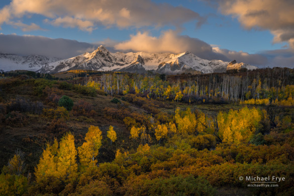
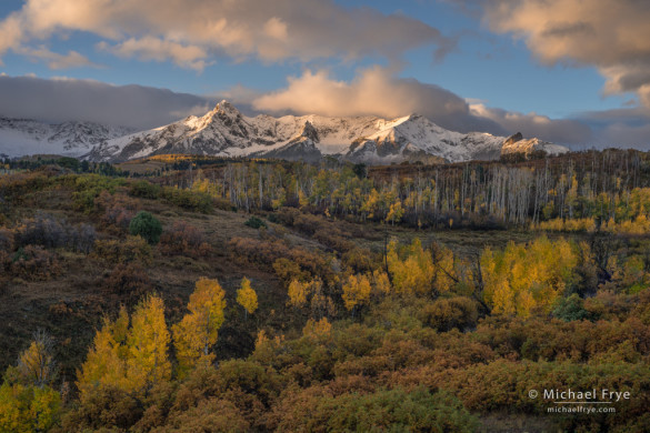
Autumn sunrise over the Sneffels Range from the Dallas Divide, CO, USA
As I wrote in my last post, it can be challenging to process high-contrast scenes with important, colorful subjects in the shade – like aspens. You need to lighten the shadows even more than normal to bring out the color, and it’s hard to do that in a natural-looking way, while keeping contrast and depth.
This photograph is a good example. It’s from the Dallas Divide, one of Colorado’s iconic fall locations. Fresh snow on the peaks added interest, but also created more contrast. The morning sun lit the peaks and clouds, but I knew it would be awhile before that light reached the aspens in the foreground, and by that time the color in the sky would be gone. I bracketed three exposures, each one stop apart, in case I needed to blend them together later. But I didn’t need to blend; the final image was processed in Lightroom with just one frame.
I chose the middle frame to work with, because it was the lightest of the three that had good highlight detail. The darkest image also had good highlight detail, but using it would have required lightening the shadows even more, which could have brought out more noise. And in the lightest frame the highlights were too hot, too washed out, to work with.
When you’re evaluating highlight detail in Lightroom (or Adobe Camera Raw), keep in mind that ever since version 4 Lightroom has had automatic highlight recovery. If it’s possible to recover overexposed highlights in a Raw file, Lightroom does so automatically upon import. So if you import an image and see pixels pushed up against the right edge of the histogram, that means the highlights were too overexposed to recover. Pick a darker frame to work with – if you have one.
If you’re not sure whether you can work with that one image, or whether you need to blend exposures or use HDR, try making a couple of quick adjustments in Lightroom (or Camera Raw). Drag Highlights to the left, and Shadows to the right, then zoom in. Look closely at the brightest highlights: do they have good texture and detail, or do they look hot, or weirdly splotchy? And look at the shadows too – how much noise do you see? If your zoomed-in view reveals good highlight detail, and little noise, you’re good to go. If not, you may need to use HDR, or some other method of exposure blending.
Getting back to the photograph from the Dallas Divide, here’s what that middle exposure looks like at Adobe’s default settings:
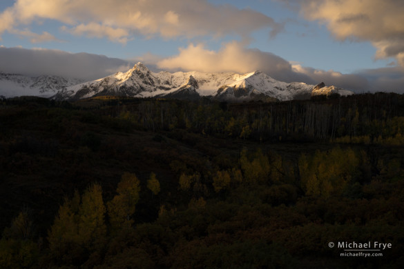
The unprocessed Raw file at Adobe’s default settings
The bottom two-thirds of the photo looks awfully dark, but the histogram showed nothing pushed up against either edge, and I did the same kind of evaluation I just suggested, which revealed good detail in the highlights, and little noise in the shadows. So I knew I could get the results I wanted with just this one frame.
There are a lot of steps to processing any image, and for the sake of brevity I’ll gloss over most of them here, and get to the heart of it – the tonal adjustments in the Basic Panel. First I set the Exposure slider to +1.10, which was a compromise: a little too light for the mountains, and a little too dark for the foreground. Next, I dragged Highlights all the way down to -100, pushed Shadows up to +51, and adjusted the Contrast slider from my default of -33 up to -3 to give the midtones a bit more snap. Here’s what the image looked like at that point:
After the initial Basic Panel adjustments (Exposure +1.10, Contrast -3, Highlights -100, Shadows +51)
The mountains and sky look pretty good here. The foreground, on the other hand… not so much. It has plenty of detail, but the color is rather dark and muddy, and the aspens are an important part of the story, so they need to be brighter to draw the eye more. But pushing the Shadows slider up more just makes the whole foreground look flat. Instead, I left the Shadows slider at +51 and used the Adjustment Brush to selectively lighten the snaking line of aspens. This screen shot shows the mask, with Exposure for that area set to 0.80, Contrast to 20, Clarity to 20, and Saturation to 20:
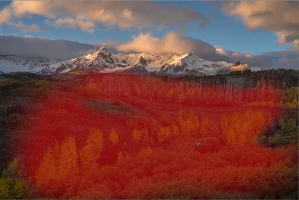
Mask showing where I painted with the Adjustment Brush to lighten the aspens
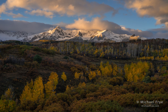
For good measure, I darkened the brightest areas of the peaks a bit too. As a comparison, here’s this image with Shadows slider pushed all the way up to +100, but no dodging and burning, next to my final version, with Shadows at +51, and the aspens selectively lightened with the Adjustment Brush:
With Shadows pushed all the way up to +100, but no dodging and burning
The final image, with Shadows left at +51, and the foreground selectively lightened with the Adjustment Brush
As you can see, in my final version the aspens are actually lighter than I could make them with the Shadows slider alone – even with Shadows pushed all the way to +100. Also, selectively lightening the aspens keeps the surrounding foreground areas darker, which draws the viewer’s eye to the aspens, and creates modulation and contrast between light and dark areas within the lower two-thirds of the frame, making the image livelier overall.
As I said, images like this are challenging to process. Just using the Highlights and Shadows sliders to balance the contrast is likely to make parts of the image too flat-looking. Instead, I’d rather use those tools to get me part of the way there, then dodge and burn with the Adjustment Brush to selectively lighten and darken certain areas, and lead the viewer’s eye where I want it to go.
Of course my ebook, Landscapes in Lightroom: The Essential Step-by-Step Guide, delves into all of this in more detail. It includes eight step-by-step examples, including several high-contrast scenes processed with with just one Raw file, and one example using Lightroom’s new HDR Merge, for situations where the contrast is too extreme for one Raw file.
And to help you get the most out of Lightroom’s tools, there are ten video tutorials that accompany the ebook, including, of course, one demonstrating how to use the Adjustment Brush – one of Lightroom’s most powerful, but least utilized tools. Other videos show how to use the Graduated Filter, the new HDR Merge and Panorama Merge, the Spot Removal Tool, how to do do Advanced Retouching in Lightroom, and much more.
And remember that automatic highlight recovery I mentioned? That’s just one of the image-adaptive behaviors in Lightroom (and Camera Raw). In fact all of the Basic Panel Tone Controls (Exposure, Contrast, Highlights, Shadows, Whites, and Blacks) are image-adaptive – that is, they change their behavior based on the image content. For some reason, Adobe hasn’t talked much about these image-adaptive behaviors, but I think this is important stuff to understand if you’re going to get the most out of these tools, so I discuss these behaviors in depth in the ebook.
Click here to find out more information, or purchase Landscapes in Lightroom.
— Michael Frye
Related Posts: Autumn Landscapes; Outdoor Photographer Excerpts My Landscapes in Lightroom 5 eBook; Free Bonus Video: Using the Arrow Keys in Lightroom
Did you like this article? Click here to subscribe to this blog and get every new post delivered right to your inbox!
Michael Frye is a professional photographer specializing in landscapes and nature. He is the author or principal photographer of The Photographer’s Guide to Yosemite, Yosemite Meditations, Yosemite Meditations for Women, Yosemite Meditations for Adventurers, and Digital Landscape Photography: In the Footsteps of Ansel Adams and the Great Masters. He has also written three eBooks: Light & Land: Landscapes in the Digital Darkroom, Exposure for Outdoor Photography, and Landscapes in Lightroom 5: The Essential Step-by-Step Guide. Michael has written numerous magazine articles on the art and technique of photography, and his images have been published in over thirty countries around the world. Michael has lived either in or near Yosemite National Park since 1983, currently residing just outside the park in Mariposa, California.


It’s certainly refreshing to see another landscape shooter who doesn’t resort to HDR to salvage their photos. Great post as always.
Thanks Cris. I do use Lightroom’s new HDR Merge sometimes, when the contrast is too extreme to handle with just one frame. It does a good job of blending exposures in a natural-looking way.
Beautiful CO fall color image Michael!
You could have also tried using the digital GND filter in LR to lighten the exposure on the foreground. Wonder if that would result in better foreground color and less washed out darks and less noise than pushing shadows 100%? But it would not have the local contrast of your selective dodge and burn where the glowing foreground trees cobtrast with the dark ground around them.
Thanks Wayne! I don’t normally use the Graduated Filter tool for images like this, so I didn’t try it earlier, but just did to see what it would look like. It doesn’t look that different than just pushing Shadows higher, except that pushing Shadows up also lightens some tones in the upper third of the frame, while using the Graduated Filter on just the lower two-thirds doesn’t. With the Graduated Filter you could also add Contrast and/or Clarity to just the bottom part of the image, which would probably help make it look less flat (but you could also just push up Shadows to 100, then add a Graduated filter for just Contrast and Clarity to the bottom part of the image, which would accomplish the same thing). It’s also hard to hide the transition area of the Graduated filter in this image so it isn’t obvious. There isn’t going to be any difference in noise if you lighten a shadow area the same amount, regardless of which tool you use to lighten it.
The Graduated Filter is a useful tool, and I do use it sometimes, but it’s more limited than the Adjustment Brush. I’d say the same thing about the Radial Filter – sometimes useful, but limited. As you pointed out, here the Adjustment Brush can create selective lightening that helps create more local contrast. That’s true of many images, where I think it works better to use the Adjustment Brush for selective lightening or darkening, rather than trying to do it all with Highlights and Shadows, or with a broad selection created by the Graduated Filter.
Thanks Michael for your response! I use both methods, large area adjustments I try to use the grad filter and the adjustment brush for smaller areas and those times when the transition zone is not a simple line as you mentioned. Sometimes, I use both at the same time.Its always nice to hear your thoughts on the post processing of your images and also your posts when you select an image submitted to you and you critique it. Thanks!
You’re welcome Wayne, and I’m glad you use both. 🙂
Thanks, Michael!
As an intermediate-level amateur, I enjoy fine images, but REALLY enjoy getting the backstory for how they were captured and/or processed. Based on a quick reading of your outstanding ebook, I have begun to use the adjustment brush in ACR to great effect. Having you confirm my new practice, with comparative images here, is affirming! Keep the great work coming!
Ron
PS: And your softbound book, based on Yosemite images, is still a constant companion.
Thanks Ron! I’m glad you found this post helpful – and the ebook and The Photographer’s Guide to Yosemite too.
Hi, Michael,
if you shorten the way you may get lost. That’s what I keep telling myself. Guess it’s also true regarding photography and processing the images.
Thanks for this fine image and thanks for sharing your experience with processing it.
I do recommend your e-book “Landscapes in Lightroom: The Essential Step-by-Step Guide” – it has been my eye-opener how to use LR.
Marie
Very true Marie, and thanks!
Your tutorials are great – I’m always a bit wary of pushing some of the sliders too far, but I think I need to go by the rule of pushing until it looks icky and then back off. Thanks, Michael! Your autumn scenes are gorgeous.
Thank you Vivienne! High-contrast scenes often require pushing Highlight or Shadows (or both) pretty far. Otherwise I think your wariness of pushing sliders too far is probably a good thing – especially with Clarity, Saturation, and Vibrance. 🙂
Hi michael, I enjoy your blog… this particular autumn post just caught my attention as I’ve been wondering about your thoughts on lightroom colors. Sorry for the long reply. I’ve been using lightroom since about version 3 and LOVE some aspects of the software, but when it comes to yellows and oranges it seems like the software’s interpretation of my canon raw files always have me struggling. They just never look quite right to me from the start, I often spend most of my time trying to tame what happens to them when I pull and push settings. I’ve tried many camera profiles and color adjustment settings over the years and personally built a few myself that get me close, but, in the end some images just don’t look right to me with lightroom and for those instances… I revert back to Canons DDP, which despite it’s own drawbacks seems to get me what I want from the start in regards to color. I’ve even built a few profiles in lightroom that mimic the DDP look. I was just wondering about your thoughts and personal opinions on lightroom color reproduction per the actual scene, particularly regarding some of the more dramatic colors that happen at sunset and sunrise and in autumn. Do you ever find yourself not agreeing with lightrooms color conversion/interpretation of the RAW file? Love your blog and work as well.
PS There is an aspen tree shot you took last year in Colorado I think that is etched in my brain whenever I’m wandering in a forest of aspens.
thanks for your time
mizz
Mizz, in short, no, I haven’t ever felt that the colors in Lightroom were far off. And I would say that I’m pretty tuned-in to the nuances of color. Sometimes the yellows look a bit too yellow – that is, they should be more toward the orange side of yellow. But that’s easily fixed with a Hue adjustment in the HSL panel. I used to think that Adobe’s profiles for Nikon cameras weren’t as good as their profiles for Canons, but they seem to have gotten better in recent years – and, of course, that wouldn’t affect you, since you’re using Canon.
Thanks for the kind words – I’m glad you enjoy the blog!
Thanks.. Yeh… Those yellows… I appreciate your quick response and your thoughts.. If there was anyone to ask, I certainly thought you would be the one considering all your lightroom expirience.
I love lightroom for a million other reasons, just thought I would ask. Guess I’ll have to hue it up from time to time. Thanks again.
Great photo, love the colors… Please keep sharing the backstory for how they were captured and/or processed, have your e-book but I really like expanding my knowledge with more examples.
Thanks John, and I’ll do that when I can. 🙂