“A Walk Along the Cascades” by Charlene Burge
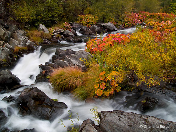
This week’s photograph, by Charlene Burge, is from the Plumas National Forest near the northern end of my home mountain range, the Sierra Nevada. The colorful plants along the creek are called wild rhubarb or Indian rhubarb. They’re found in a few places in and around Yosemite, but I was pleasantly surprised to discover this photo and see that they grow further north as well. It’s hard to tell from this image, but their leaves are quite large, sometimes more than a foot in diameter. Since they’re colorful in the fall, and grow along creeks, these plants make great photo subjects.
Color is one of the most appealing things about this image. The reds and oranges of the rhubarb draw the eye and contrast with the greens of the grasses and trees. The soft light of an overcast day worked perfectly for this subject. Sunlight would have been too harsh, creating bright highlights and dark shadows that would have overwhelmed the colors.
This seems counterintuitive to many beginning photographers—they assume that sunlight is a requirement for good photos, and that overcast is inherently dull. And that’s true for many subjects—the gray granite of El Capitan, for instance, seems lifeless on a cloudy day. But colorful subjects often look best with soft light. The even illumination gives prominence to color contrast rather than light-and-dark contrast.
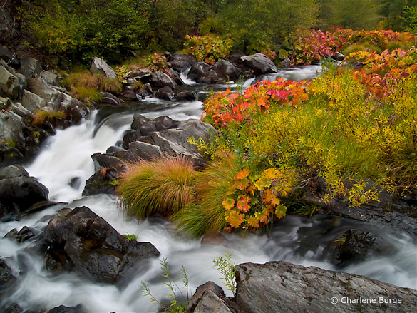
While we’re on the subject of color, the white balance looks good here—the rocks and white water appear neutral, and everything else is the appropriate hue, except perhaps the greens, which look a bit too red to me. Usually I see the opposite problem—greens that look blue-green. Here the greens are too warm, so they blend with the surrounding golds and oranges, and some of the natural warm-cool color contrast has been lost. I used Lightroom to remove some of that reddish tint in this next version. The difference is subtle, and takes a good monitor to see, but to me it’s significant.

With the greens adjusted to remove the reddish tint
This image was captured at f/22 with a 1/2 second shutter speed. These were appropriate choices for showing the movement of the water and getting enough depth of field to keep everything in focus. The blurred, silky look of the water creates a nice textural contrast with the rocks and vegetation. The largest cascade, however, near the middle of the frame along the left side, lacks definition—it’s mostly the same shade of white. I might have tried a slightly faster shutter speed, like 1/4 sec. or 1/8 sec., to try to keep more texture in that area without losing the flowing appearance of the water. Of course that would have required opening the aperture to f/16 or f/11, creating possible depth of field problems, or using a higher ISO, which would have added noise. In photography, everything is a compromise.
The two branches of the creek form a nice semi-circular shape and give the image structure. The top and right edges of the frame seem well placed. The lower-left corner, however, is troublesome. Bright areas along the edge of a photograph are often distracting, and here the white water in the lower-left corner pulls my eye out of the frame and away from the main centers of interest.
But having identified this problem, there may not have been a solution. Charlene told me that she couldn’t include anything to the left because she couldn’t hang out further over the water. I’m guessing that intervening vegetation blocked the view. Even if she could have pointed the camera down and to the left more, the creek obviously continues in that direction, and white water would have touched the edge of the frame somewhere. In those situations I try to put dark rocks along as much of the edge as possible, but sometimes there’s no perfect solution.
These dilemmas are common in landscape photography. A subject catches your eye, yet somehow it defies your attempts to make a clean composition. Some annoying, distracting element can’t be eliminated without losing an essential component of the scene.
Most of my best photographs have practically composed themselves; the right framing was immediately obvious. When I struggle with the composition I rarely like the end result. But there are exceptions, situations where I’ve worked with a subject for half an hour and finally found a good solution. And even if it doesn’t work I often learn something in the process. So it’s worth the effort, even if resulting image isn’t successful.
In researching my most recent book I found this quote from Ansel Adams: “I have found that when I have to labor over a composition I seldom achieve anything worthwhile.” So even the great Adams faced the same problem!
With the composition we see here, the only thing that might help prevent the eye from leaking out of that lower-left corner is to darken the water a bit, and I’ve done that in this next version. For good measure I also darkened and added contrast to that cascade near the middle-left edge to try to bring out more texture. I can’t say these changes made a big difference, but every little bit helps.

Water along the left side darkened, plus more contrast added to the large cascade
Despite my nitpicks this is a pleasing photograph of an intimate landscape. It makes me wish I had been there.
Thank you Charlene for sharing your image! You can see more of her work on Flickr.
If you’d like your images considered for future critiques, just upload them to the Flickr group I created for this purpose. If you’re not a Flickr member yet, joining is free and easy. You’ll have to read and accept the rules for the group before adding images, and please, no more than five photos per person per week. I’ll post the next critique on March 2nd or 3rd. Thanks for participating!


Trackbacks/Pingbacks